
THE NAVIGATOR CASE STUDY
Typography is cool… I swear.
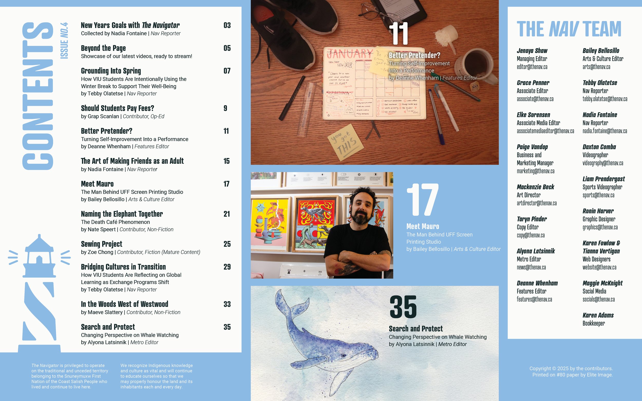
Making a TOC
A Table of Contents is far more than a simple list; it is a critical map that must generate interest while providing absolute clarity.
Designing an effective TOC requires a delicate balance of making information pop without confusing the reader, a process that is often the most time-consuming as it must be finalized last to ensure total accuracy. The bane of existence, but extremely satisfying to create.

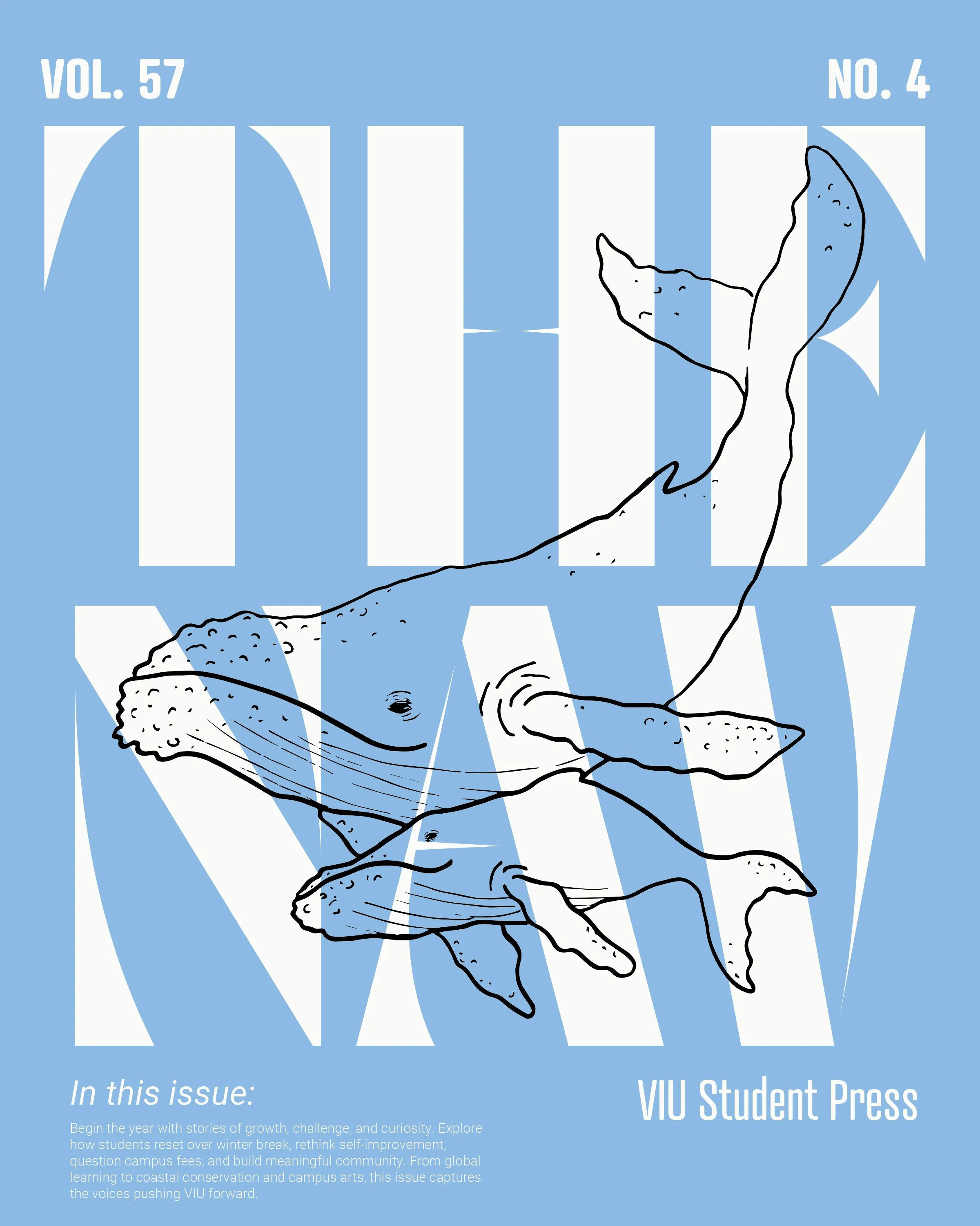
Title Pages
Title pages are the defining visual hook of any publication. Much like a digital thumbnail, they serve as the first point of contact, designed specifically to capture interest and pull the reader into the first line of text.
This is where I prioritize design over the strict legibility and flow required for body copy. Crafting these pages is my opportunity to set the narrative tone through pure visual impact, ensuring that the first thing a reader sees is also the reason they continue reading.
Titles & Covers will always be my favorite part of the process.
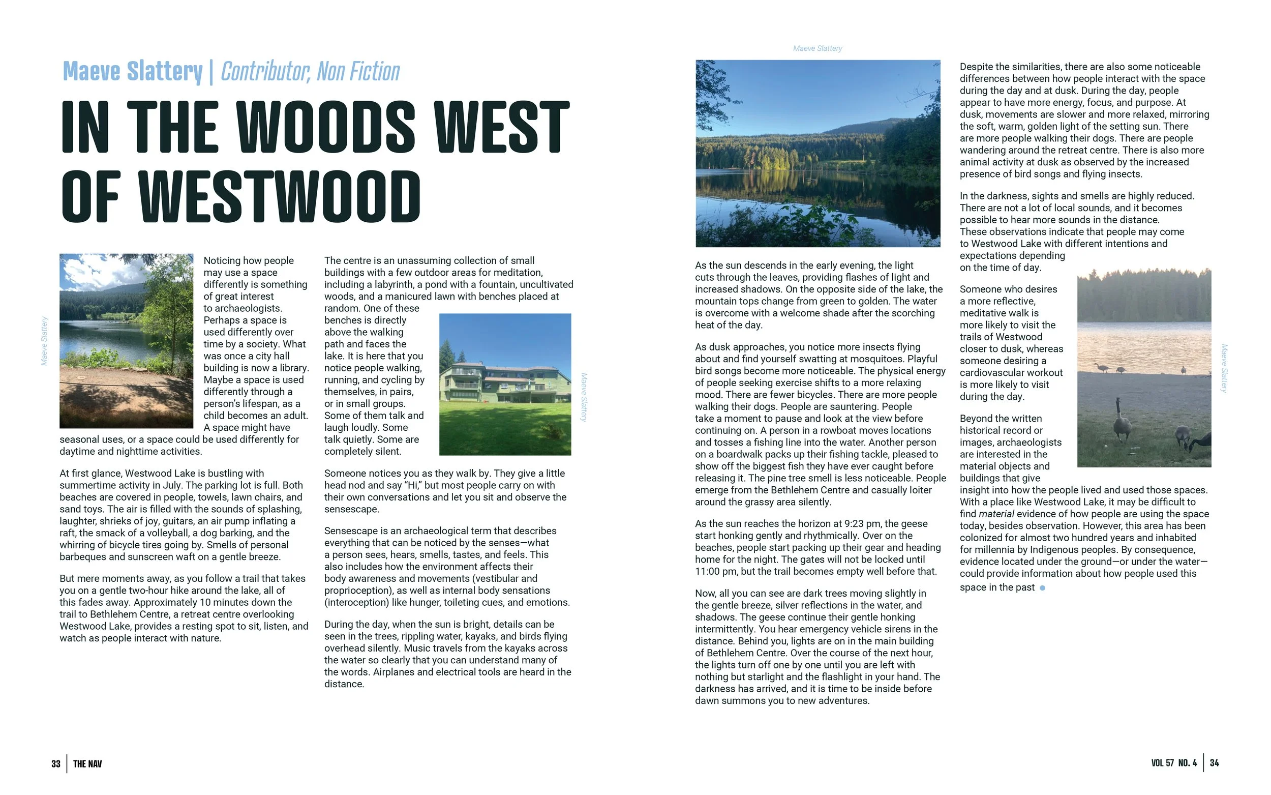
Text Heavy Spreads
Working with a high volume of body copy and imagery is a complex puzzle that I find both challenging and incredibly rewarding.
Every dense layout presents a unique set of constraints where the solution is always found through strategic typography. Whether it requires adjusting line lengths to accommodate visuals or making intentional trade-offs with pull quotes to manage space, I enjoy the process of turning a daunting headache of information into a balanced, legible, and professional spread.
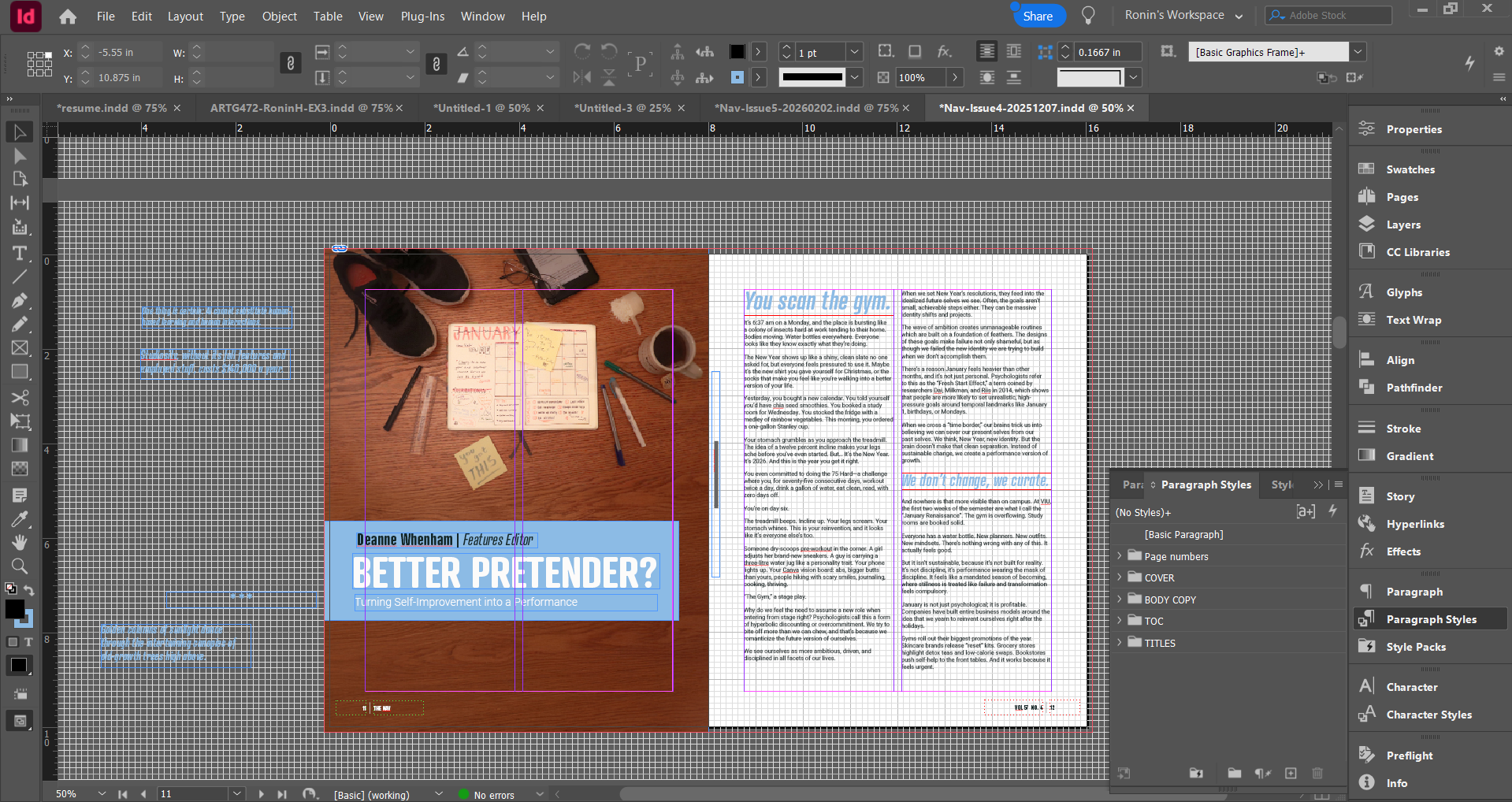
InDesign Setup
What started as my least favorite tool in the Adobe Creative Cloud has evolved into my most essential and enjoyed program.
Over the course of my university degree and my professional work in publication, I have mastered the technical intricacies of InDesign. My process is rooted in a highly organized workflow, beginning with math-based grids and maintained through the strict use of paragraph styles, layers, and parent pages to ensure every project is as efficient as it is clean.
Even though styles sometimes make me want to slam my head against the wall.

Learning Outcomes
Being the head designer for The Navigator was my first real jump into the professional world, and it taught me so much about the reality of making a publication for both web and print. While I definitely honed my workflow in InDesign and Photoshop, the biggest thing I took away was the value of the team. Getting to collaborate with so many talented people to turn a pile of ideas into a finished product was an invaluable experience, and it really showed me how much better a project becomes when you are working in a creative professional space with others.