
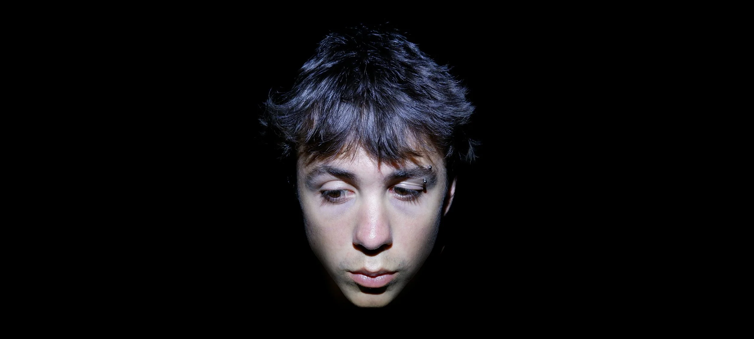
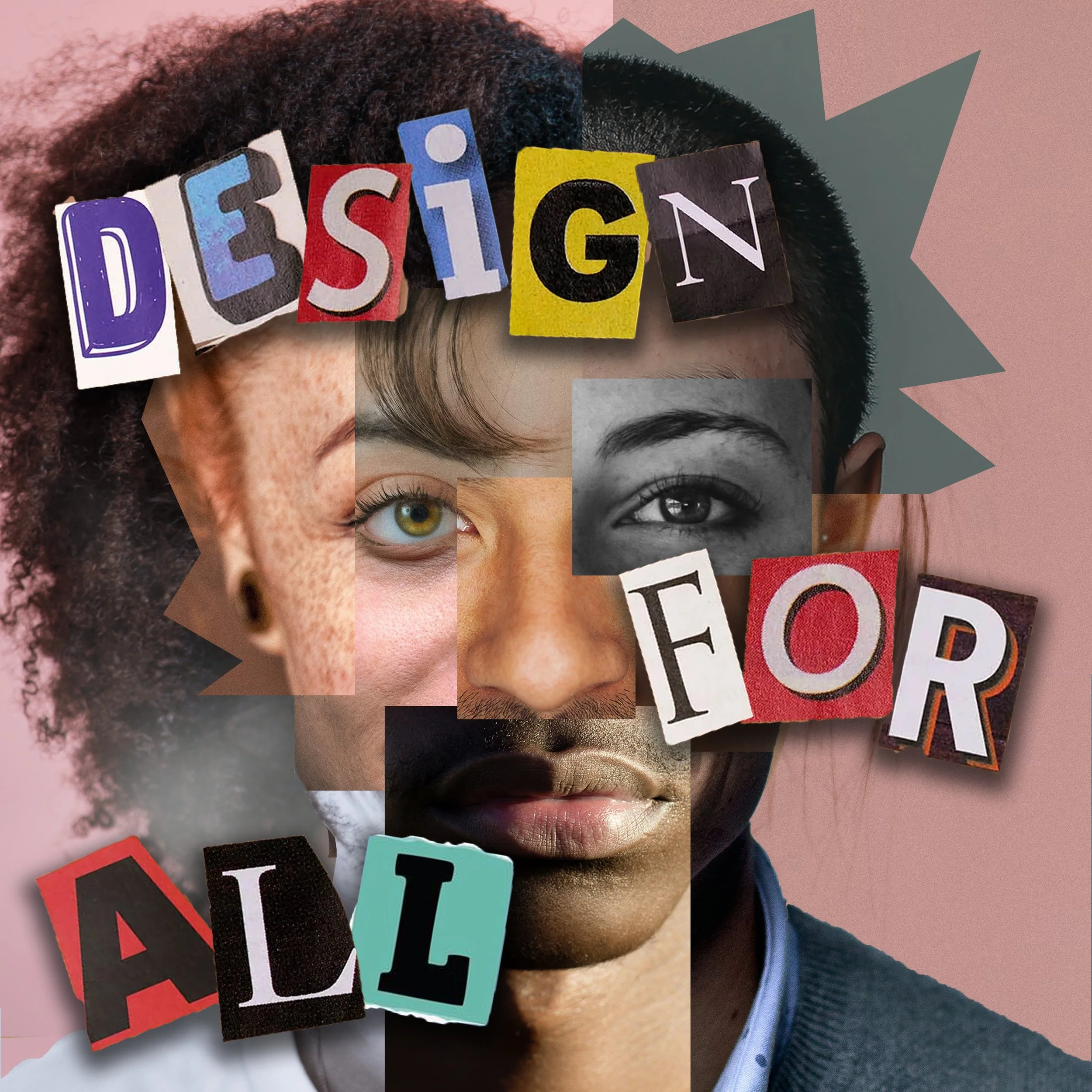
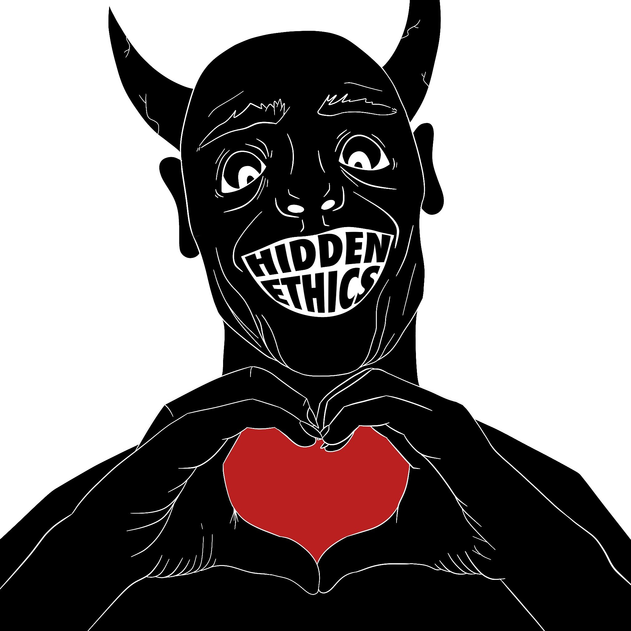
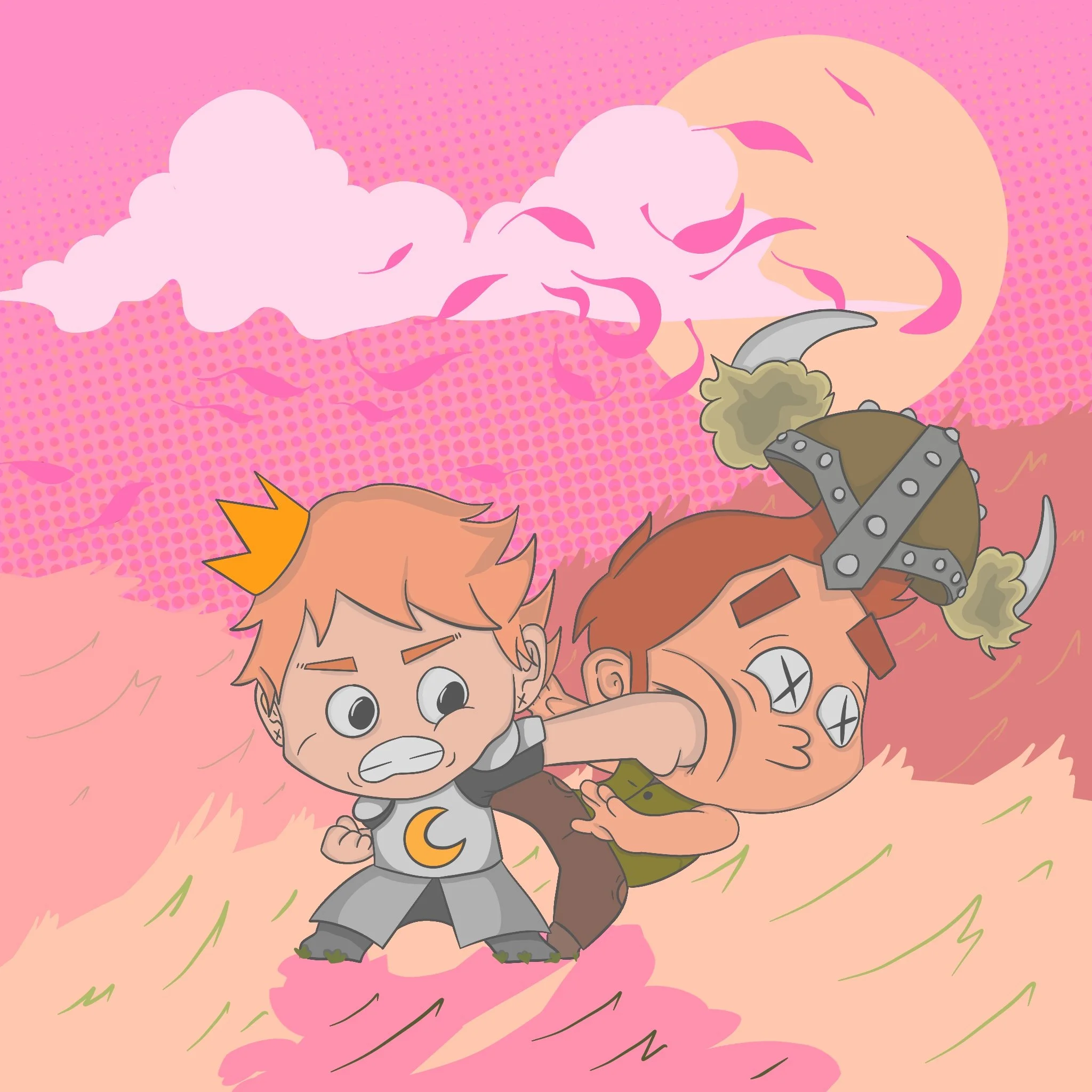
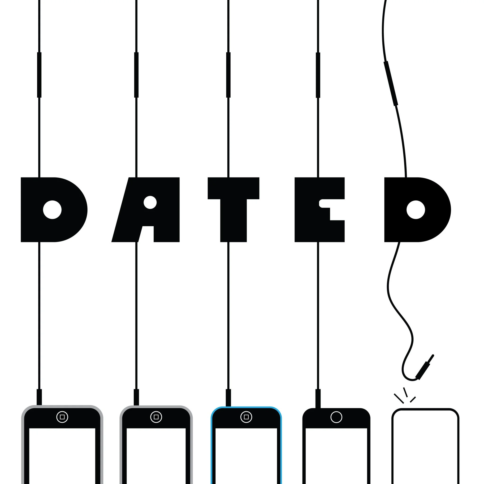
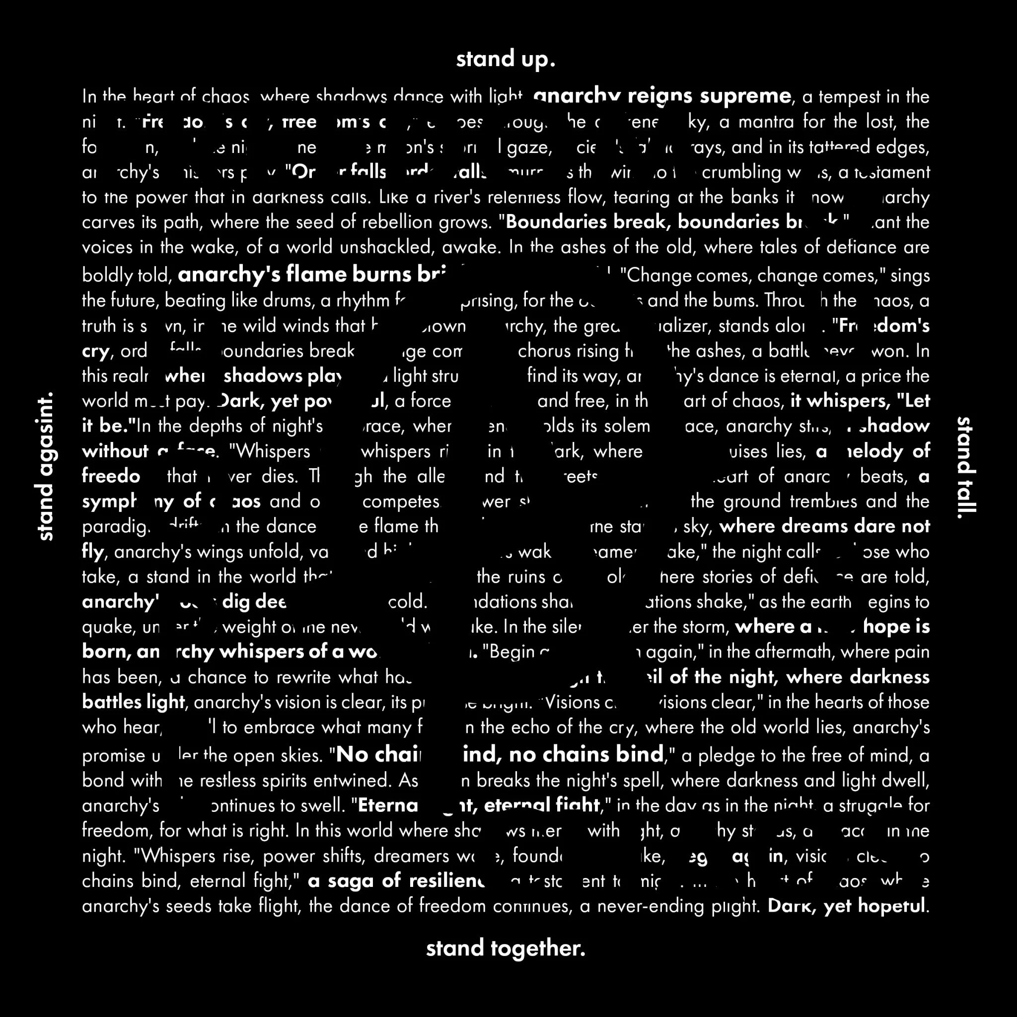
MESSY HEADED
Designer . Illustrator . Author . Creator
RONIN HARVER
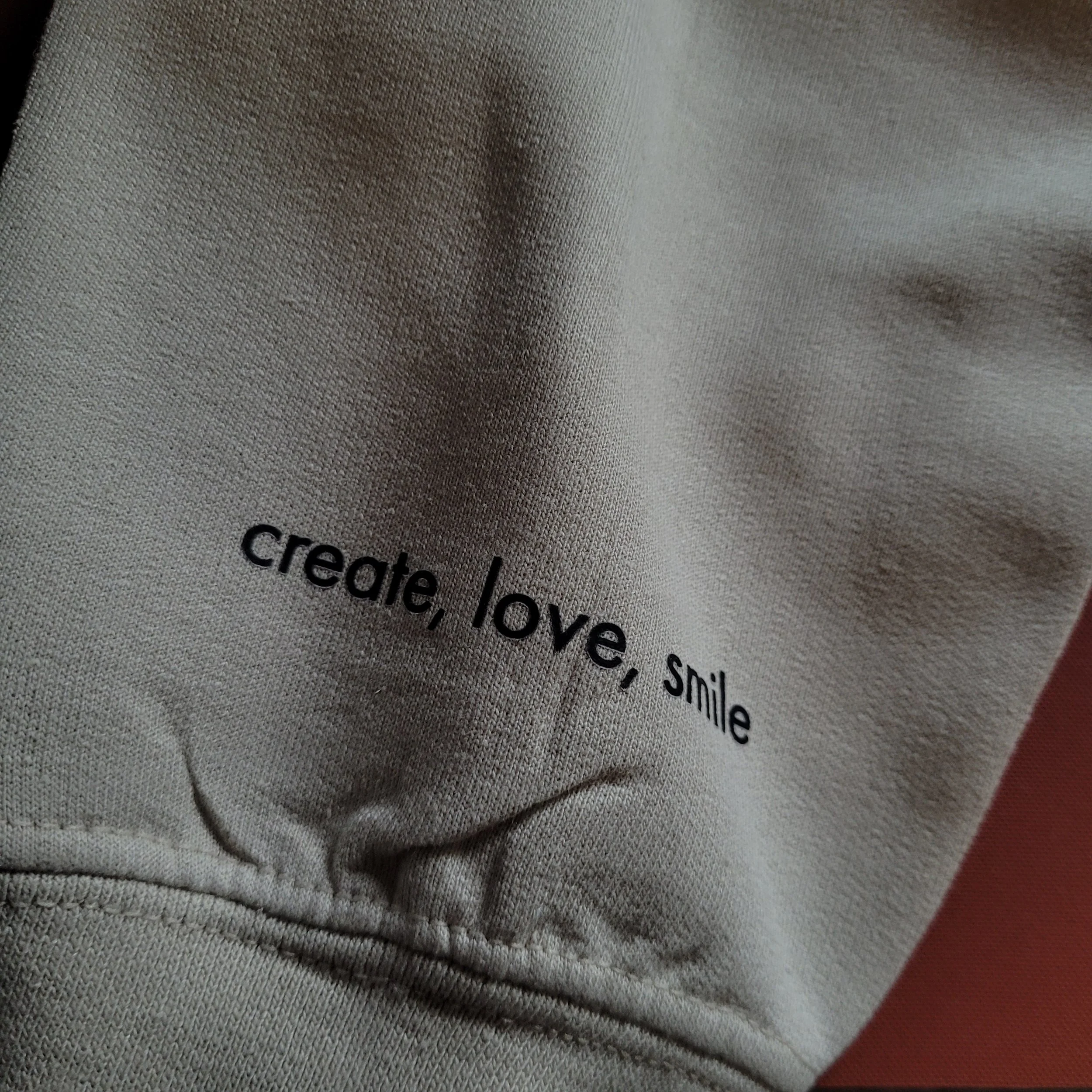
Create. Love. Smile.
Create. Love. Smile.

Hi I’m Ronin Harver!
Based on Vancouver Island, I’m a Graphic Designer by trade, but creativity is my passion across the board. Whether it’s design, illustration, video editing, filmmaking, writing, photography, or music, I love embracing every art form I can. Exploring new challenges and using storytelling to bring ideas to life has led me to become a published author, create award-winning films, and build a clothing business that taught me the ins and outs of production and branding.
Working alongside talented creatives, I’ve honed a problem-solving mindset and adaptable workflow, delivering polished results even in the face of unexpected challenges.
If you’re looking for a creative partner who can tackle any challenge and deliver impactful results, let’s connect!
Digital Arsenal


- FEATURED PROJECTS -


— DICE CHECK —
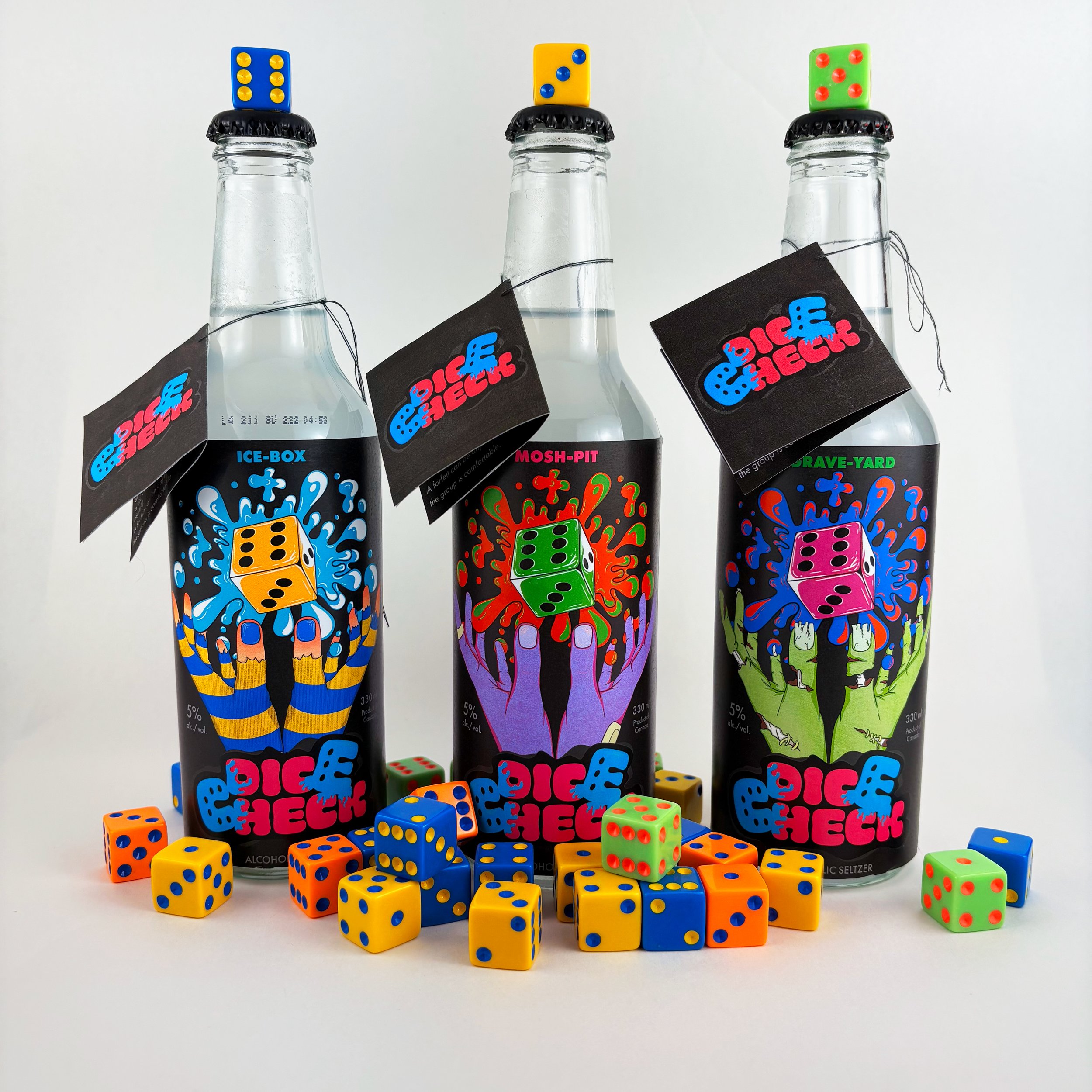
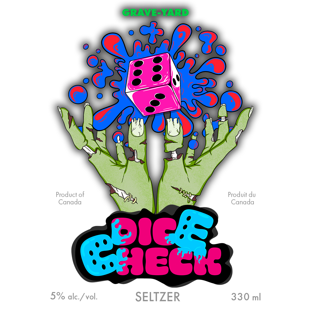
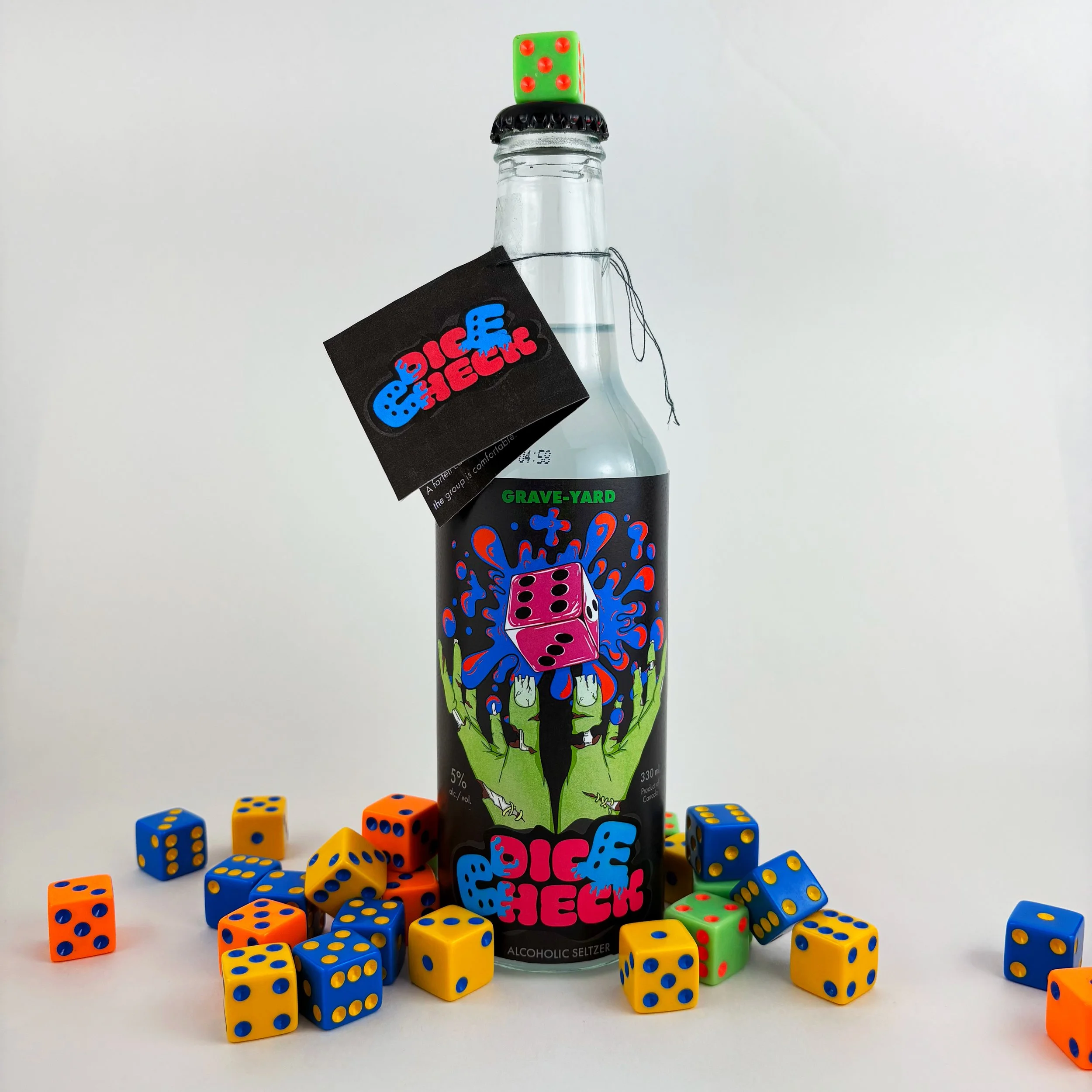
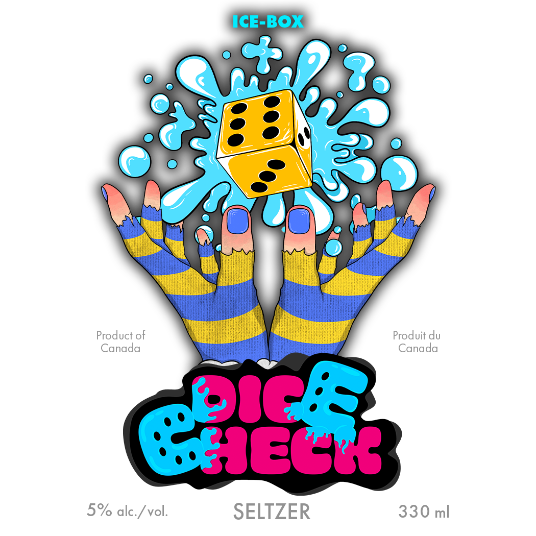
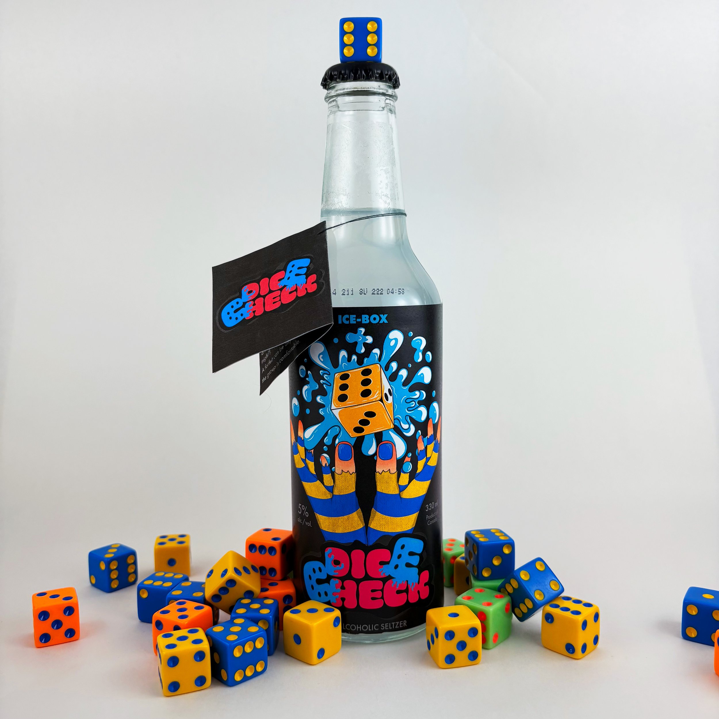
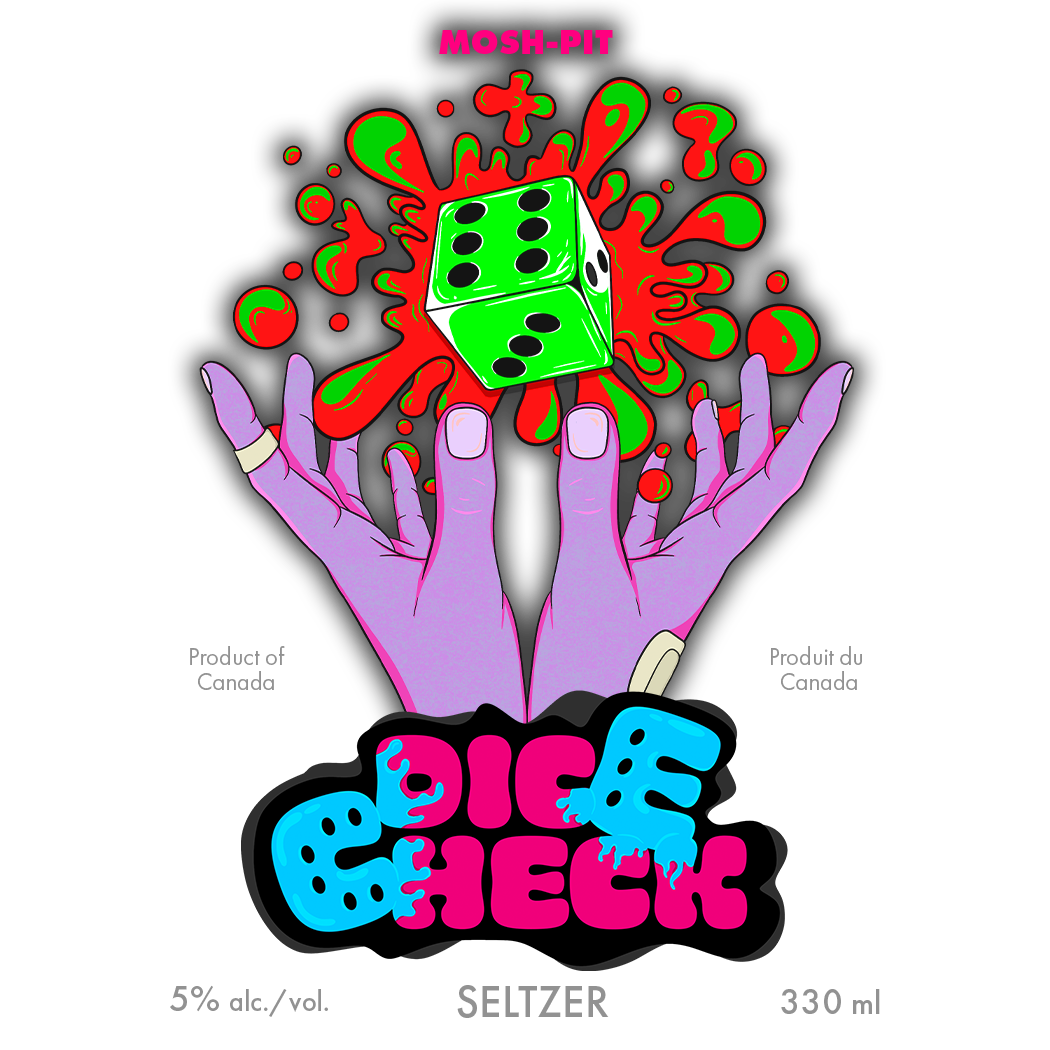
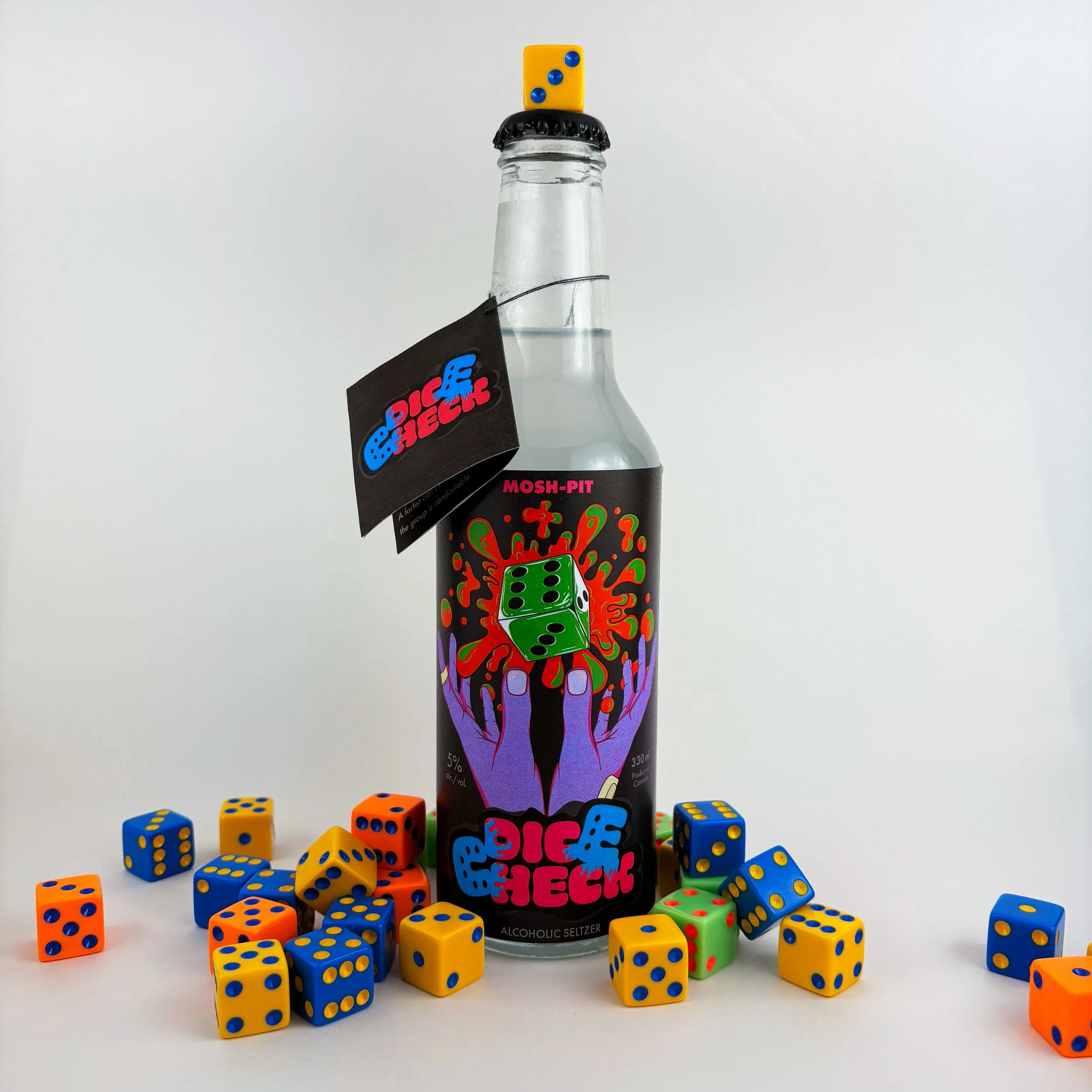
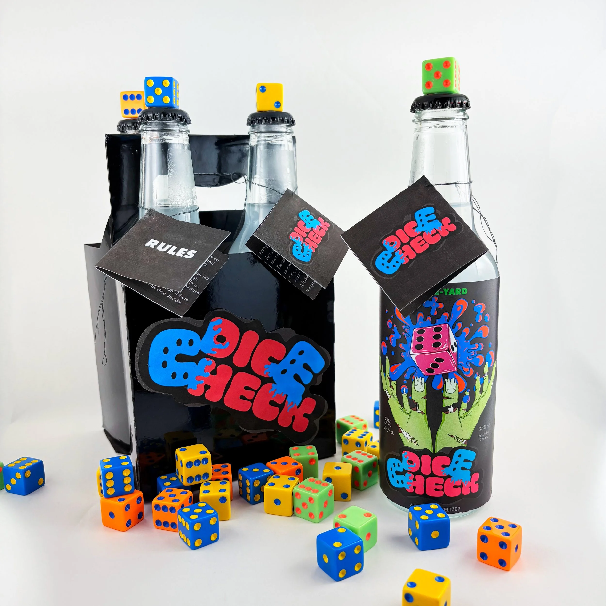
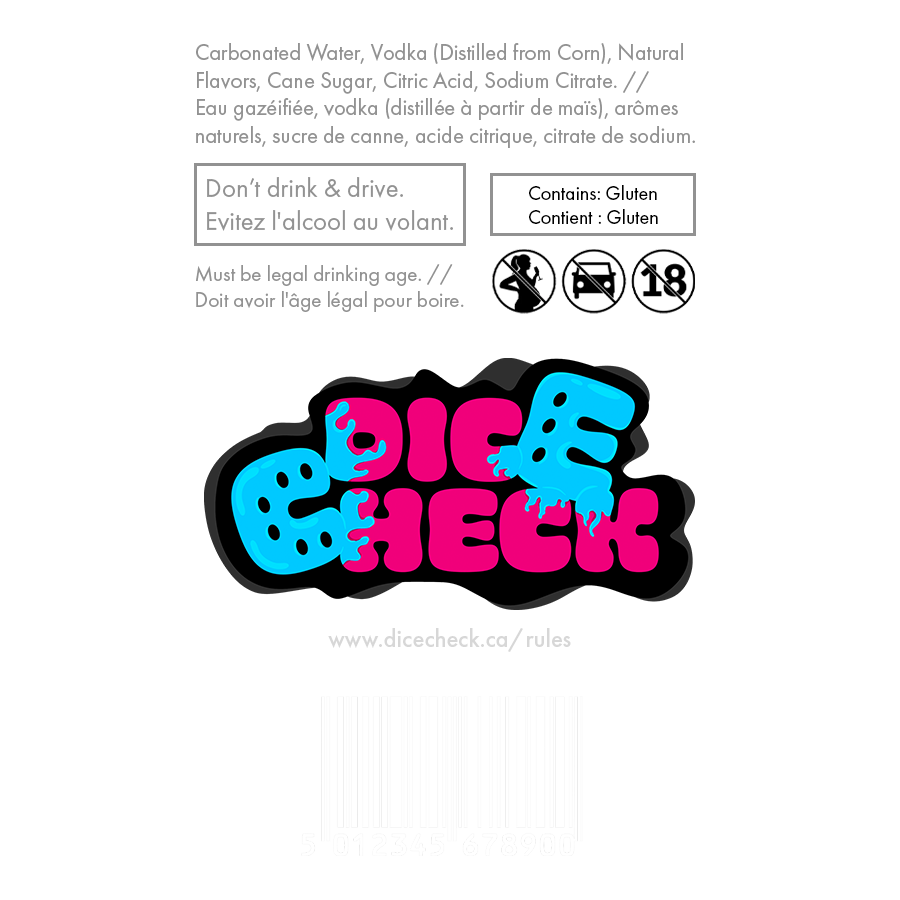
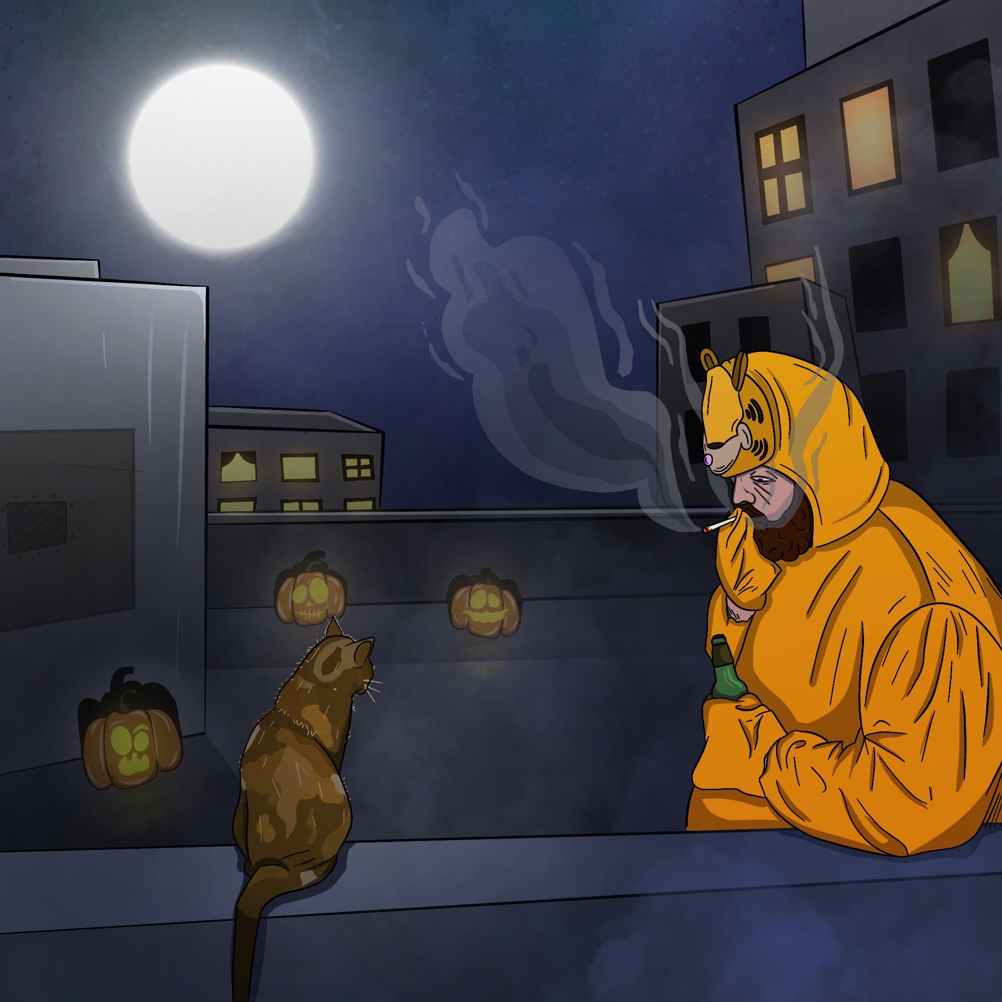
Designing the branded series for DICE CHECK, a drinking game my friends and I created, was both a personal and creative challenge. I wanted the packaging to reflect the game’s high-energy, vibrant aesthetic while remaining functional and visually cohesive. Every element like the color palette, illustrations, typography, and logo placement all had to work together seamlessly.
The biggest challenge was prototyping the bottle design. From experimenting with different die-cut labels, to printing issues, every step required extensive trial and error.
Through hands-on experimentation with materials like spray paint and hot glue, I refined the design, ensuring it translated smoothly from digital to physical form.
The final result is a bold, interactive packaging series that captures DICE CHECK’s chaotic fun. Neon colors unify the branding, while details like the rule card hanging from the bottle neck and dice-shaped cap enhance fun-ctionality. Overall, this is one of my favorite projects I’ve ever completed, and really ignited my love for bottle design.
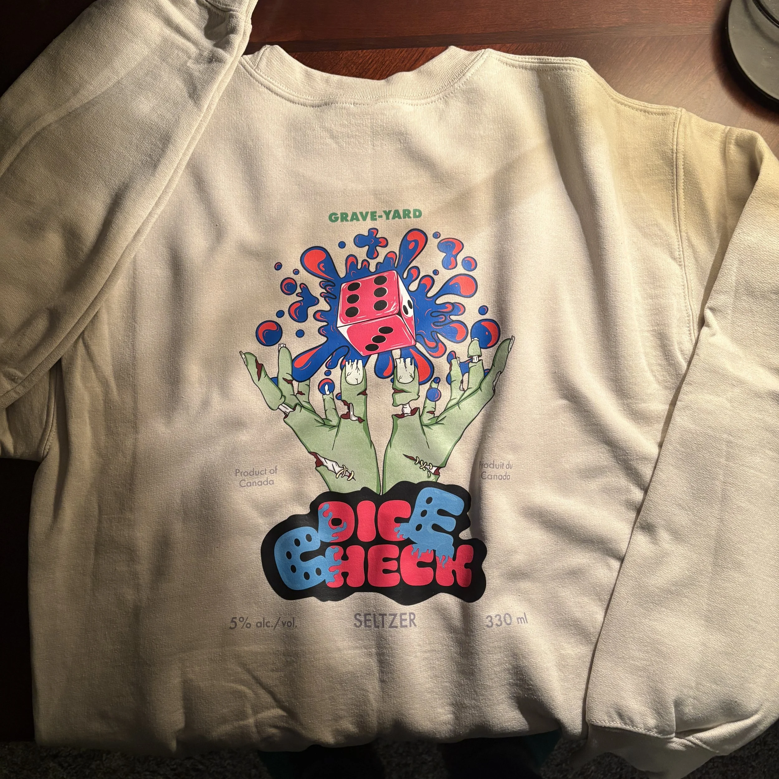
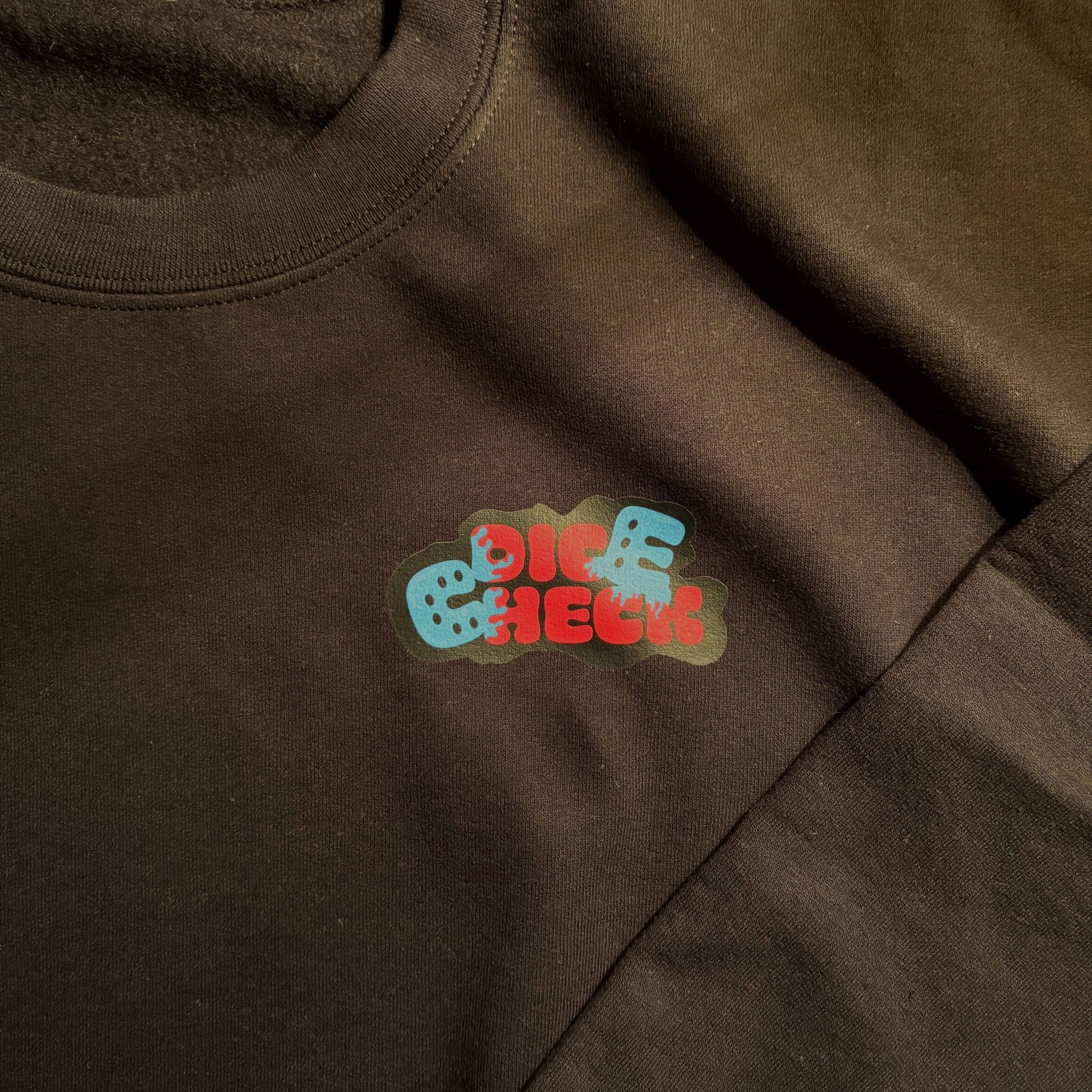
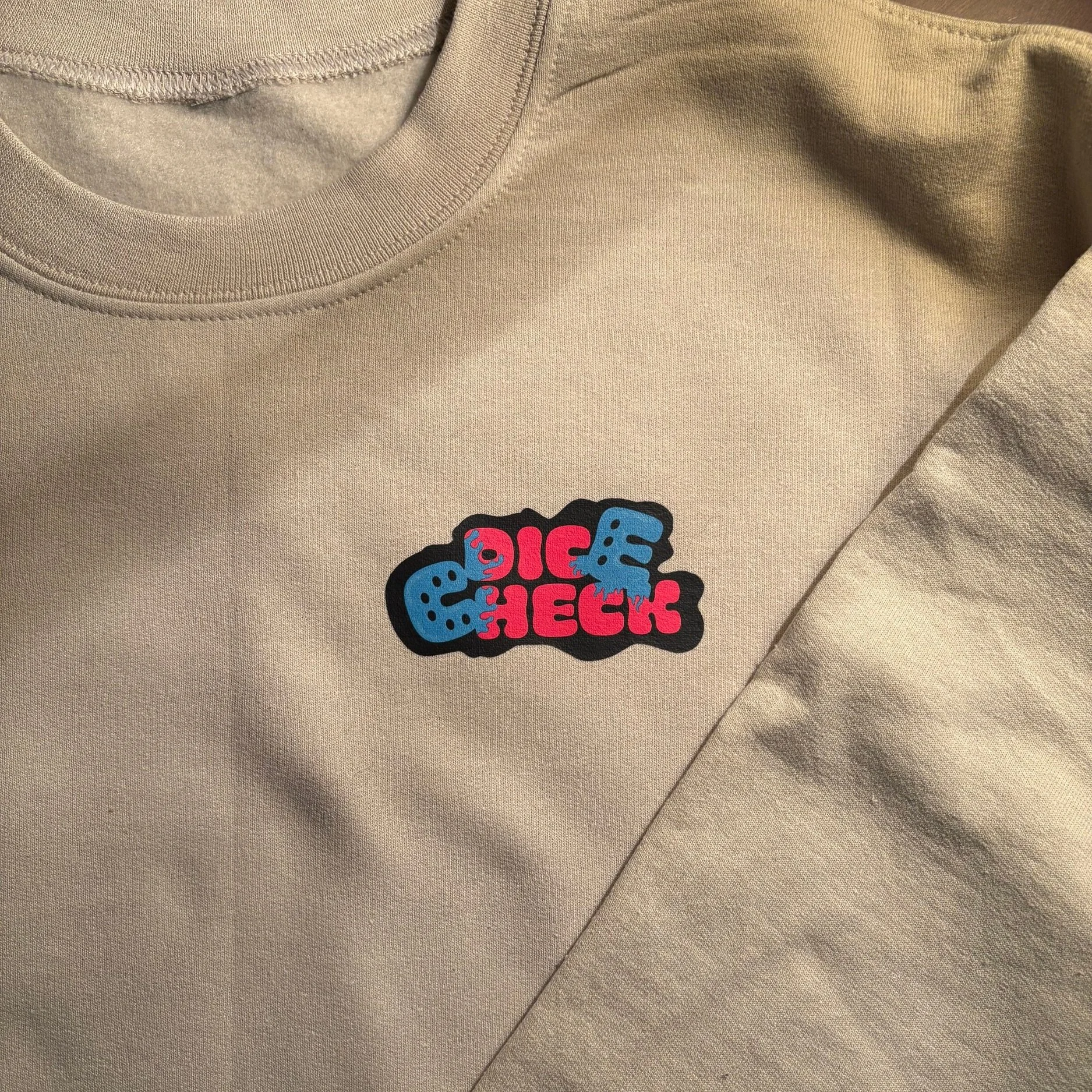
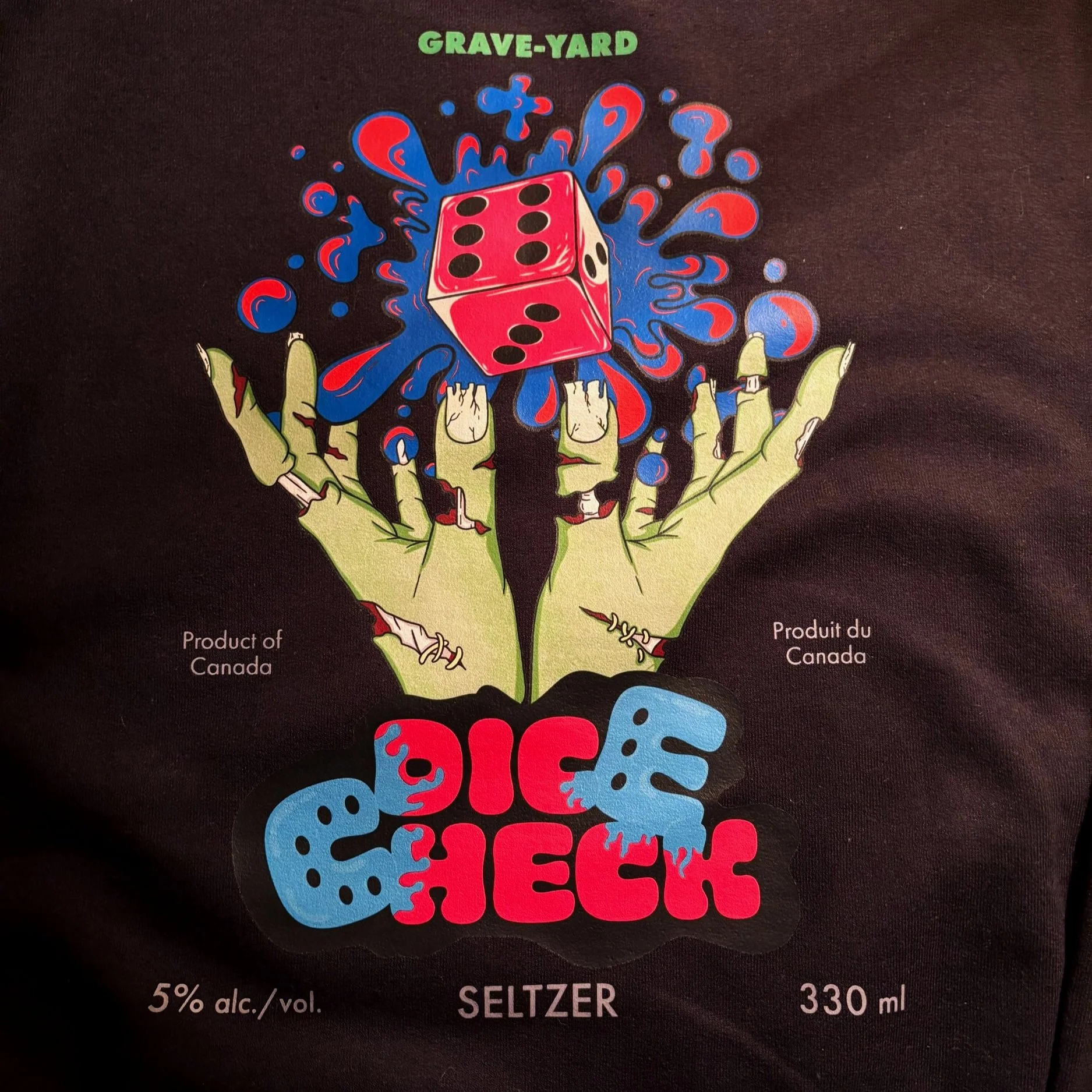
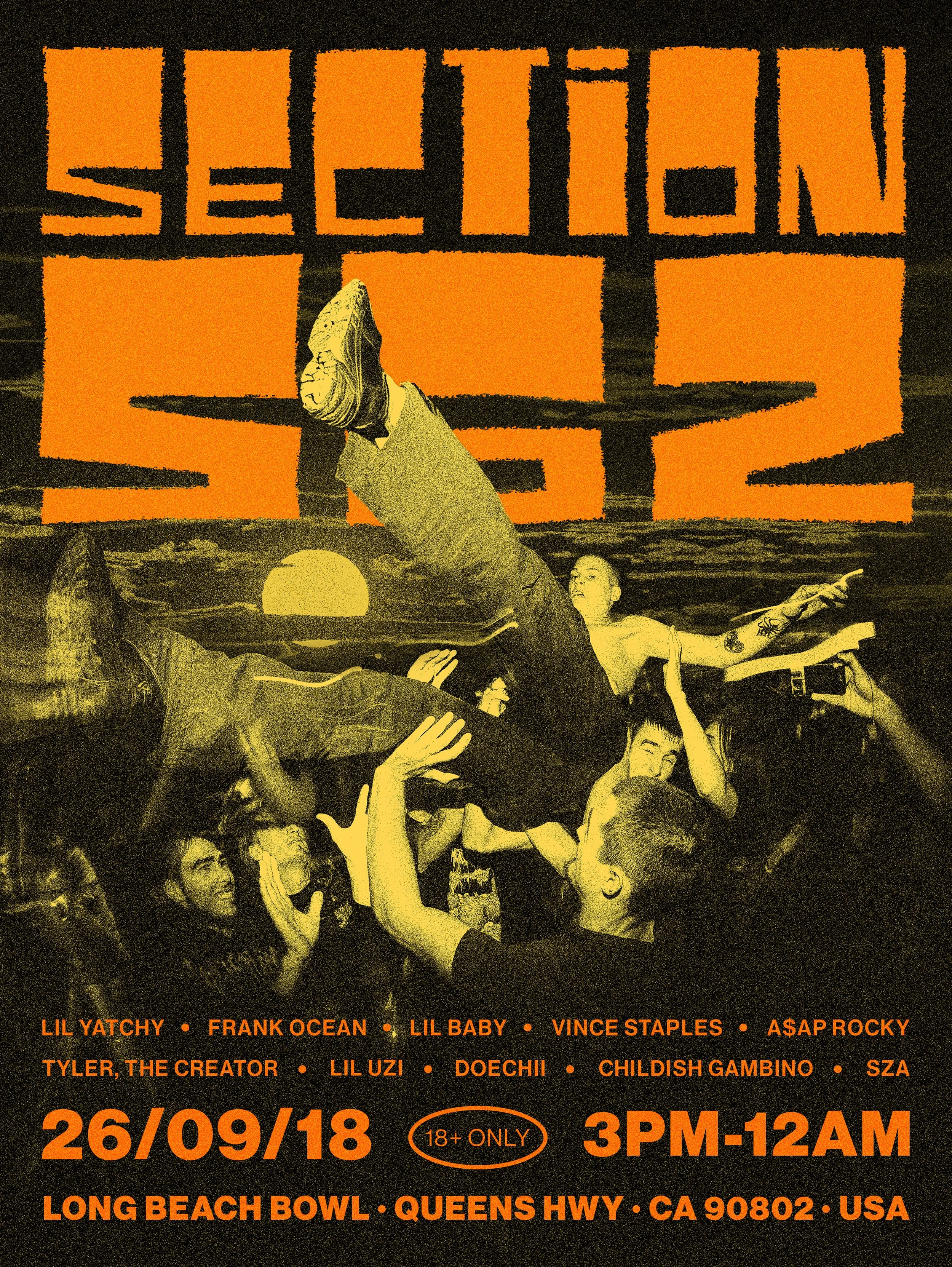
I also made merch
— PEZ RePacked —
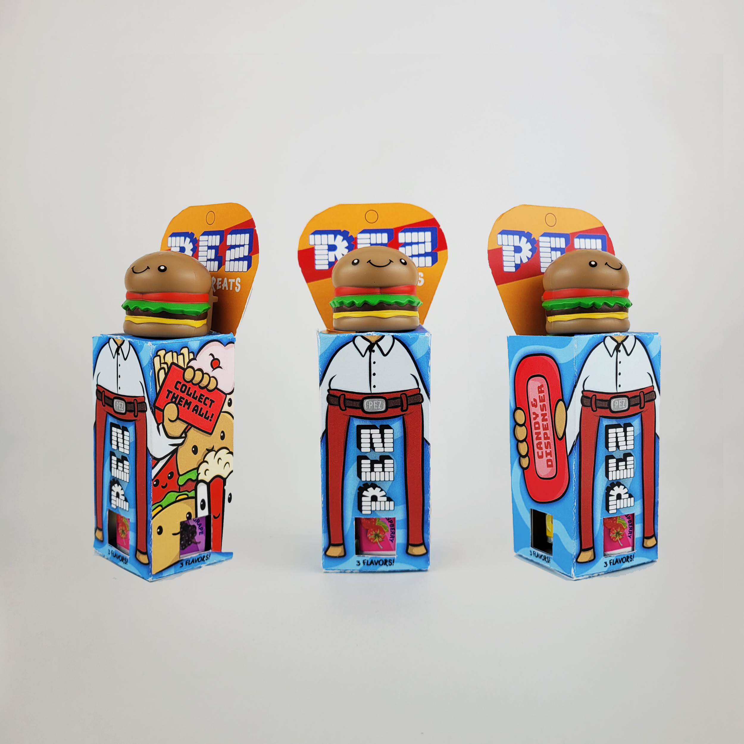
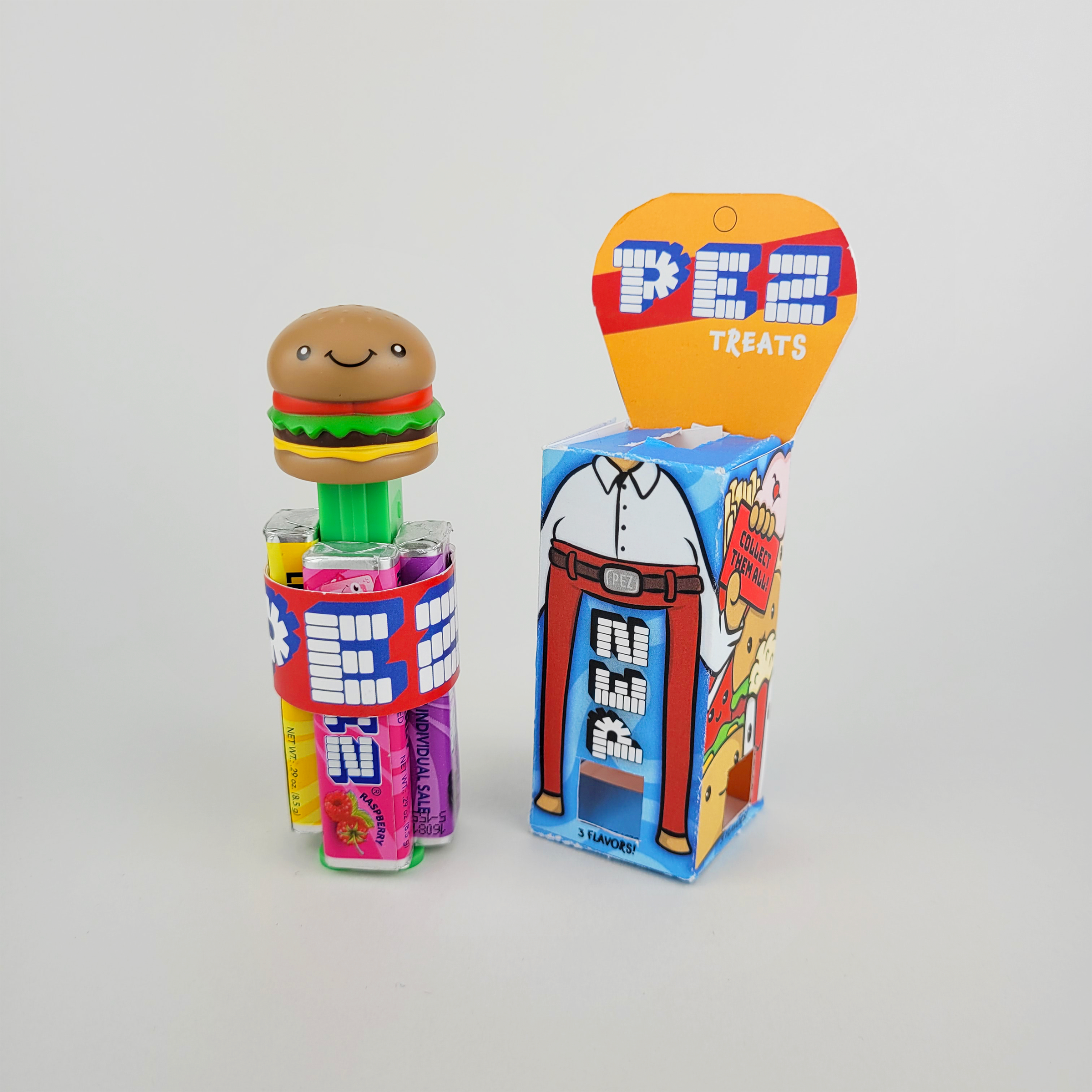
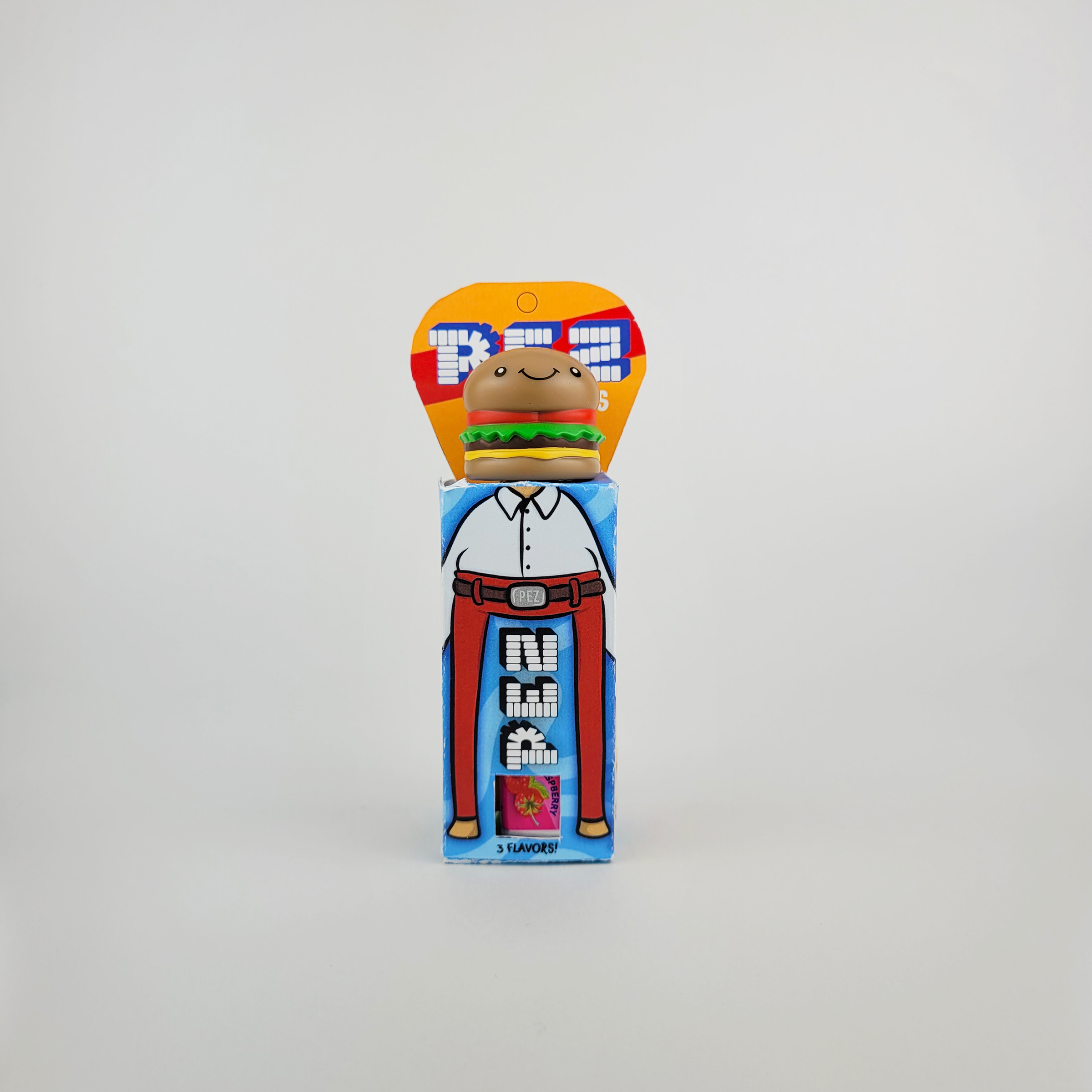
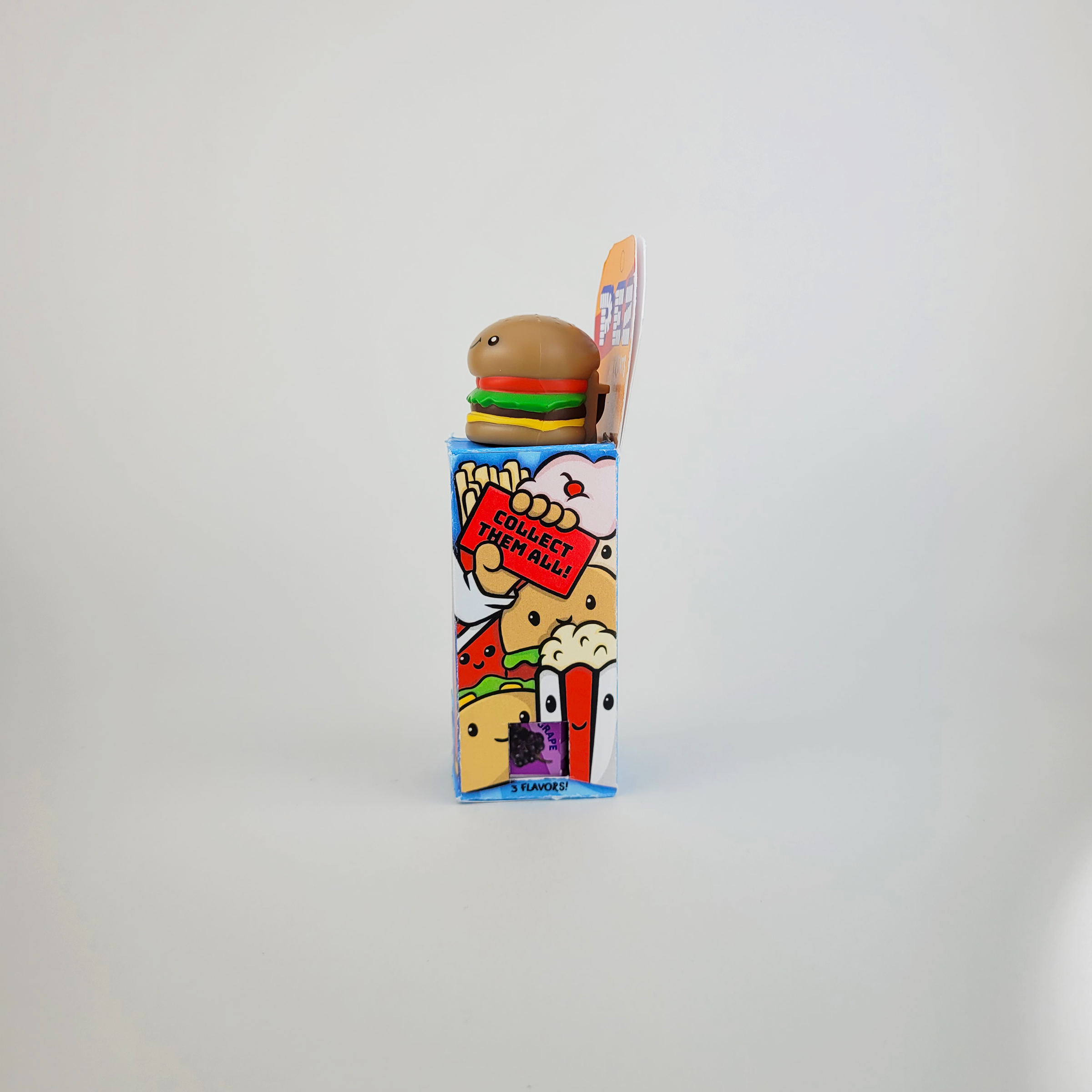
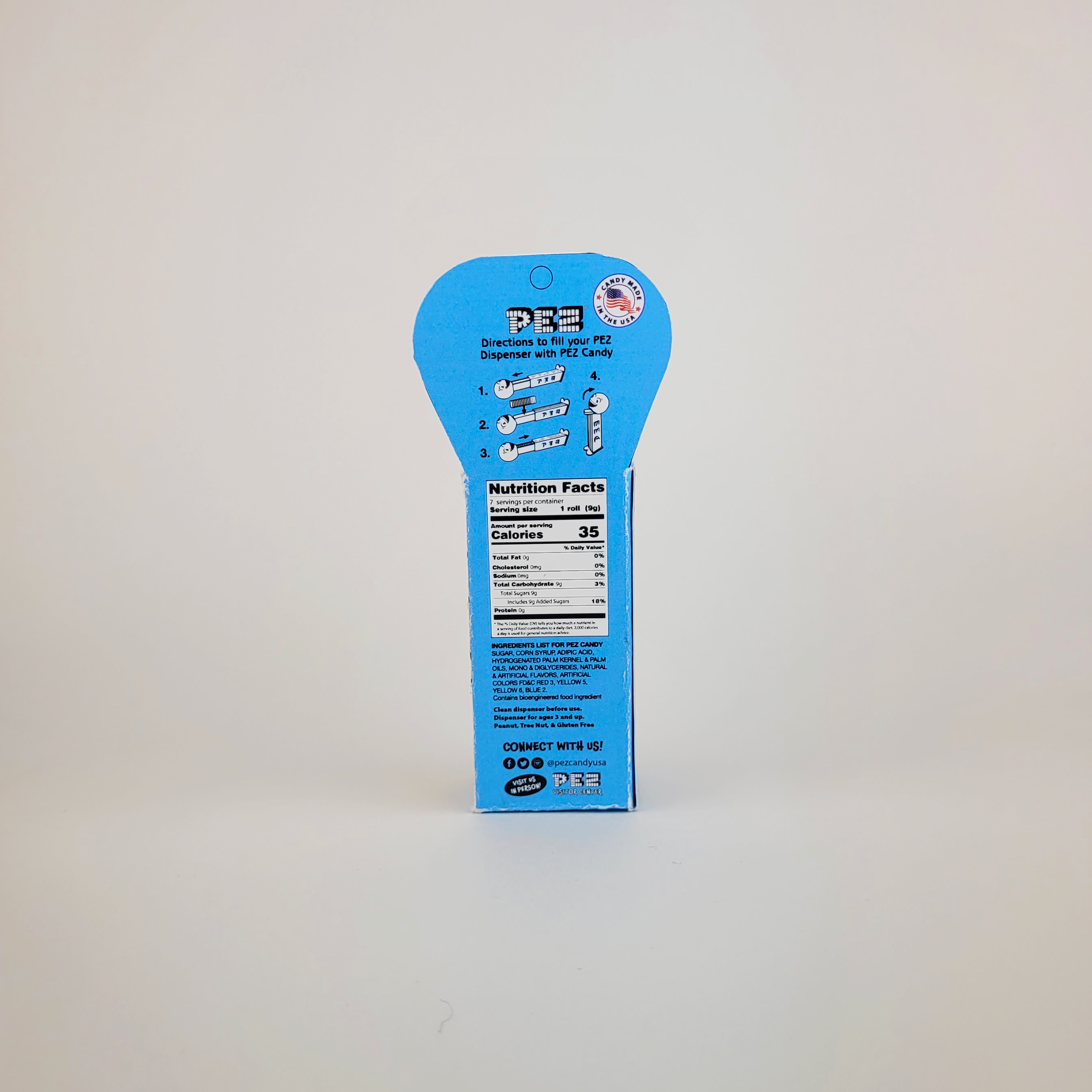
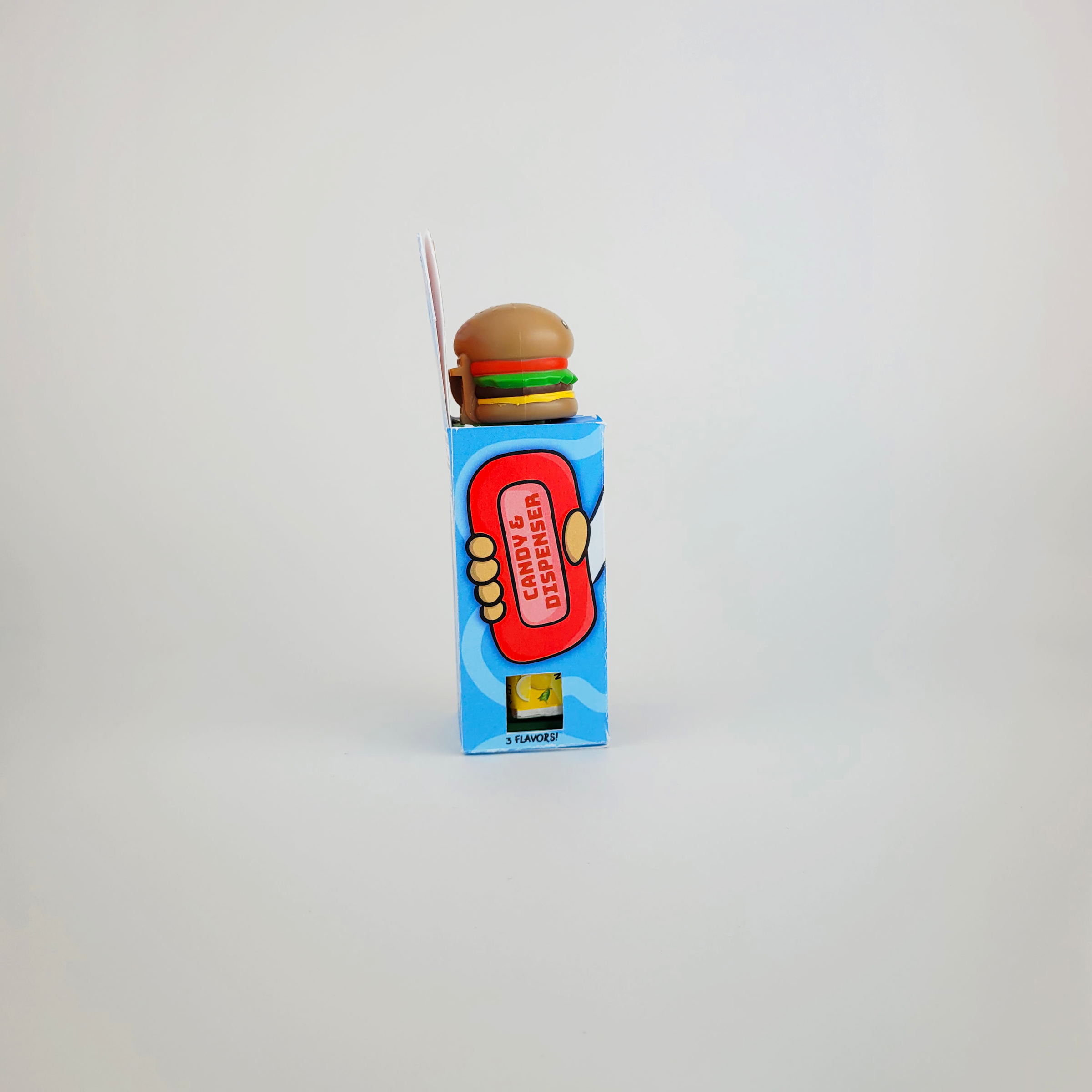
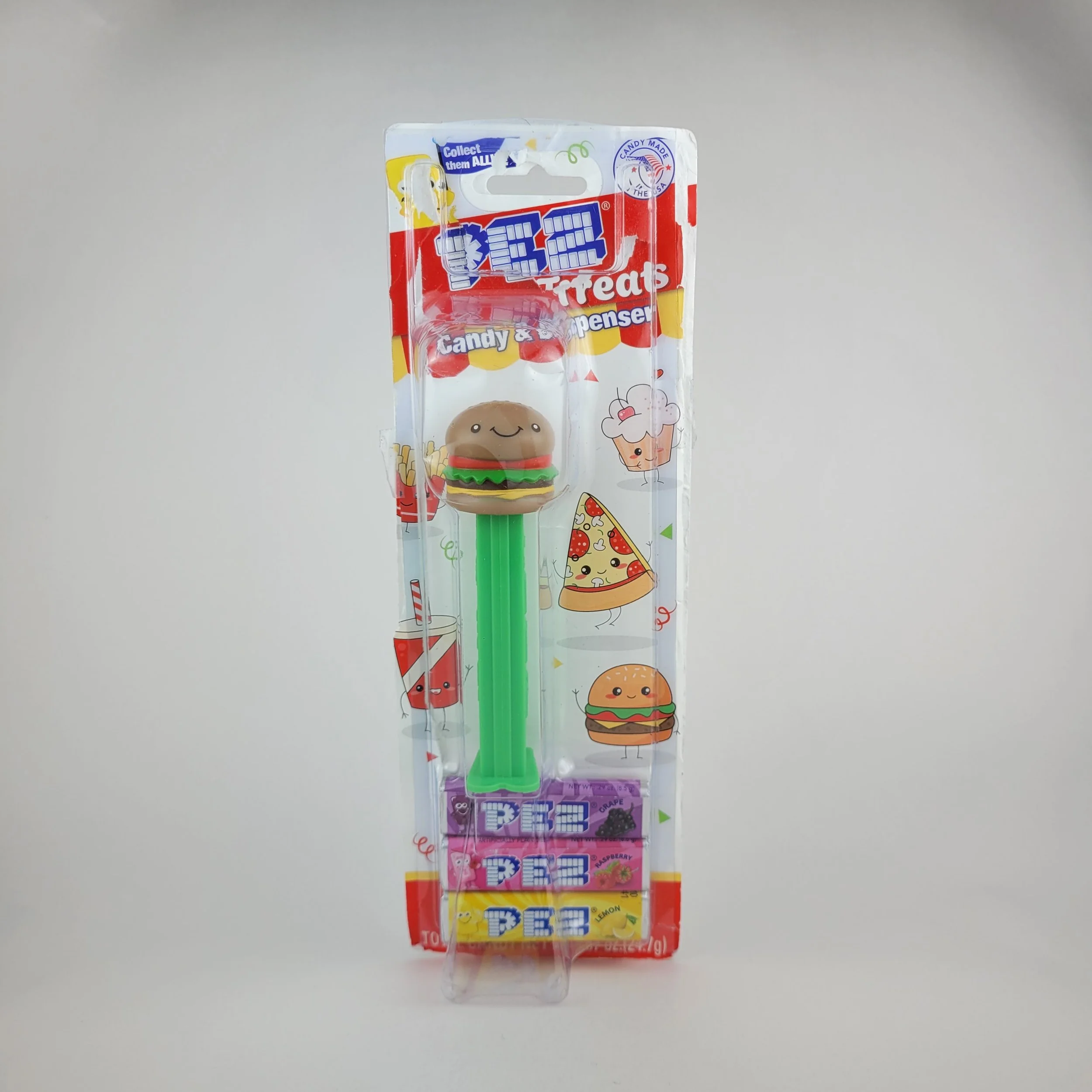
This project was a redesign of PEZ dispenser packaging with the goal of eliminating plastic while maintaining the brand’s nostalgic and collectible appeal. The original packaging contained a lot of unnecessary plastic and wasted space, which felt at odds with PEZ’s identity. The challenge was to create a fully recyclable package that not only functioned well but also encouraged consumers to keep it as part of the collectible experience. Compactness and usability were key considerations, ensuring the dispenser and refills fit securely while still feeling like a natural extension of the brand.
The design process involved sketching dielines, prototyping different structures, and refining the layout to balance functionality with aesthetics. Adjustments to the die-cut, flap design, and typography helped create a practical yet visually engaging package. The final design removes all plastic while reinforcing PEZ’s nostalgic charm through thoughtful details in color, typography, and illustration. This project was a valuable exercise in sustainability-driven design, proving that packaging can be both functional and memorable without unnecessary waste.
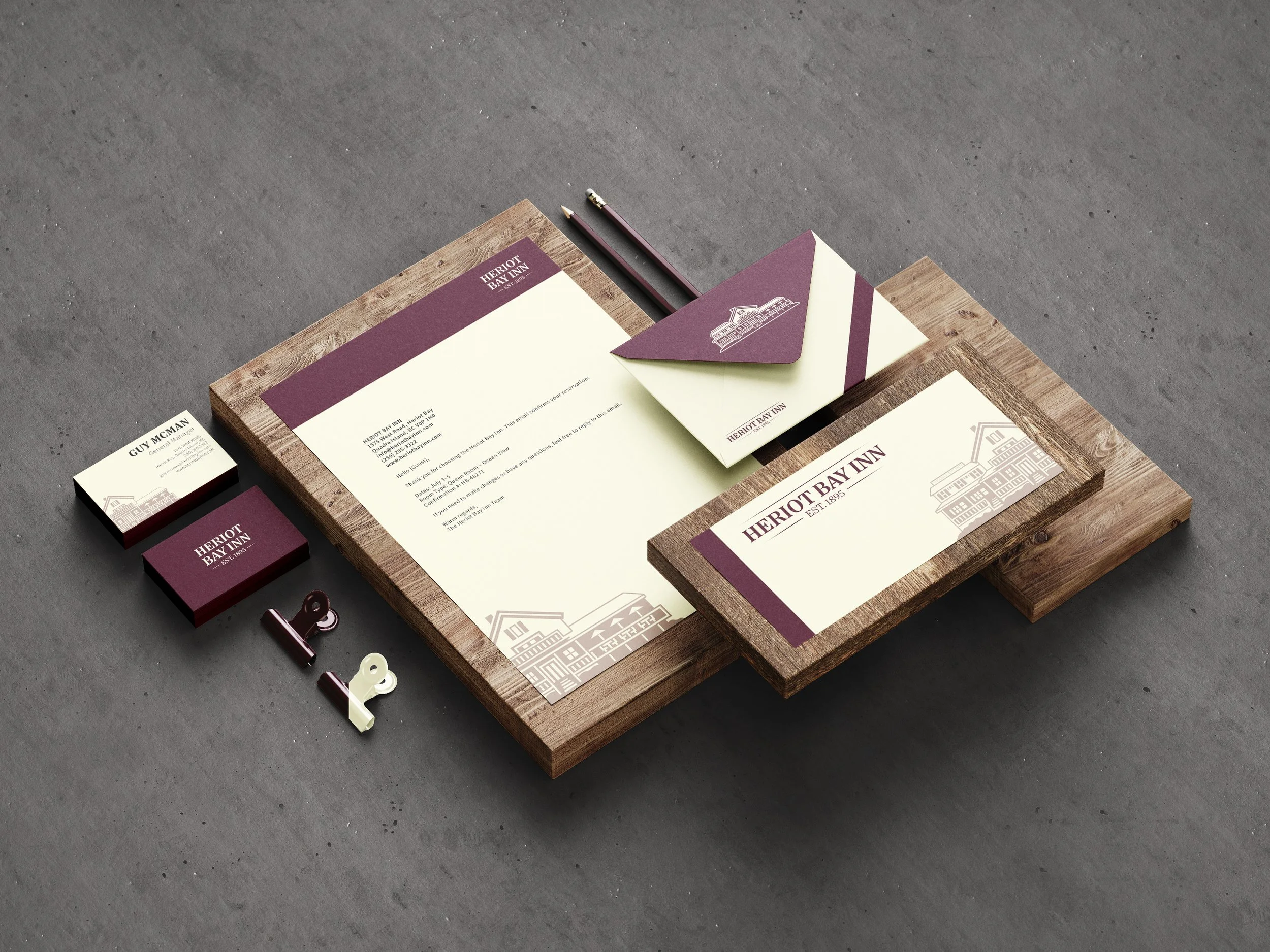
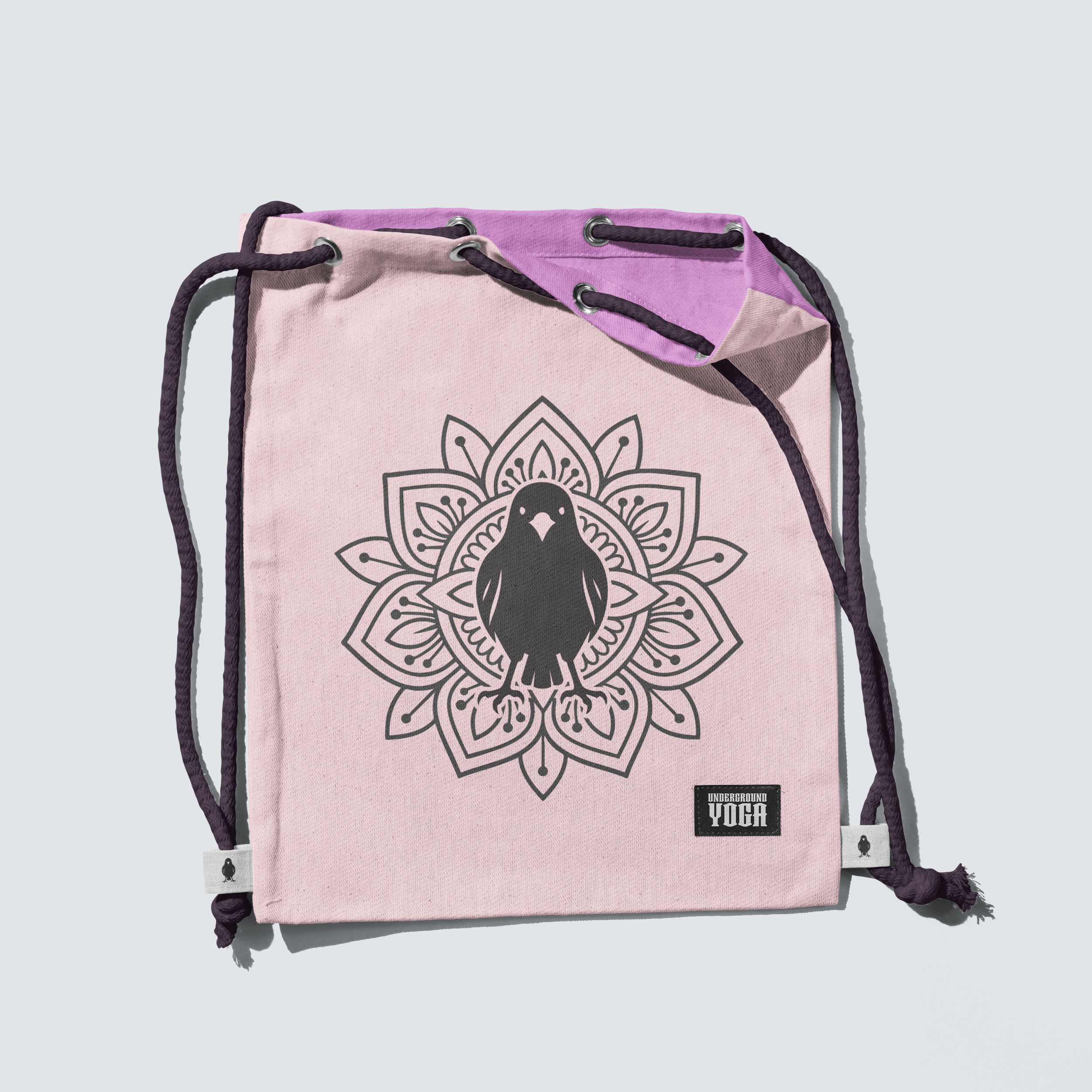
- KOBAYASHI CLOTHING -
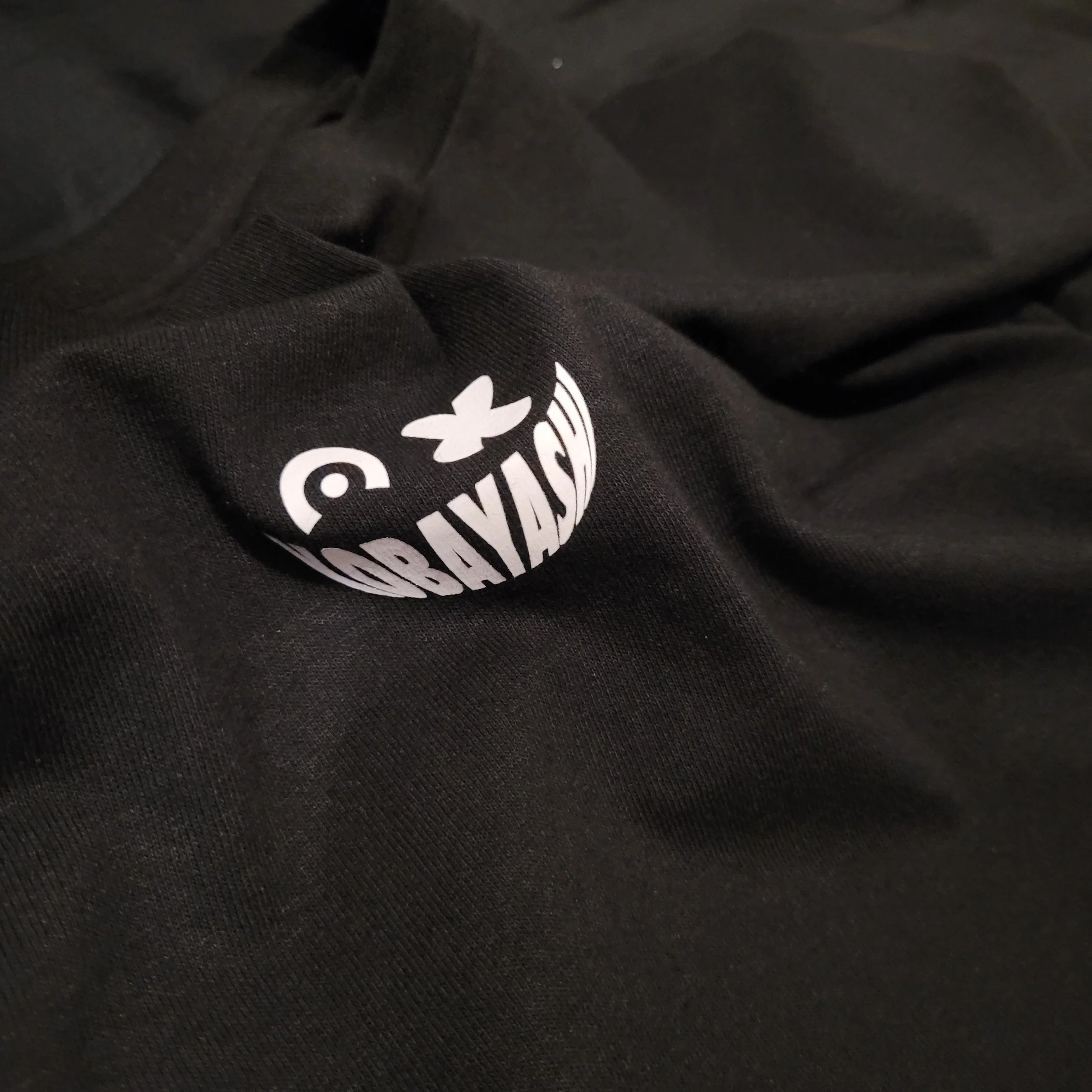
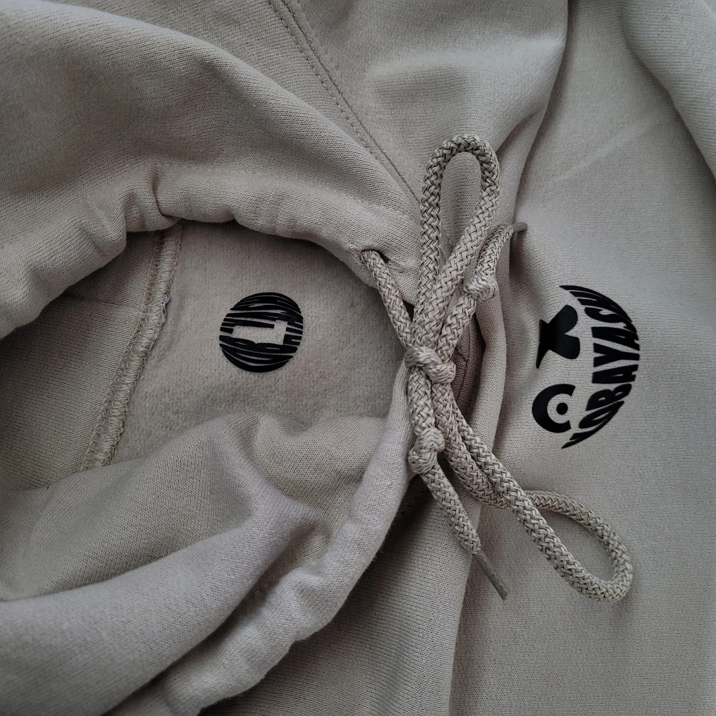
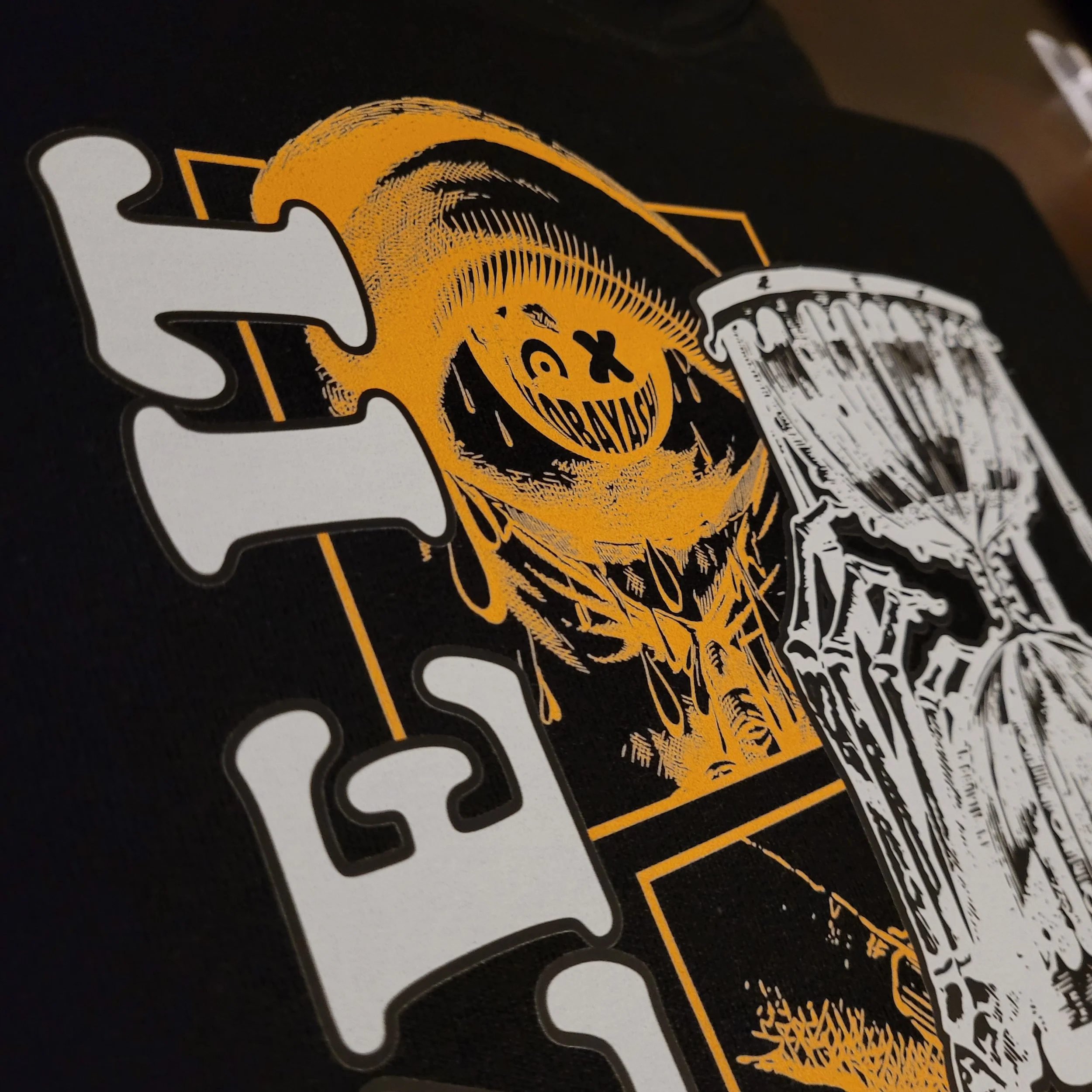
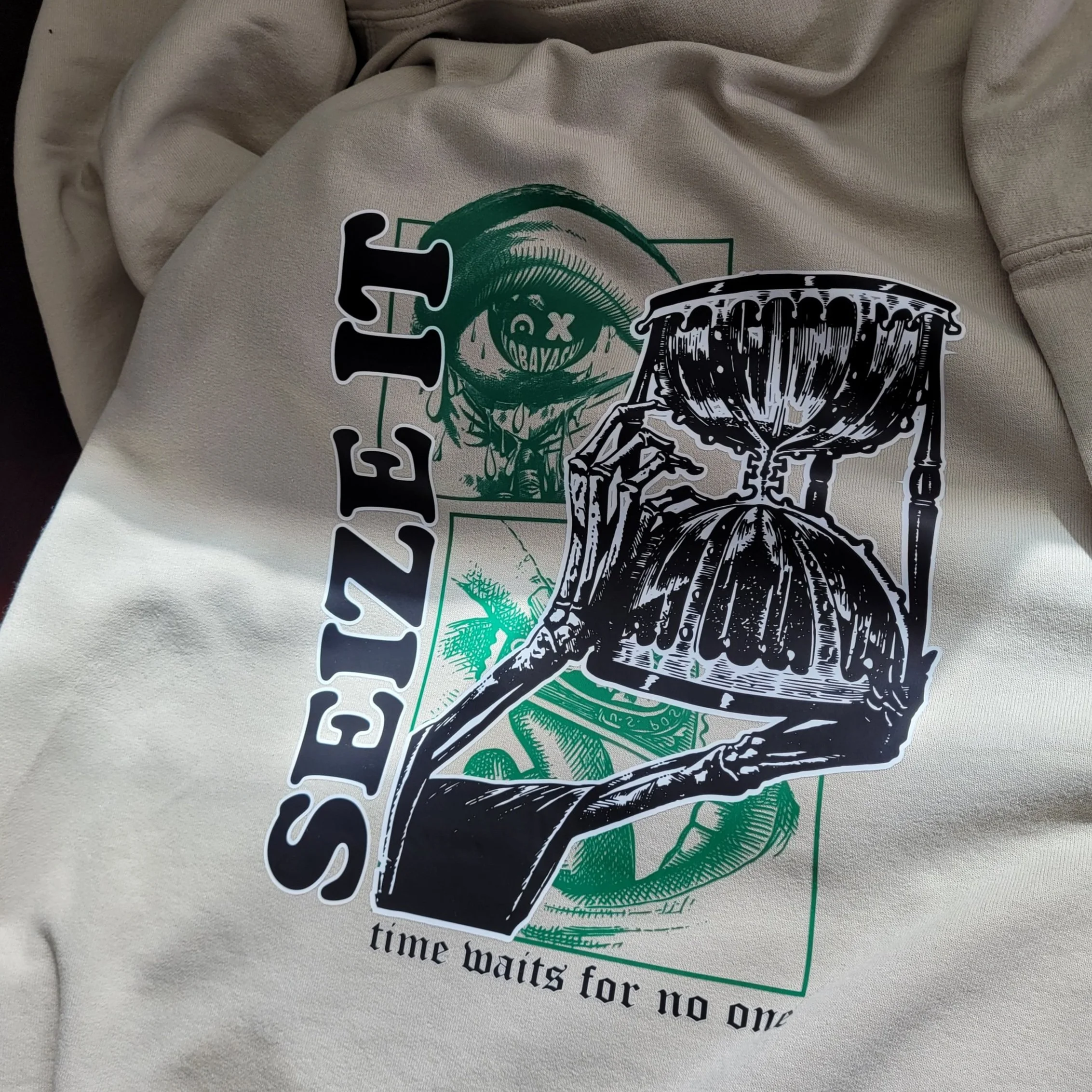
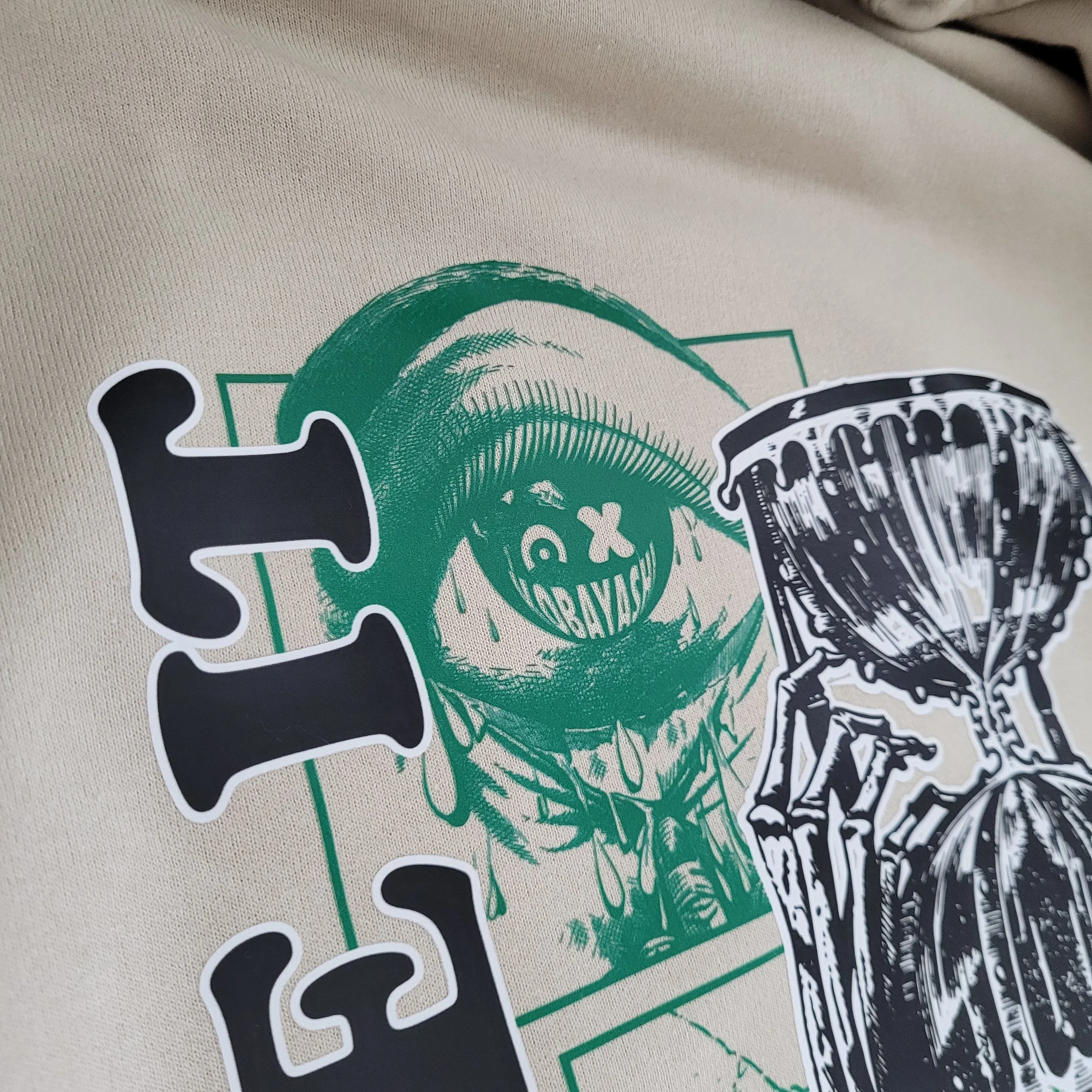
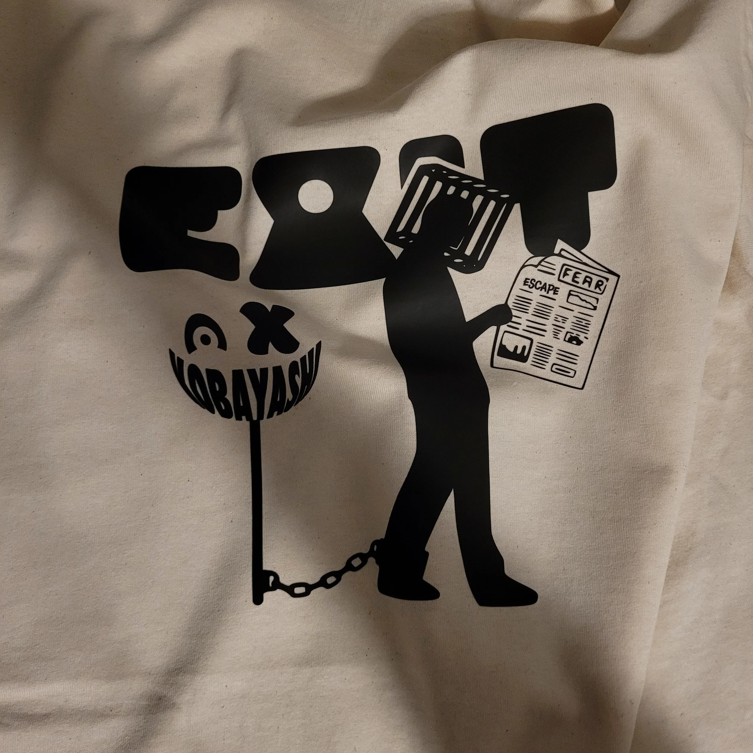
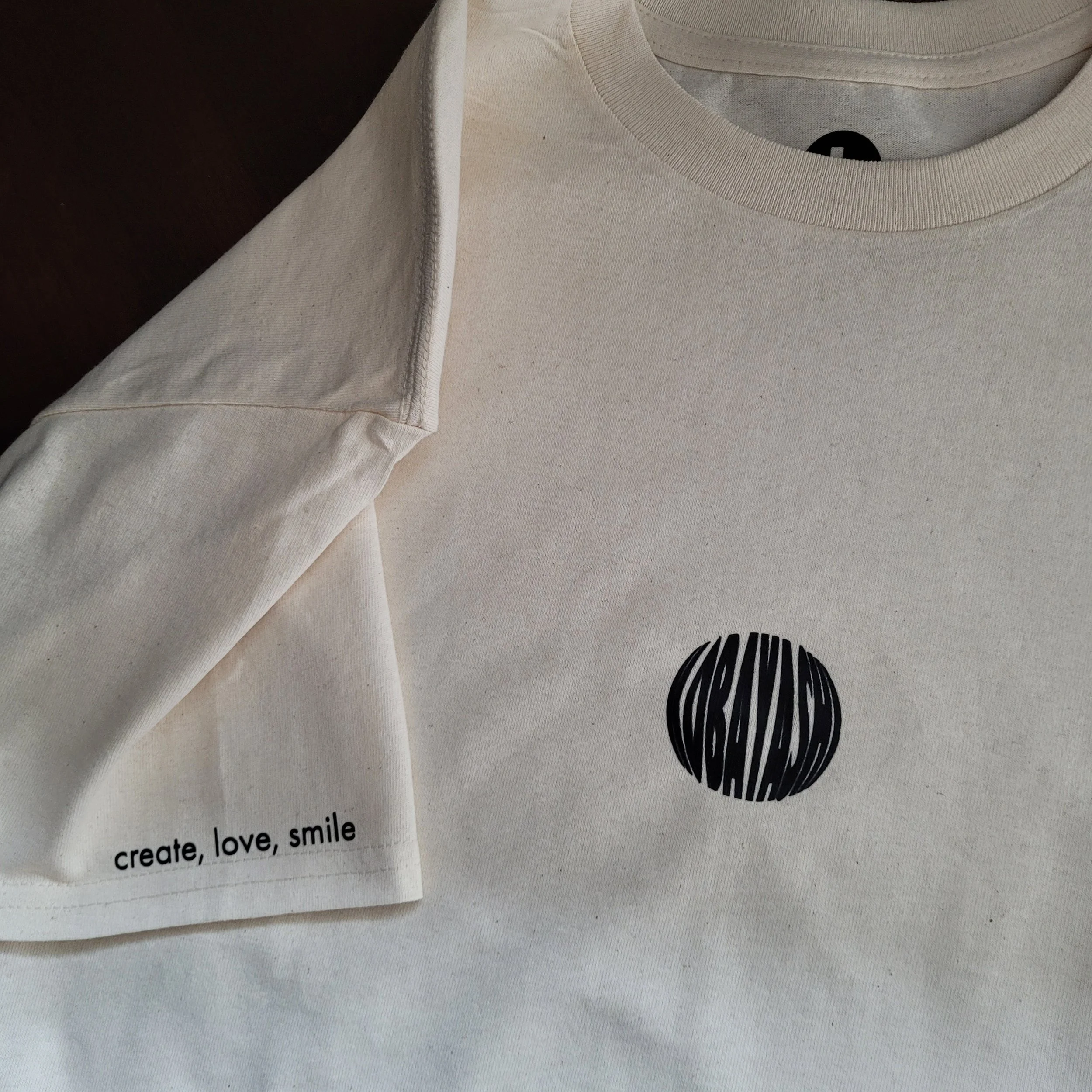
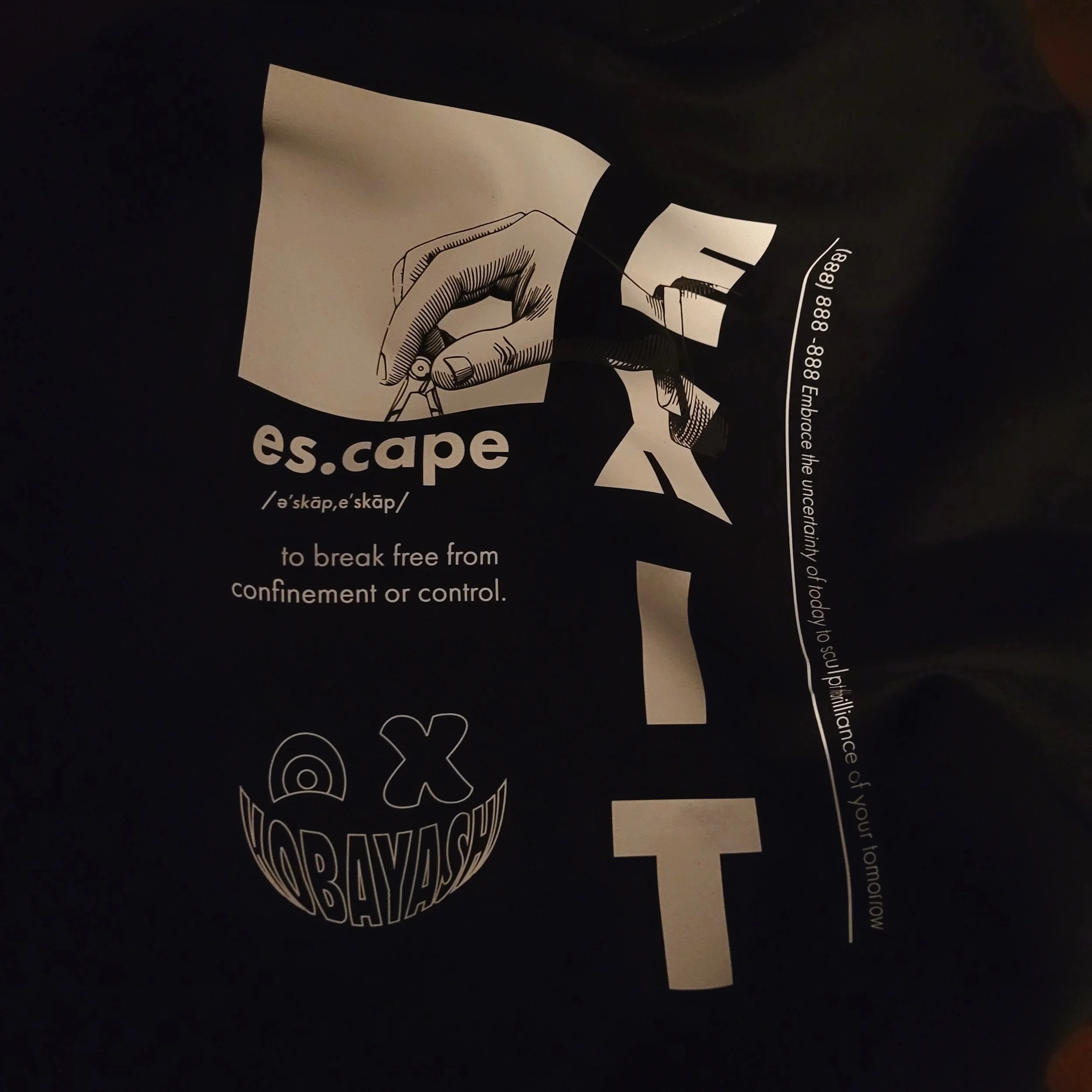
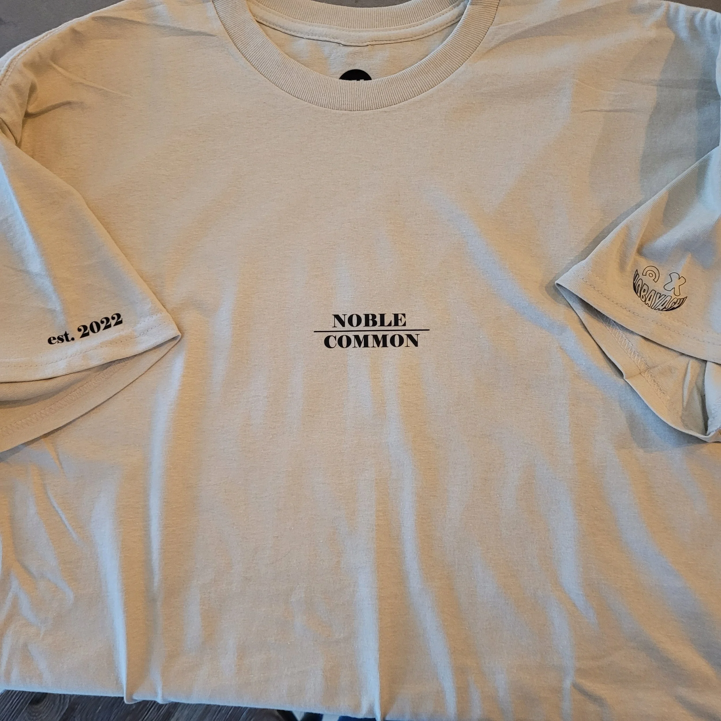
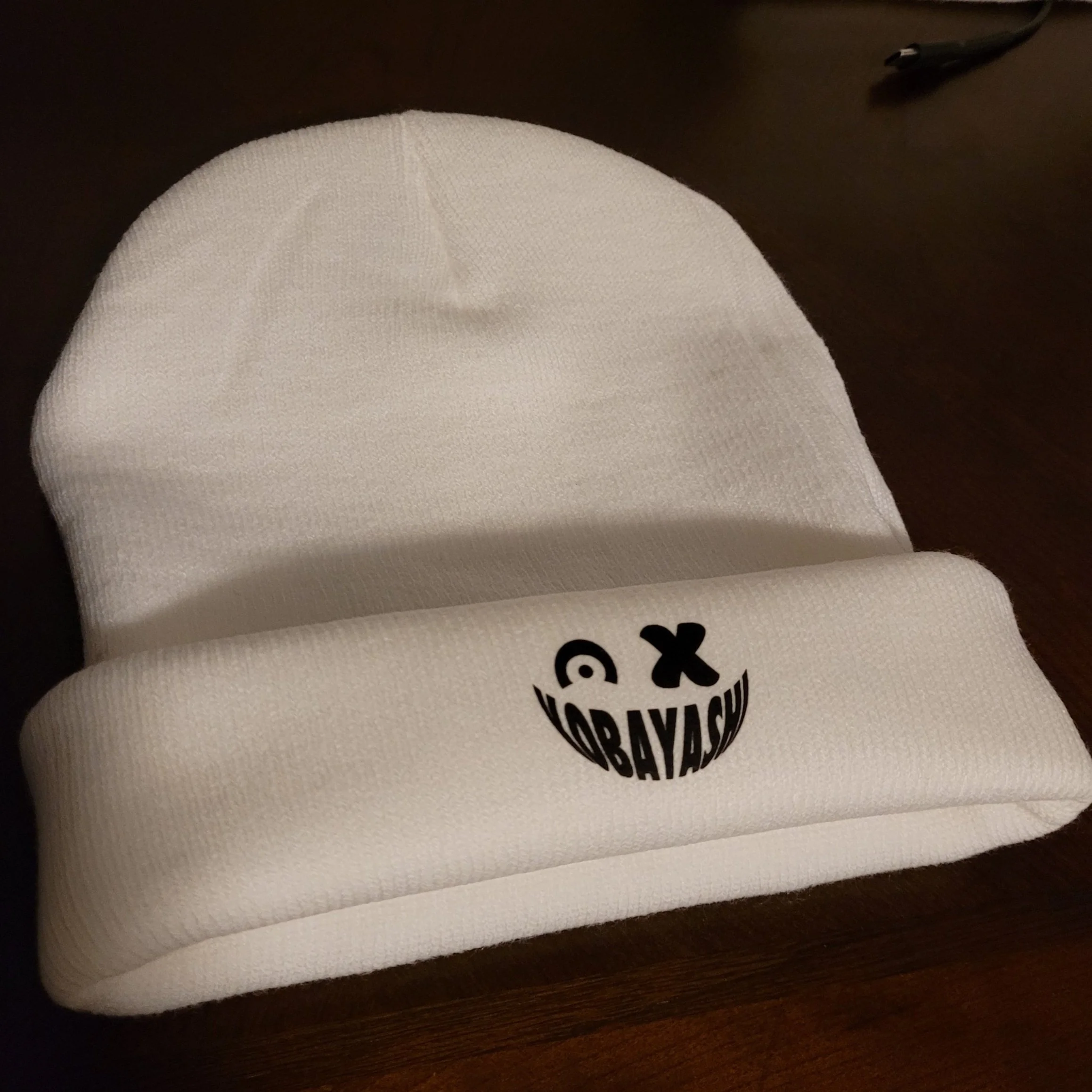
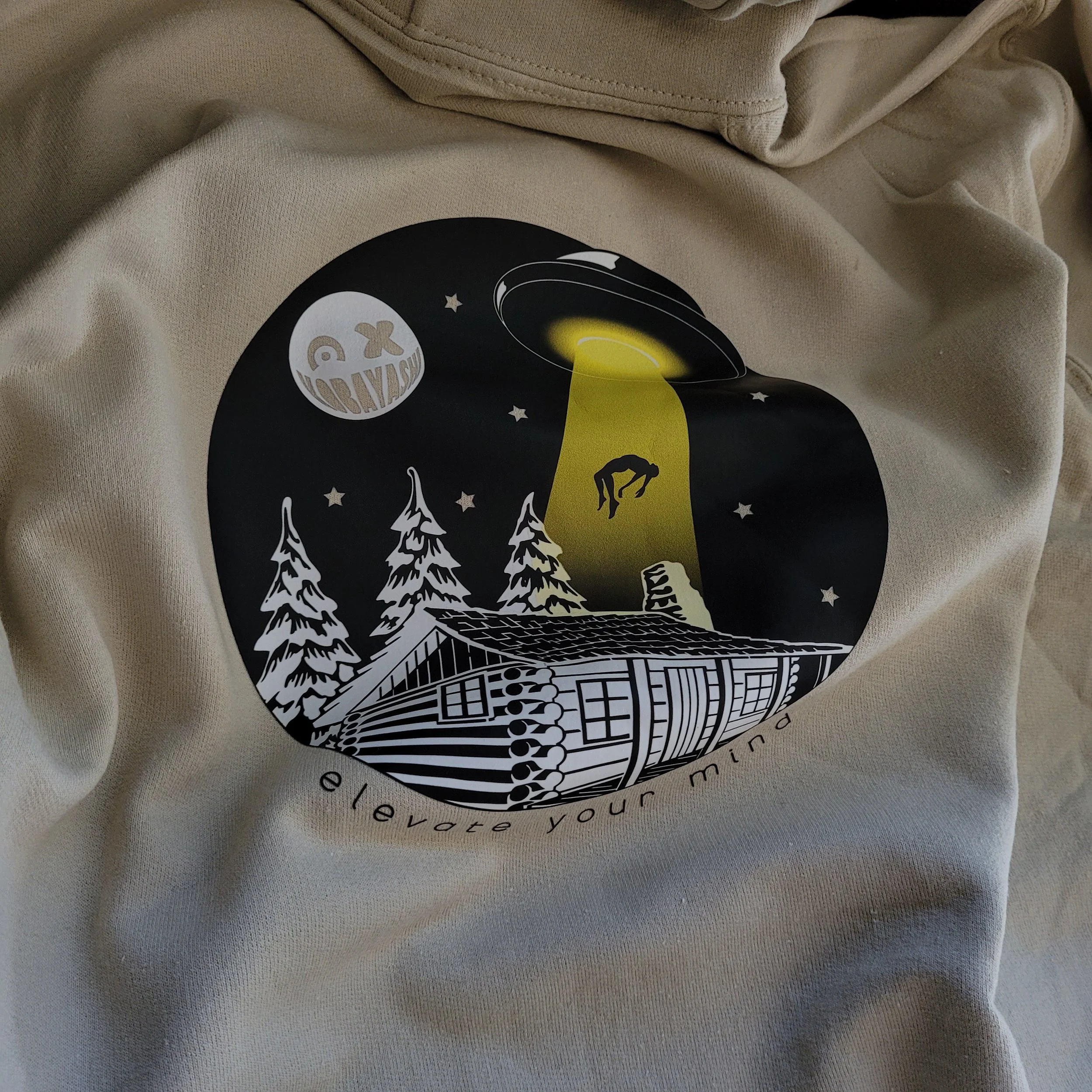
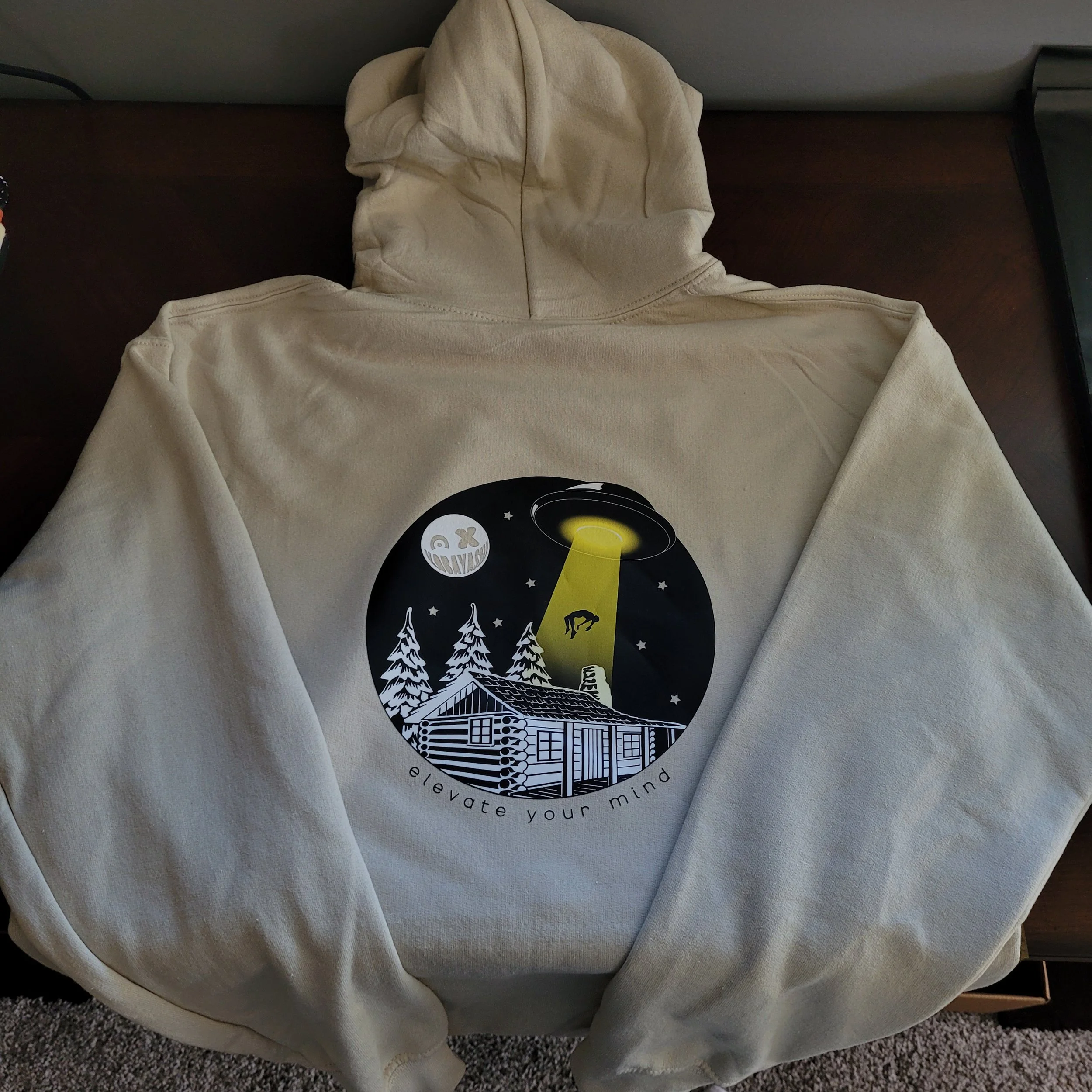
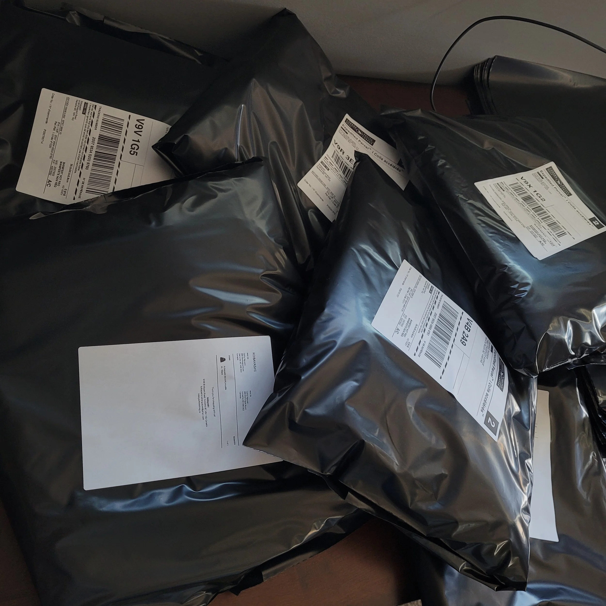
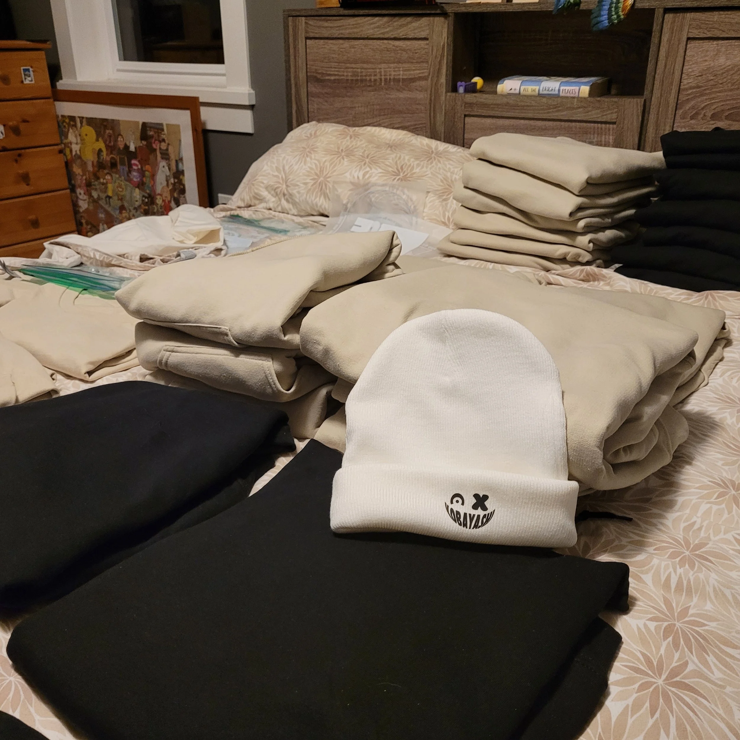
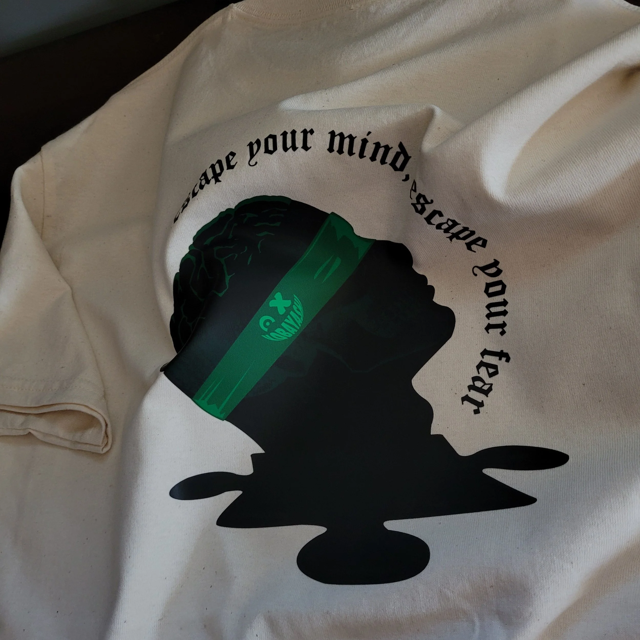
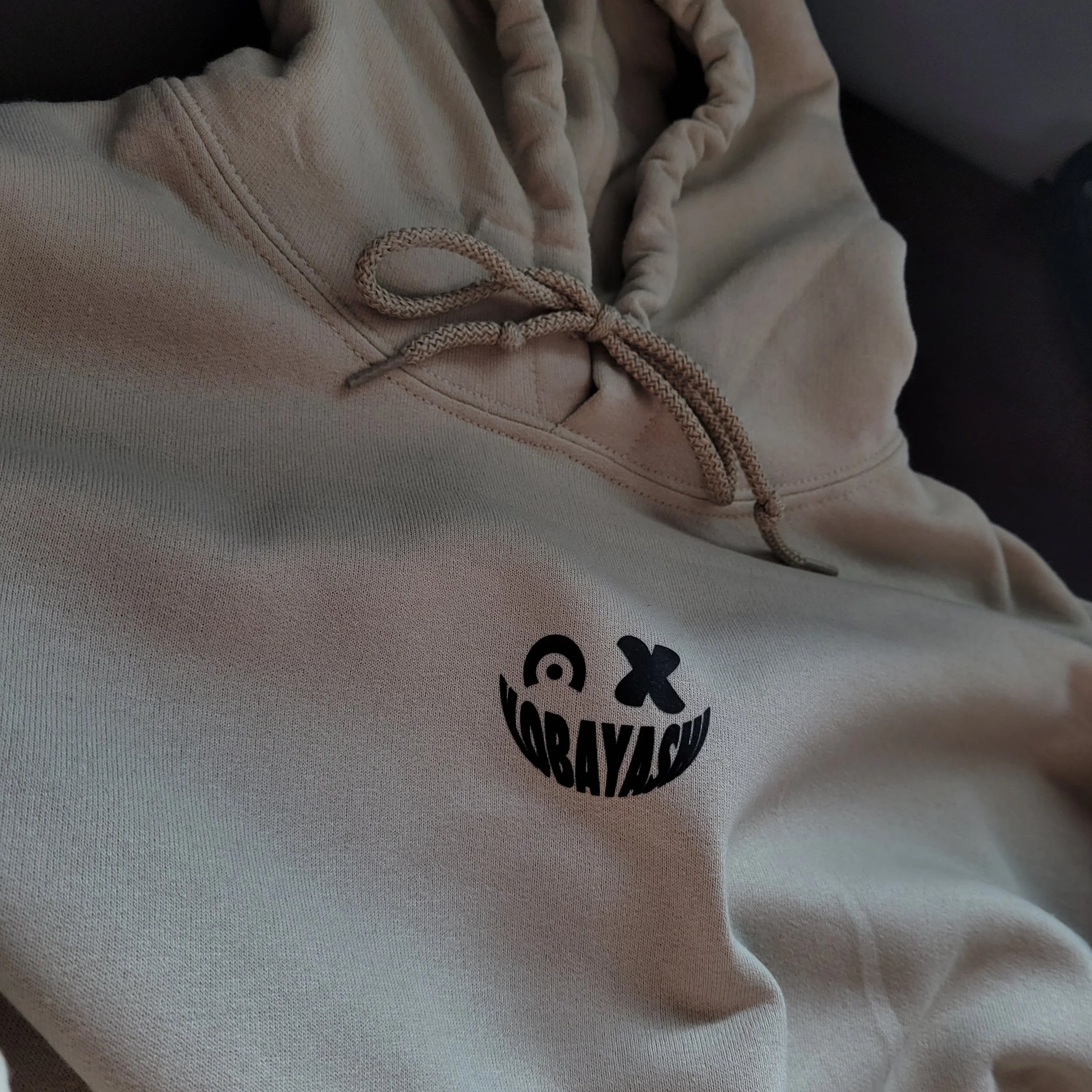

Kobayashi Clothing is the biggest and most challenging project I’ve ever taken on. It’s deeply personal — right down to the name, which comes from my mother’s maiden name. I launched this solo venture with one goal: to learn how to create and market my own brand. The EXIT Collection was the first drop, and now that it has run its course, Kobayashi is on hold as I work on an even stronger follow-up.
In the meantime, I’ve had the chance to collaborate and create clothing for other brands and artists — an opportunity that only came because I bet on myself.
From conception to design, manufacturing to the online store, I handled everything myself. With an initial investment of about $1,200, I transformed my room into a full-fledged clothing workshop — heat presses, DTF transfers, label printers, and stacks of blank apparel filling every corner. In just the first week of sales, I made back my investment and gained one of the most valuable learning experiences of my life. I figured out what worked, what didn’t, and now I have a clear vision for how to elevate Kobayashi when I return with the next drop.
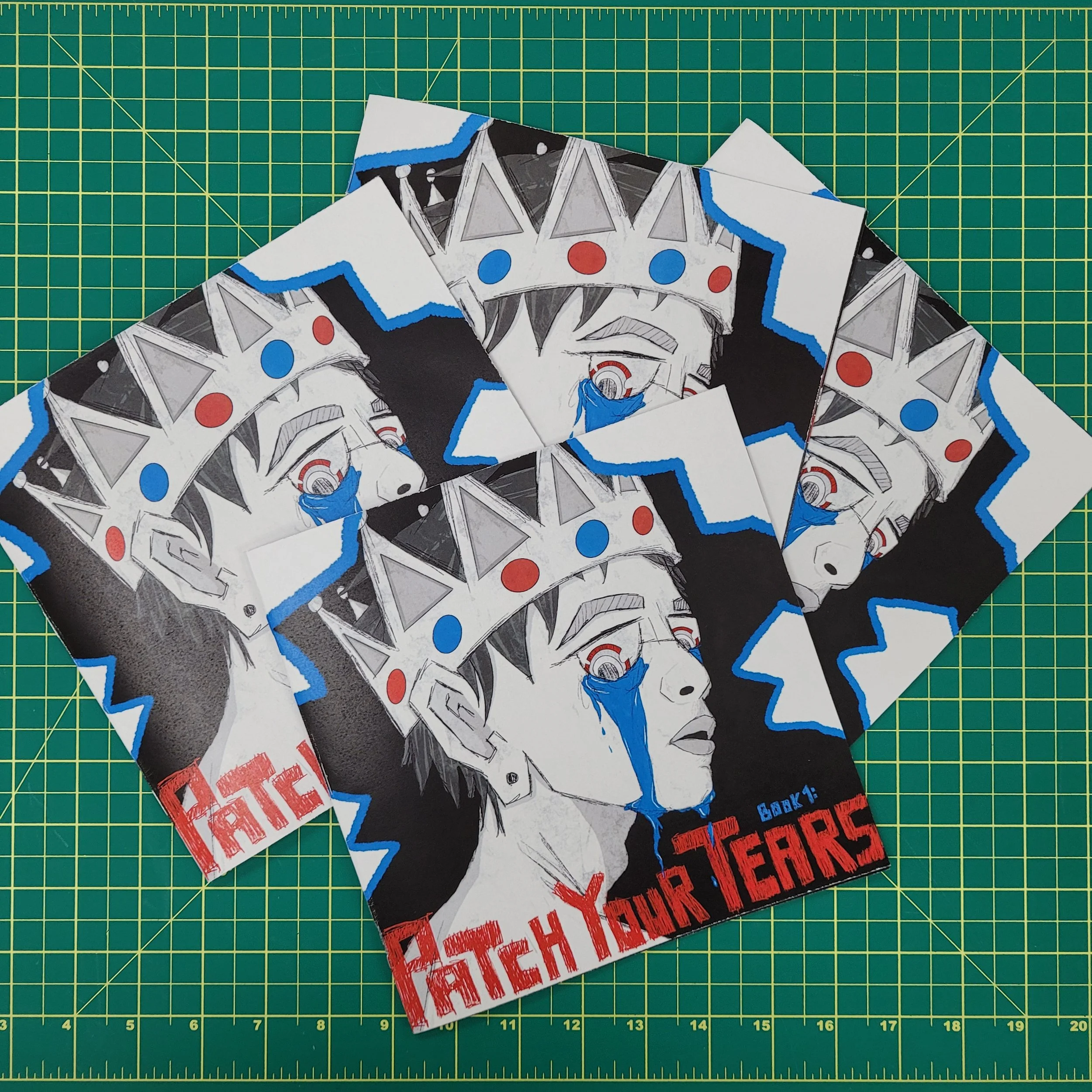
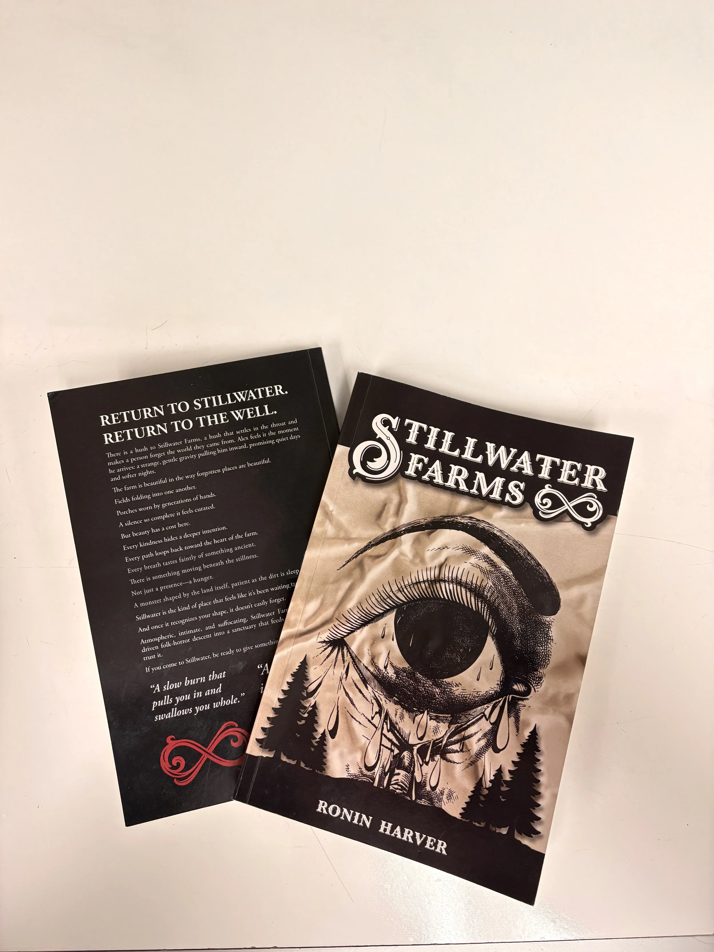
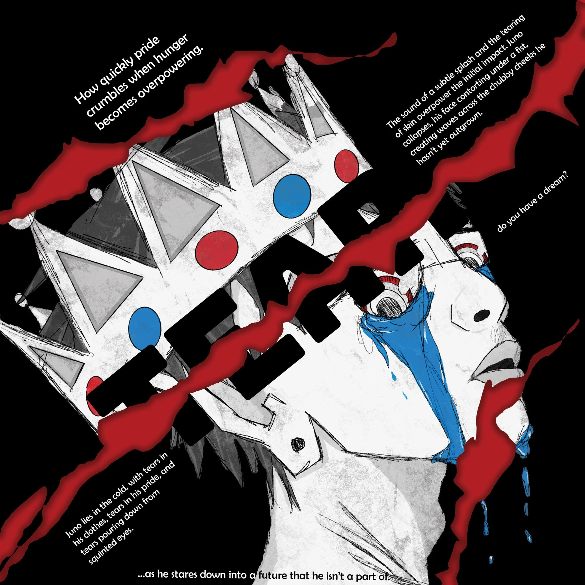
— PATCH YOUR TEARS —
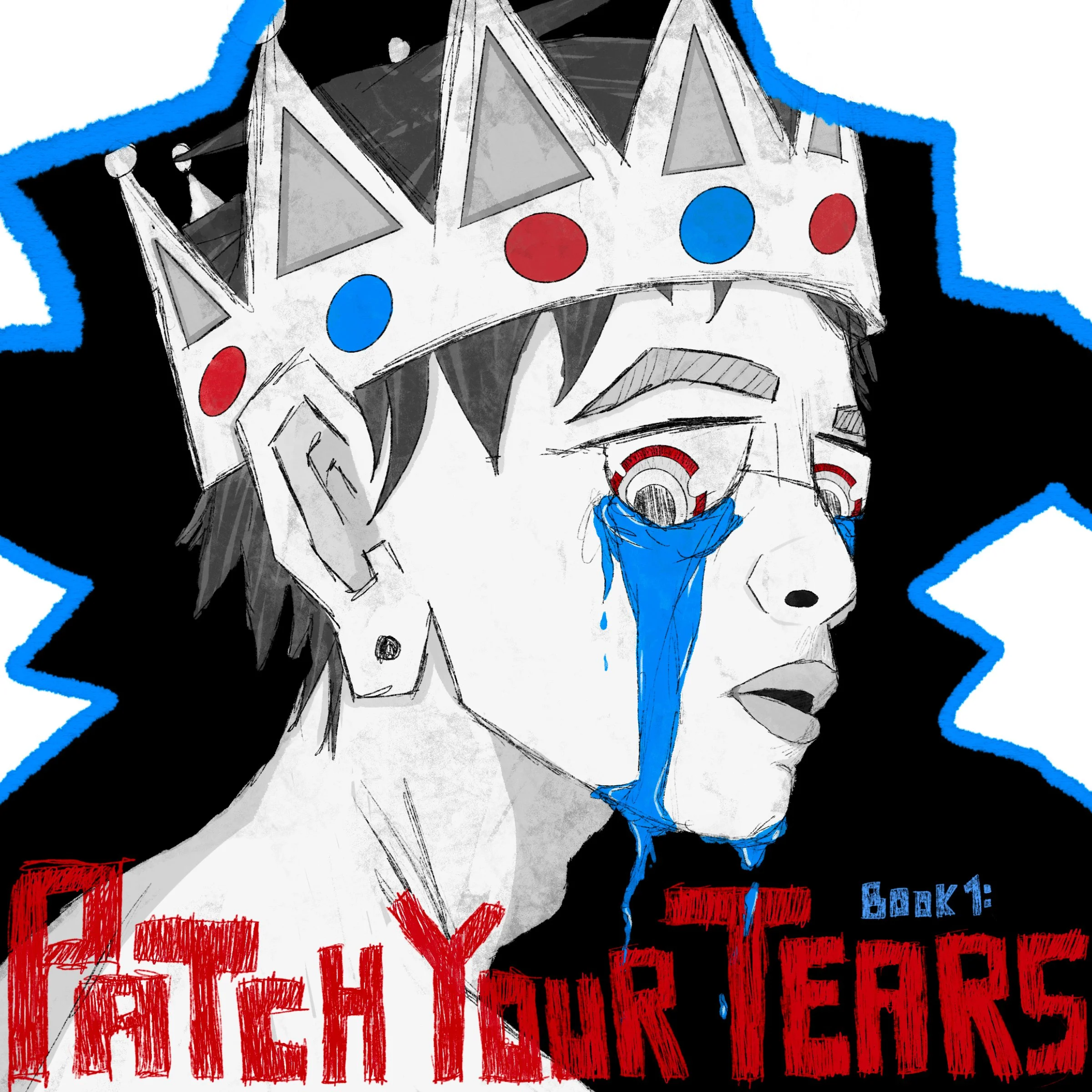
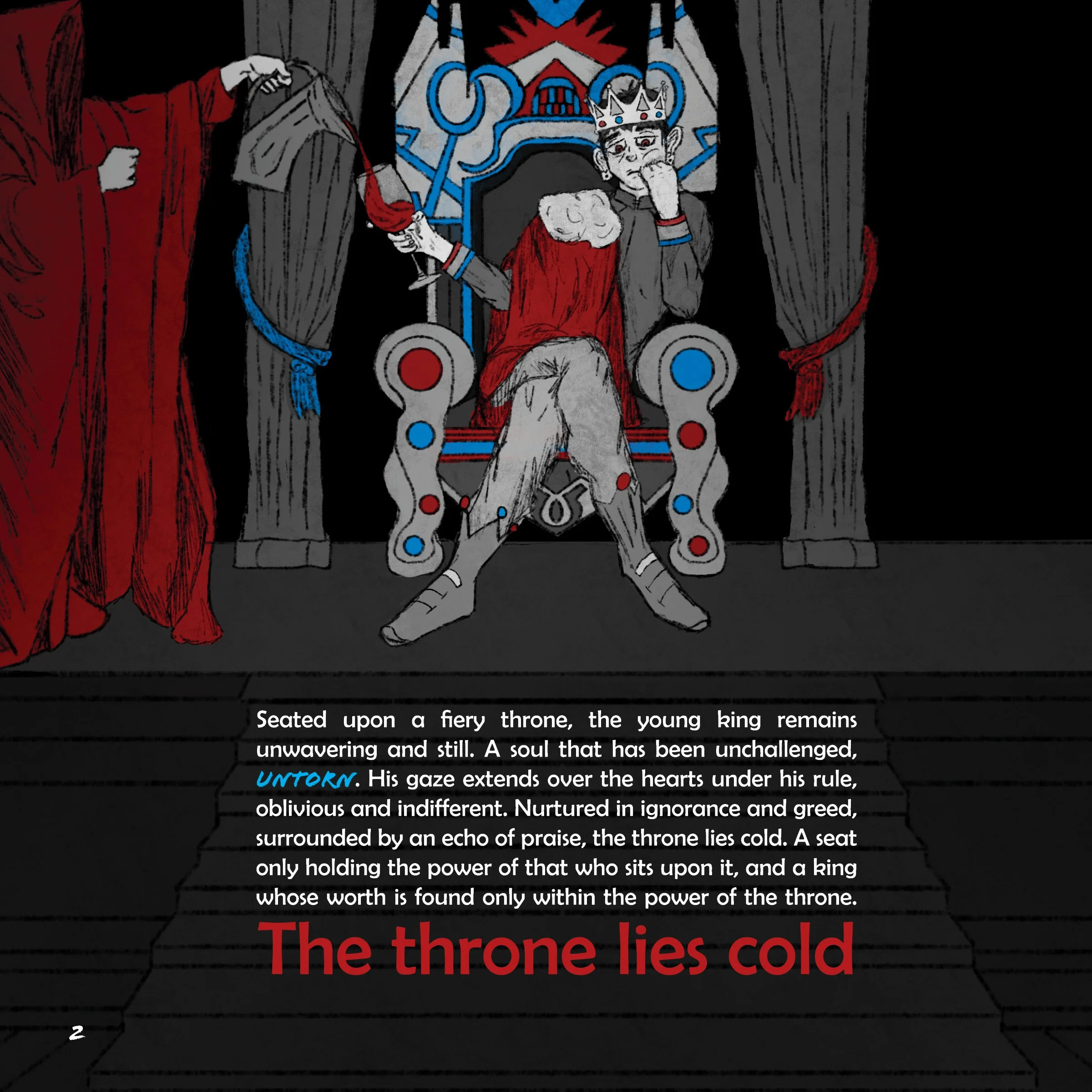
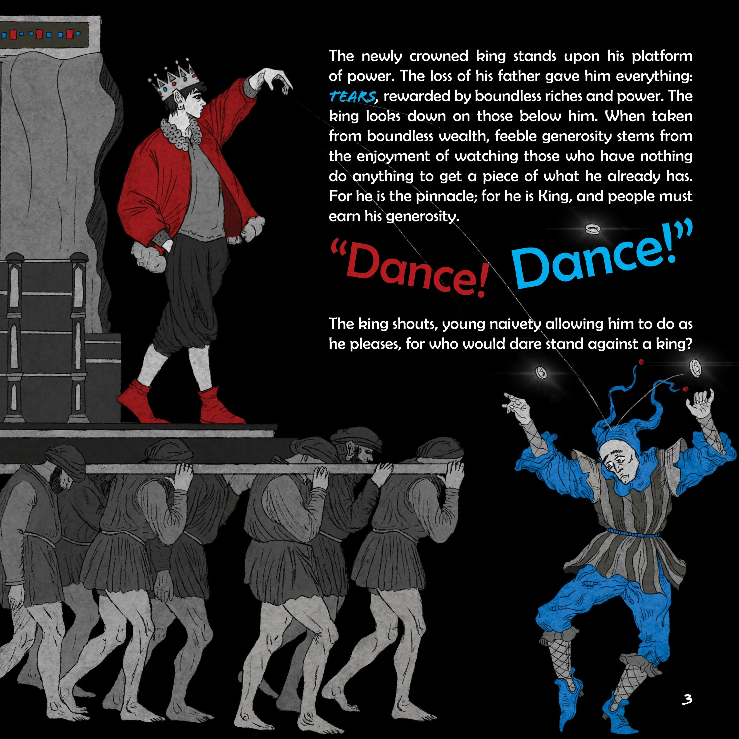
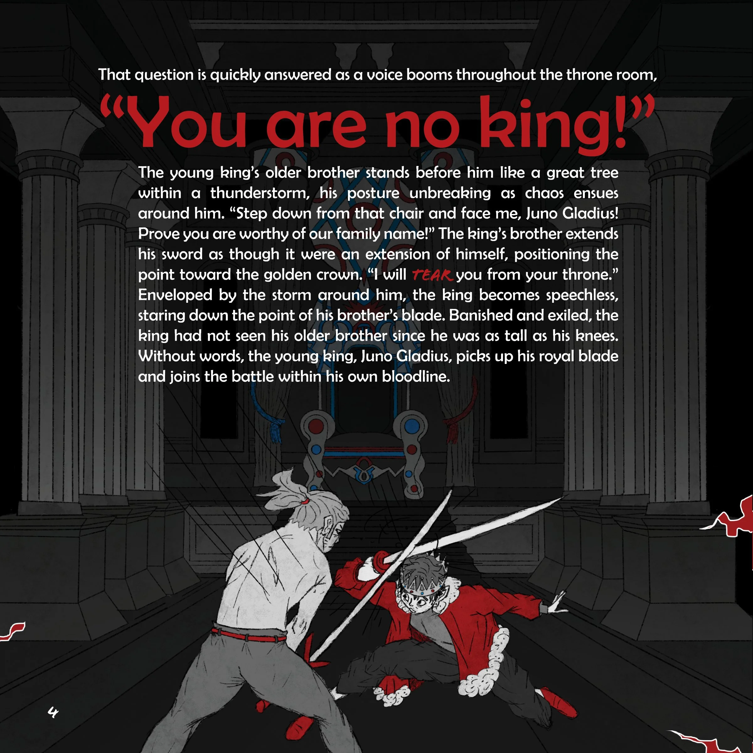
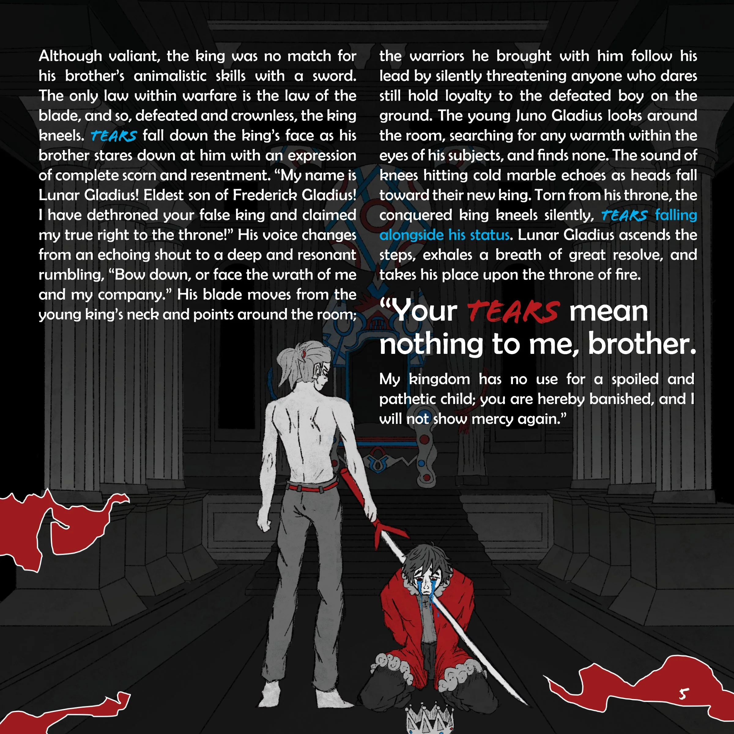
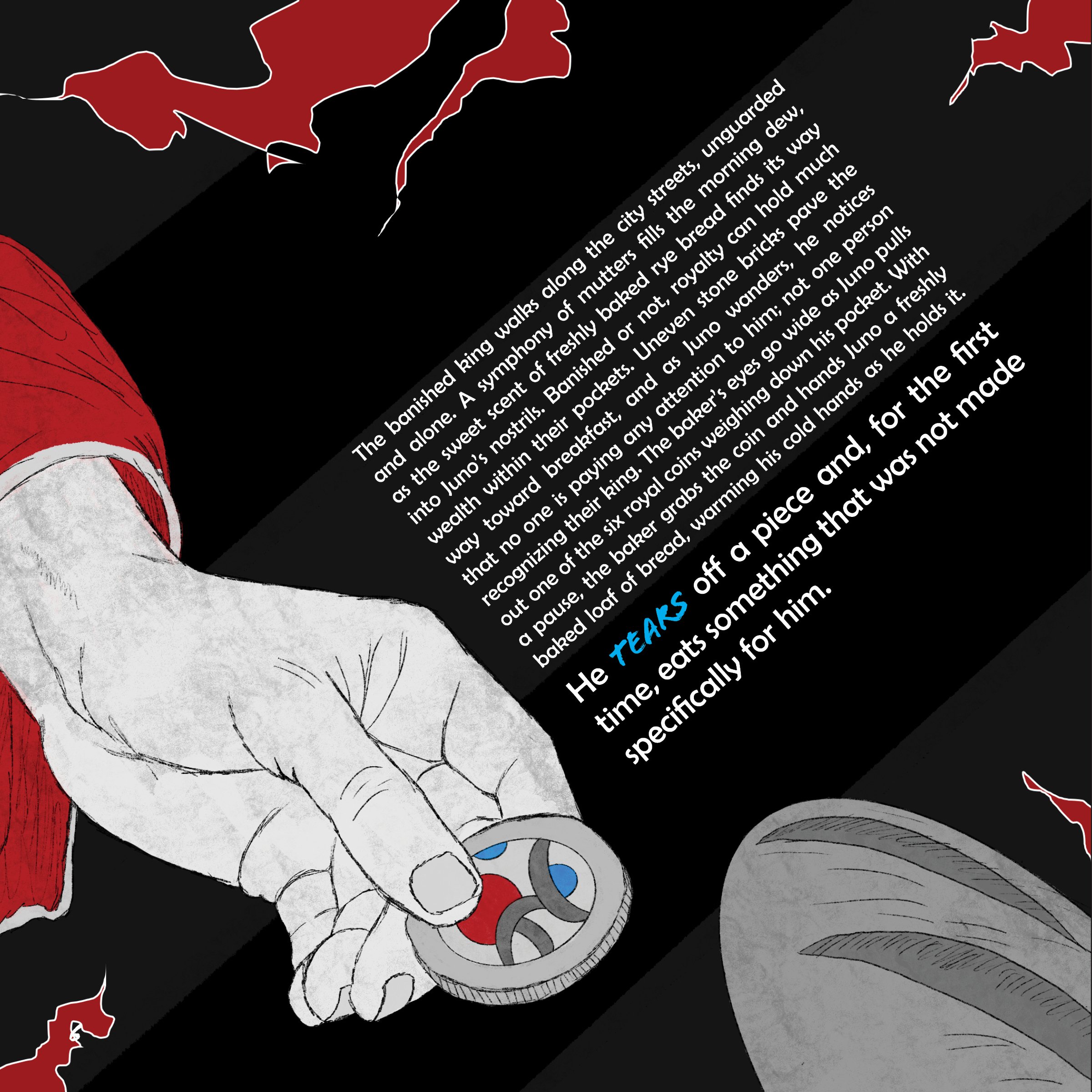
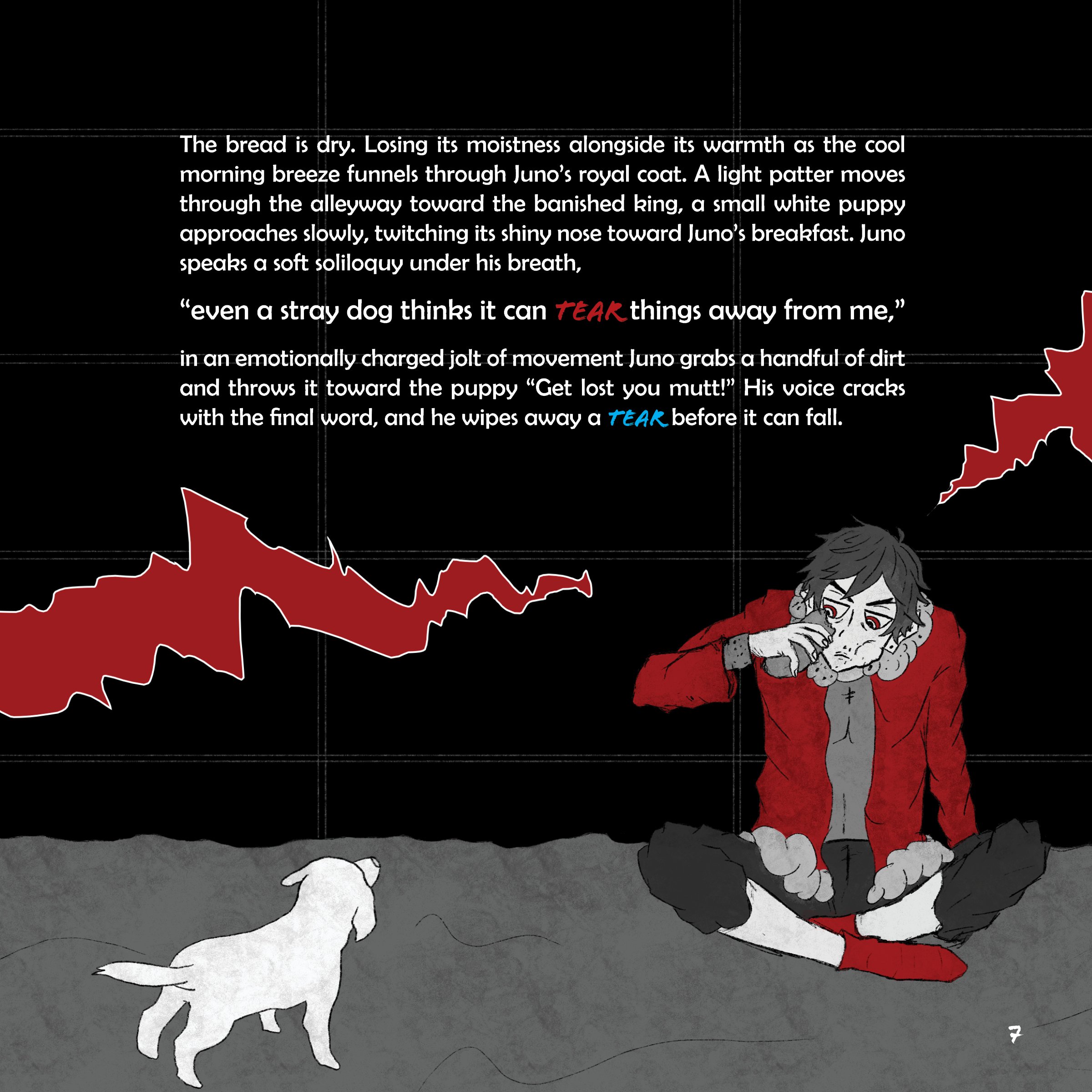
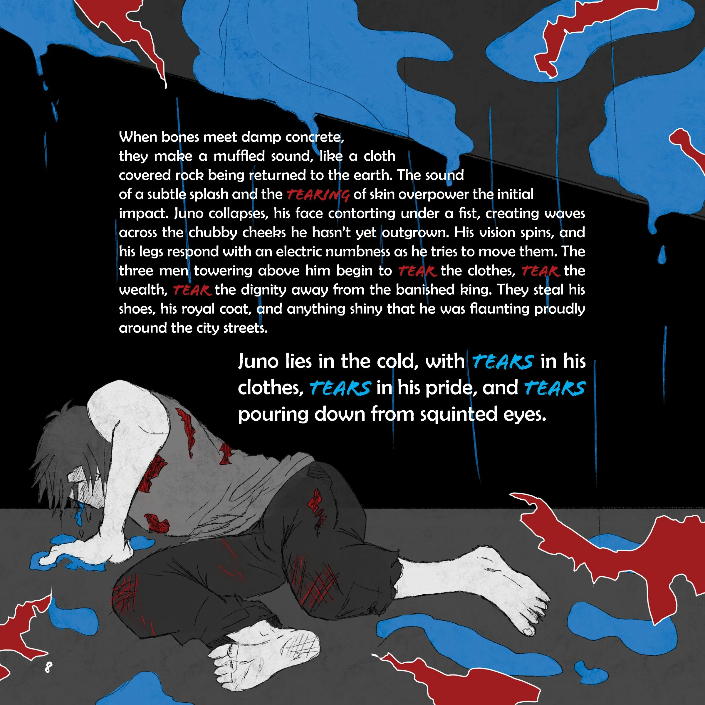
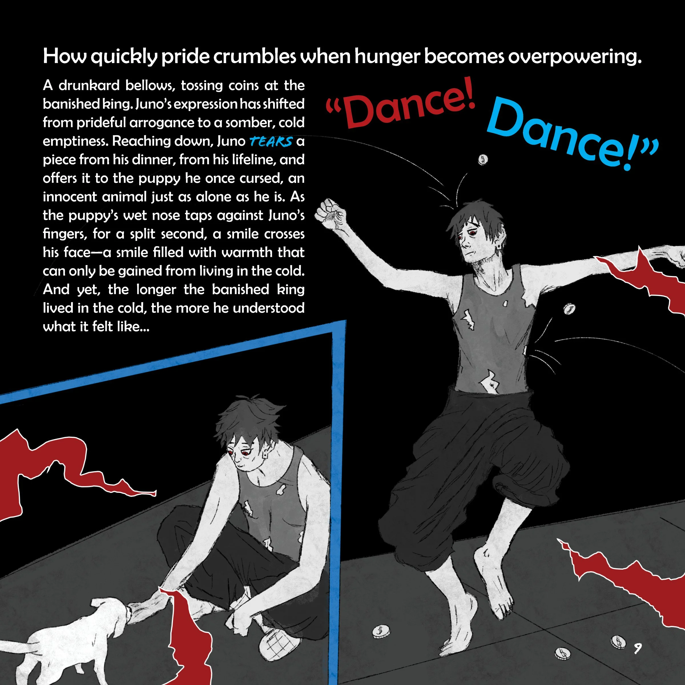
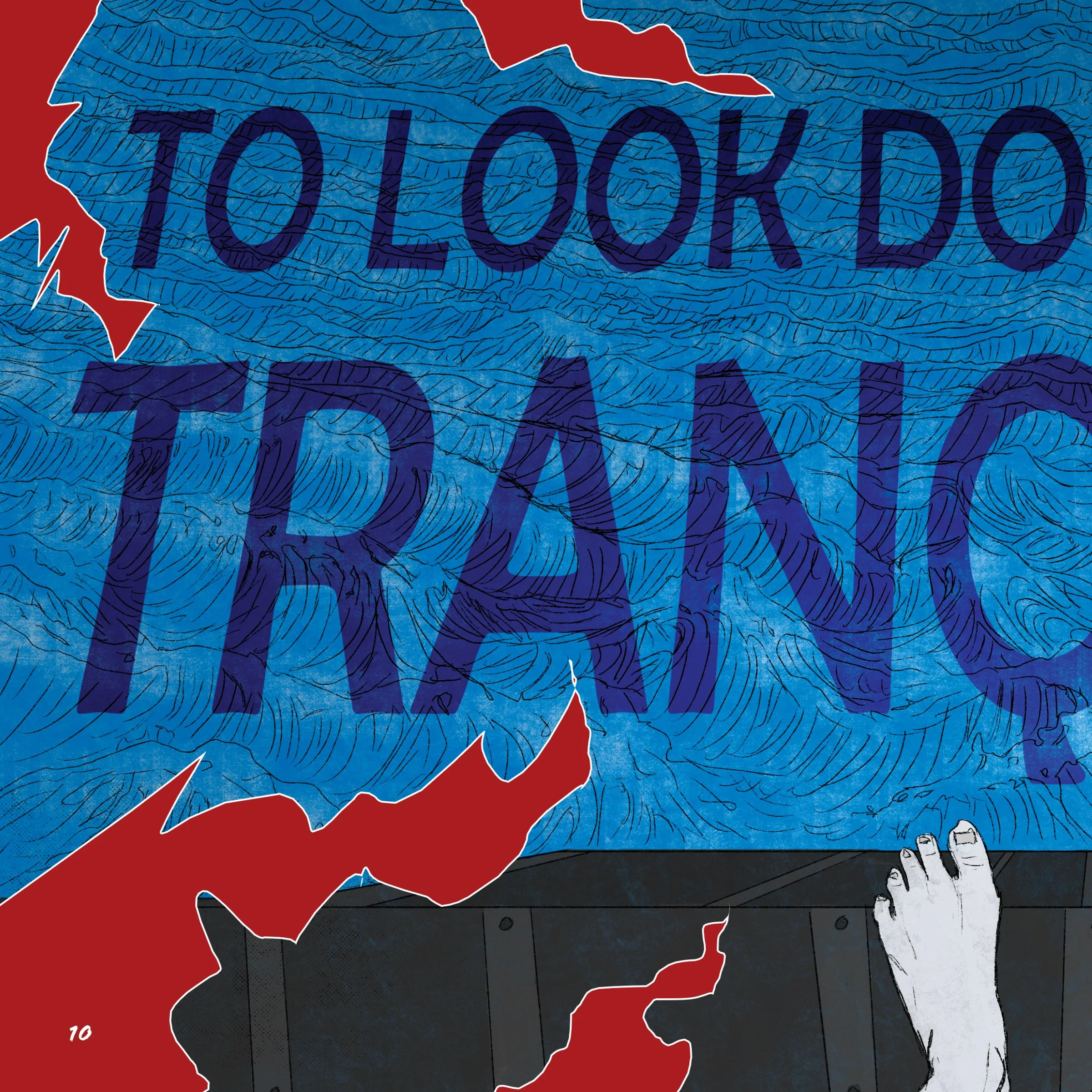
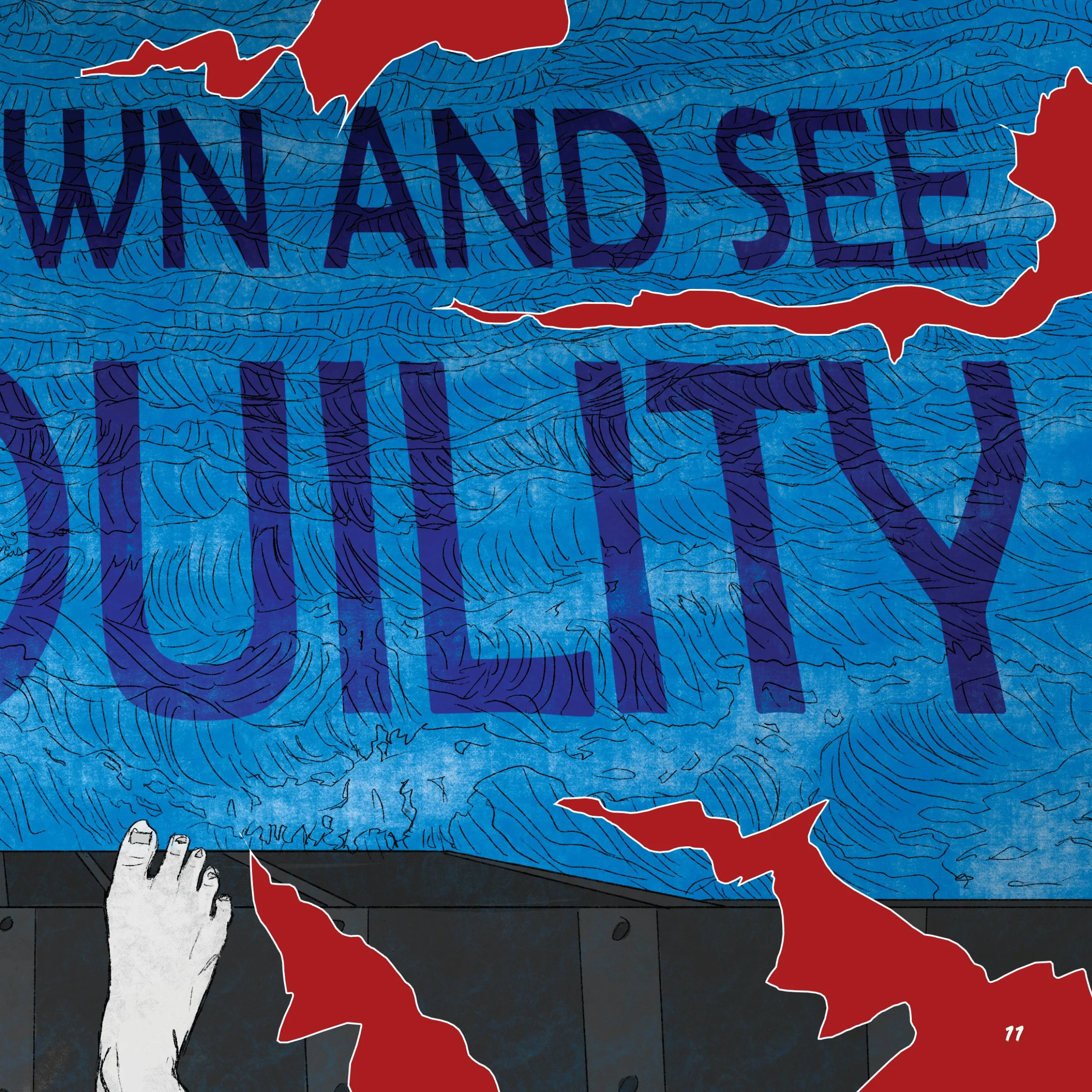
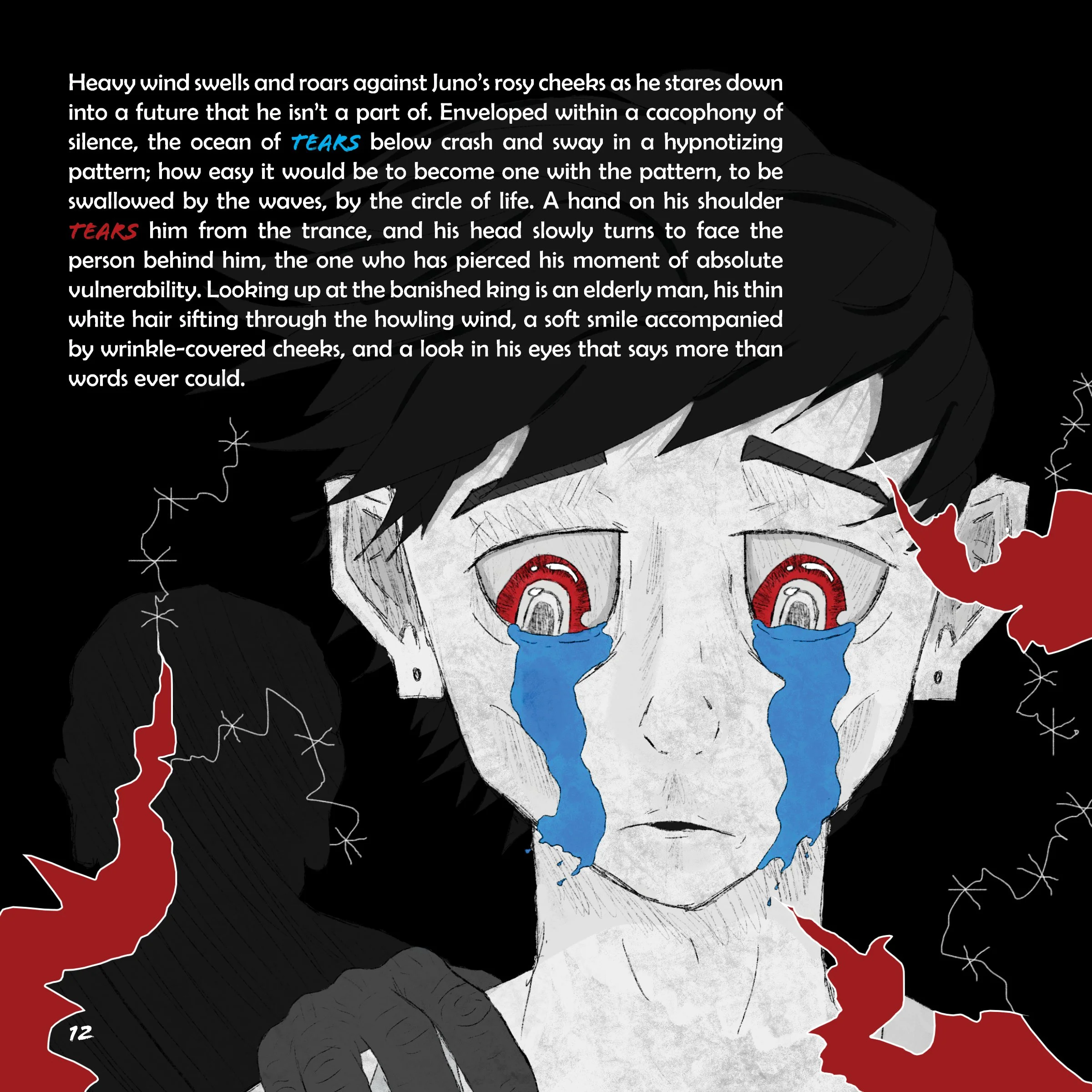
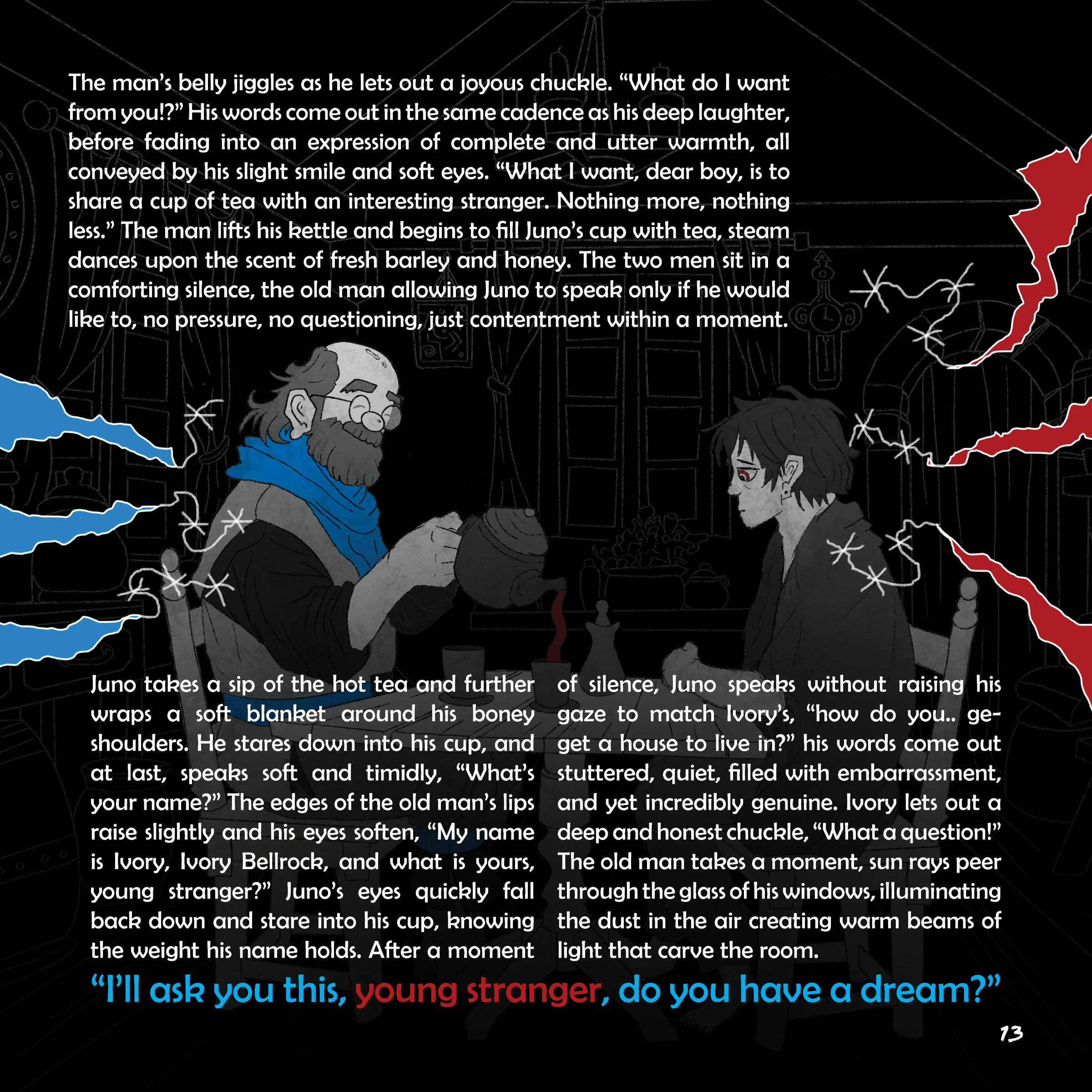
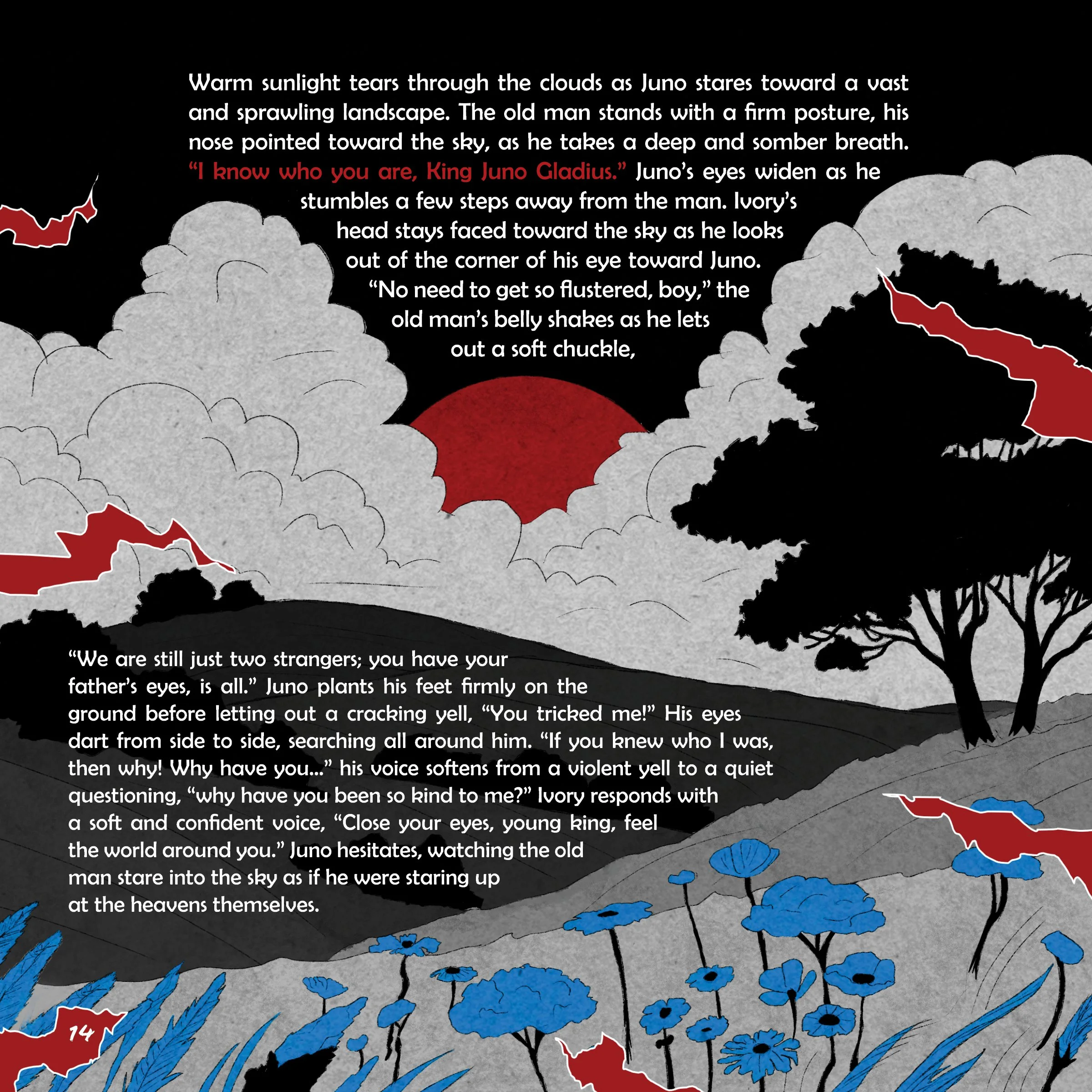
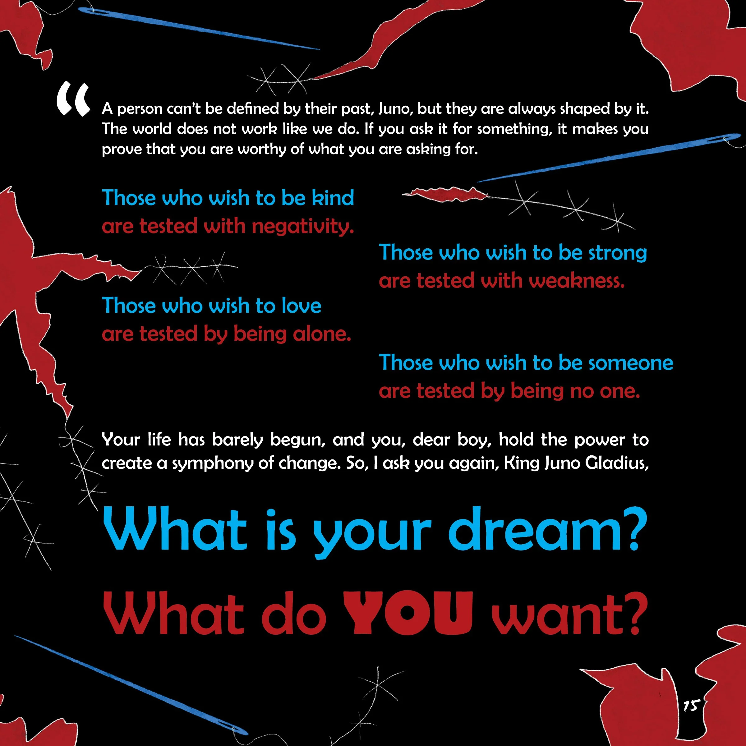
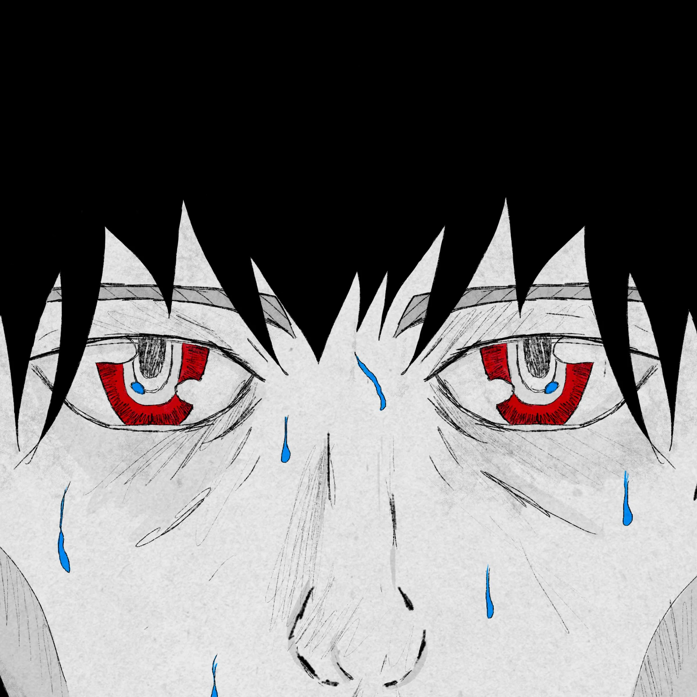
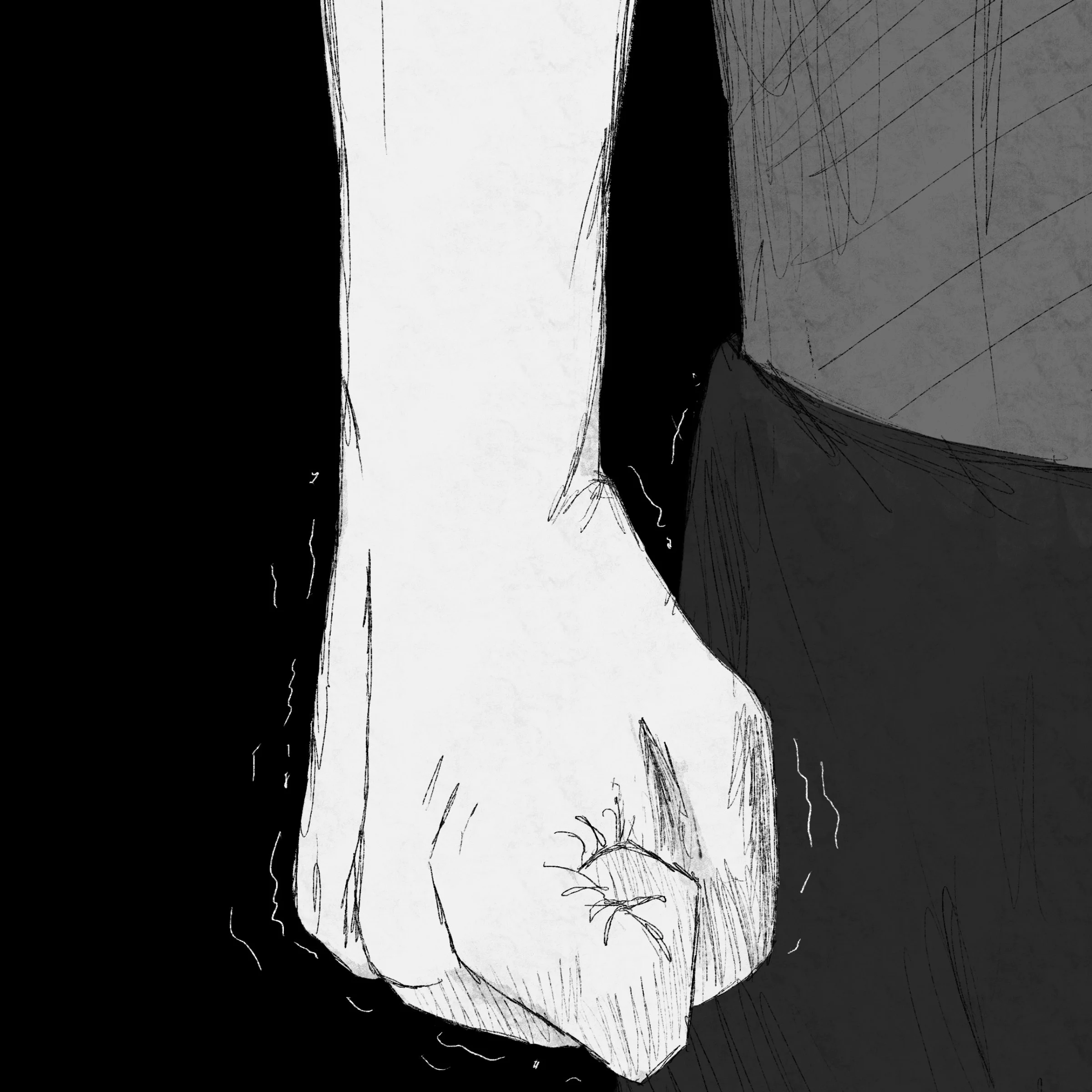
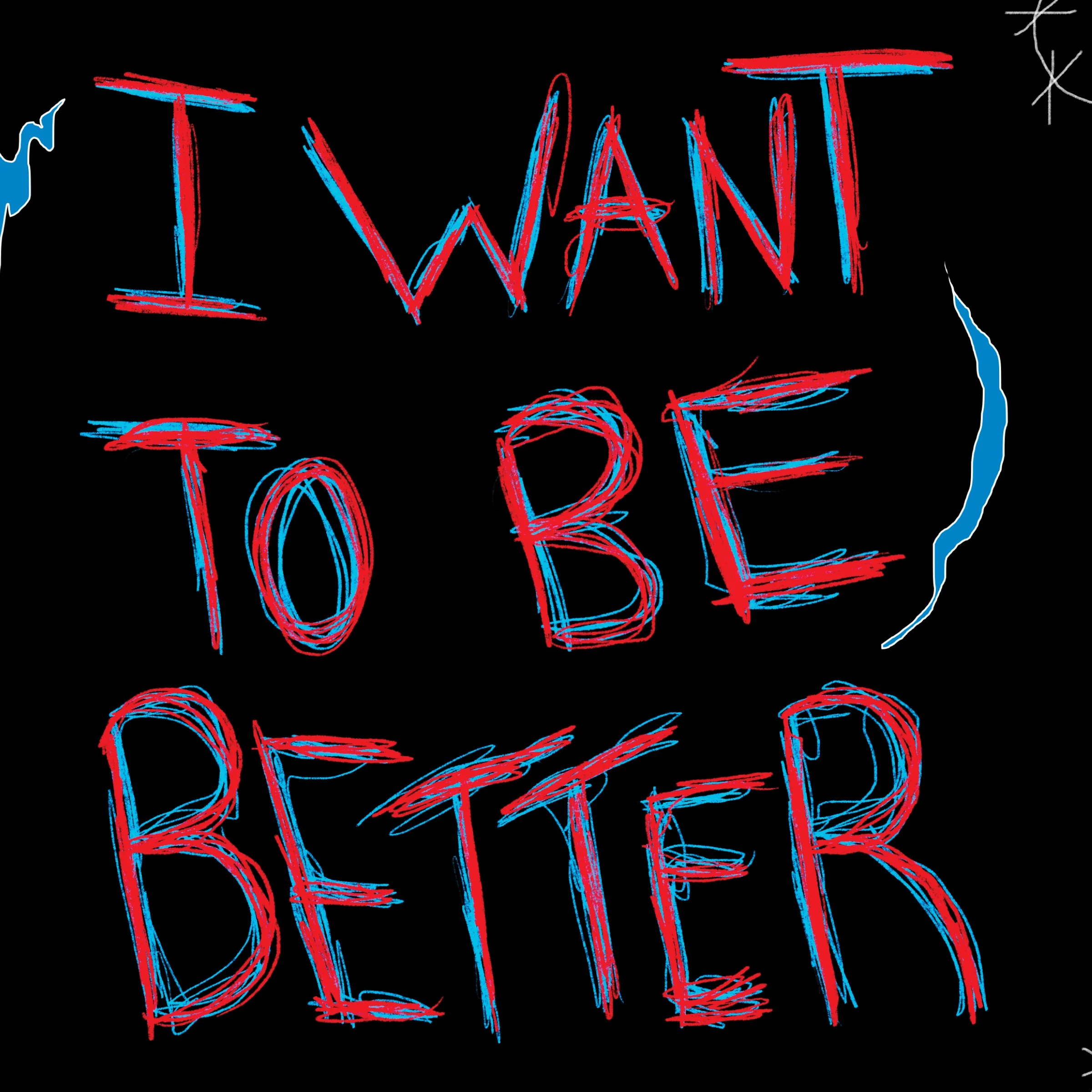
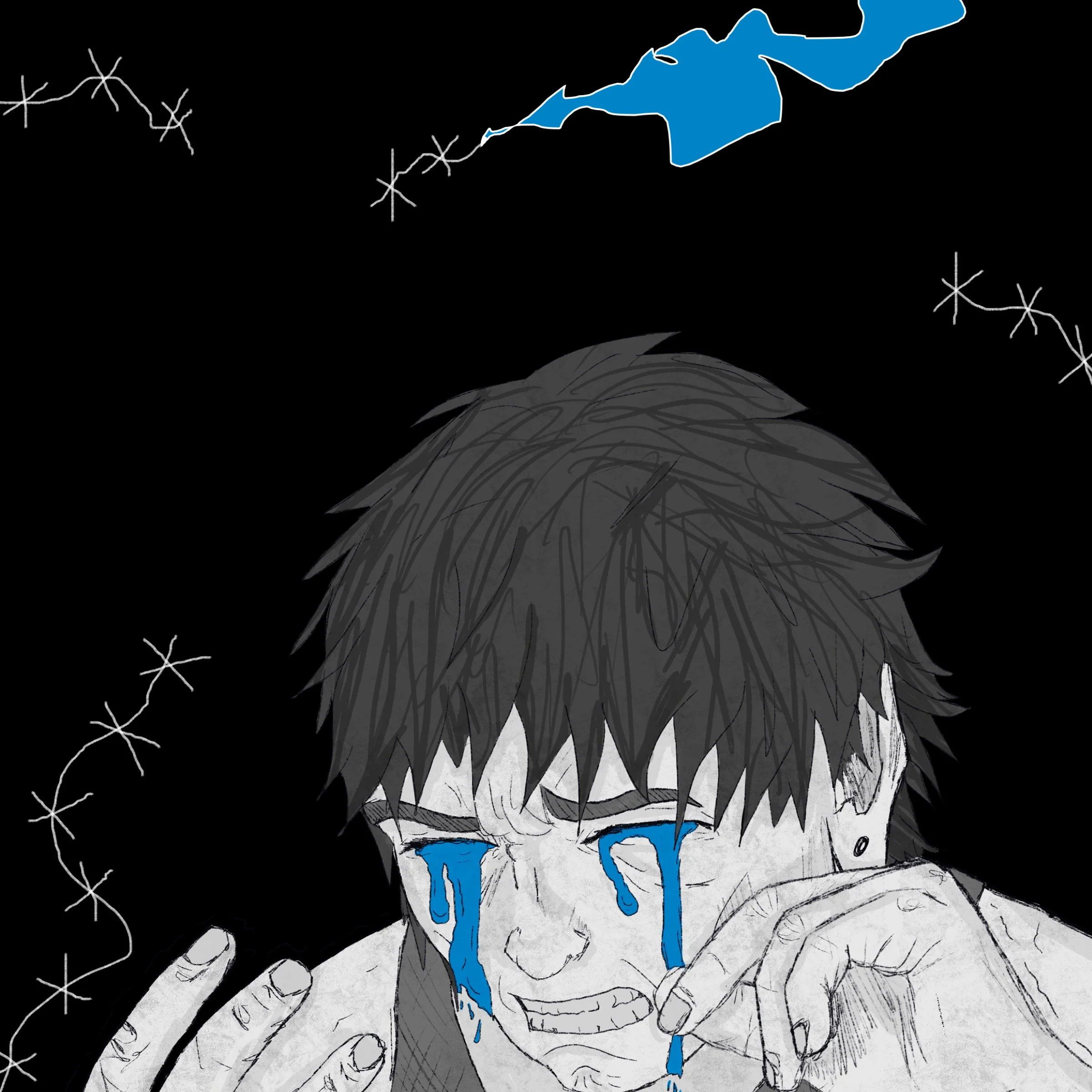
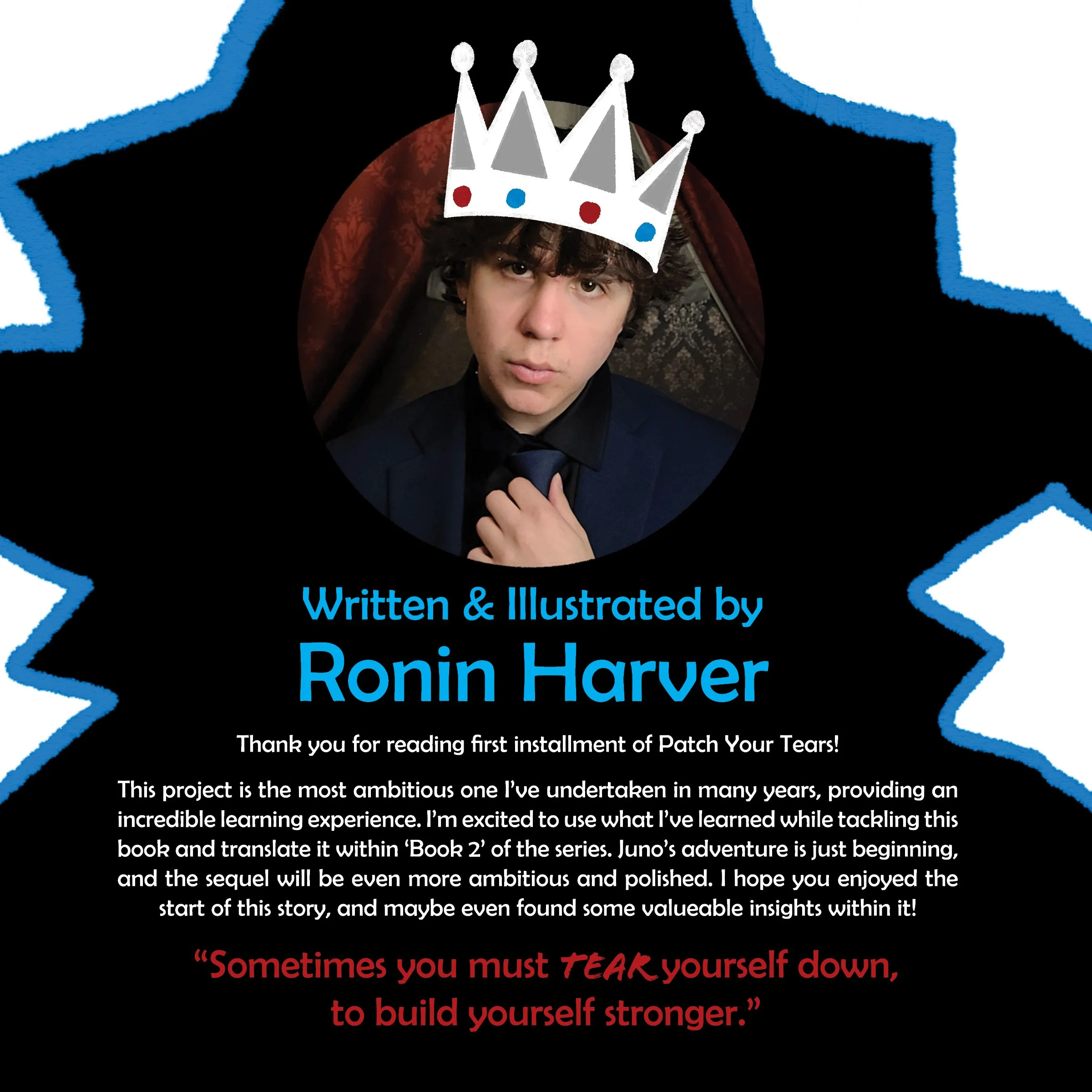

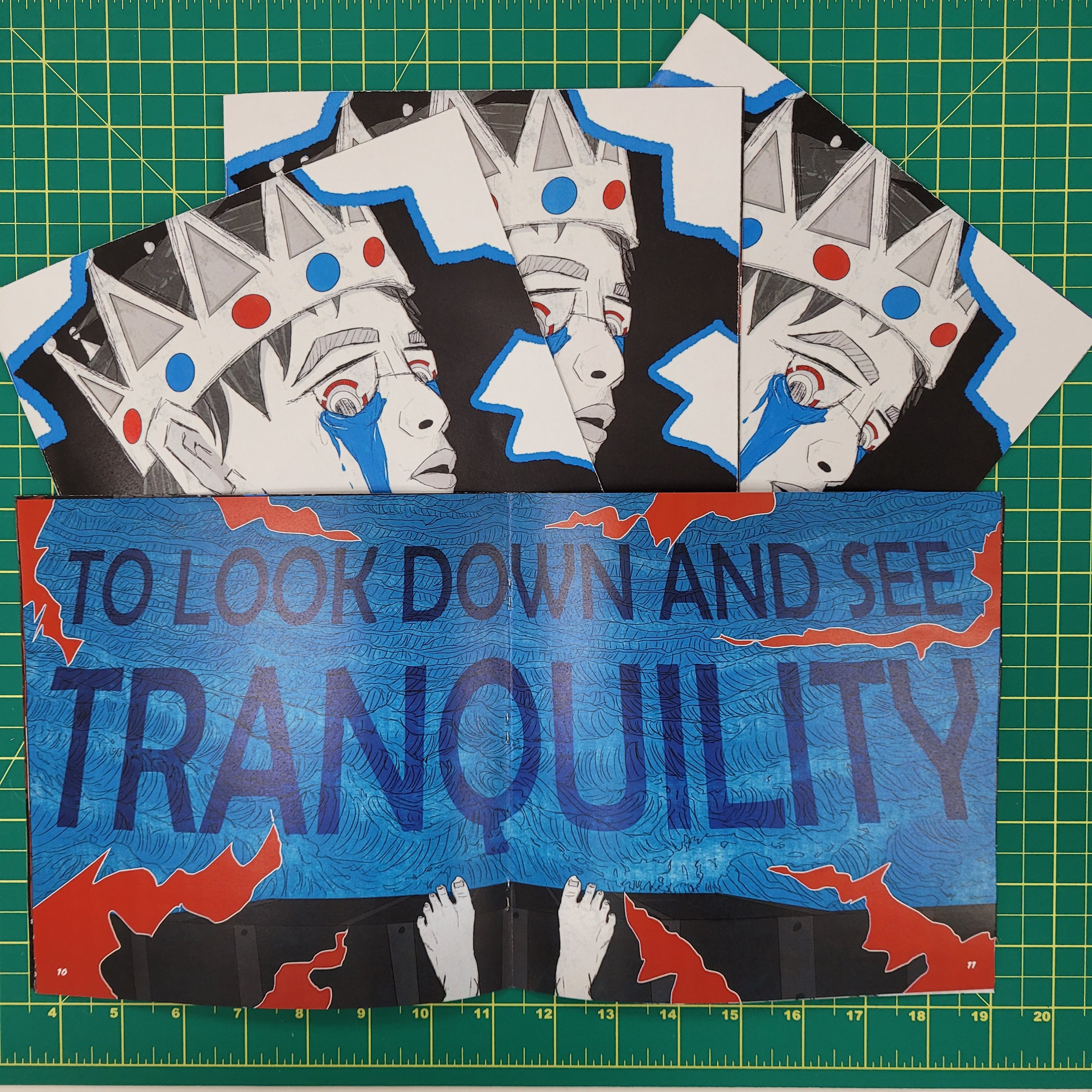
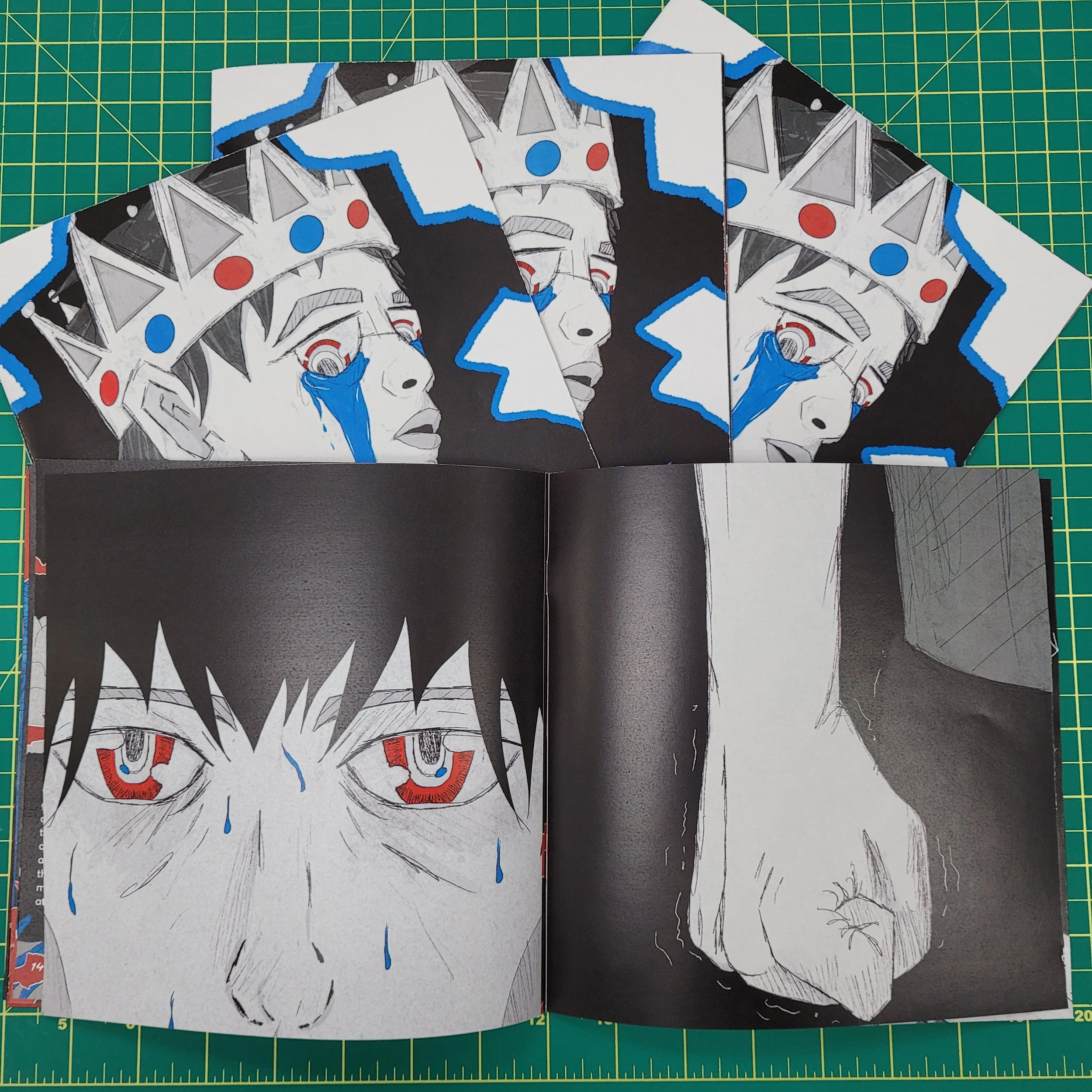
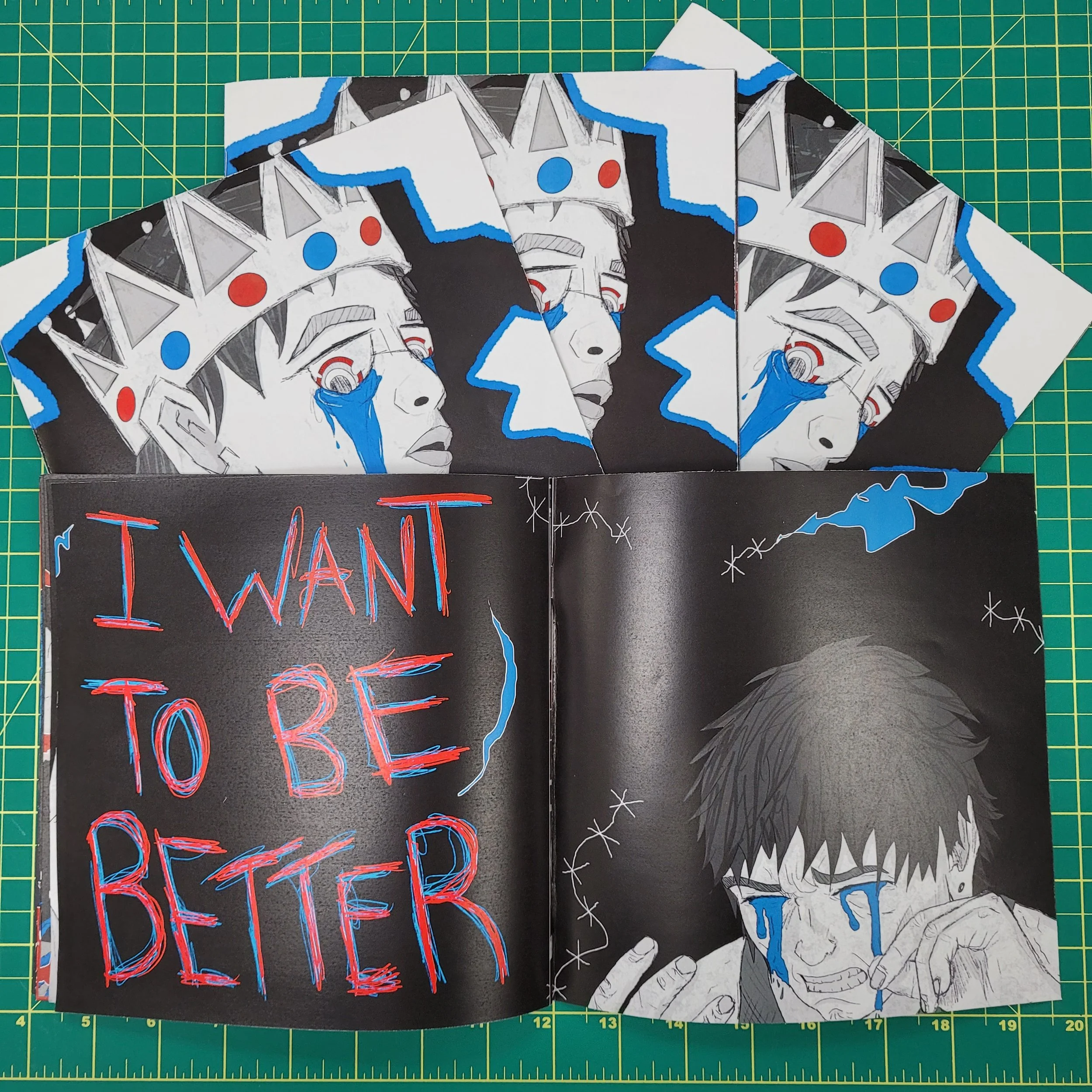
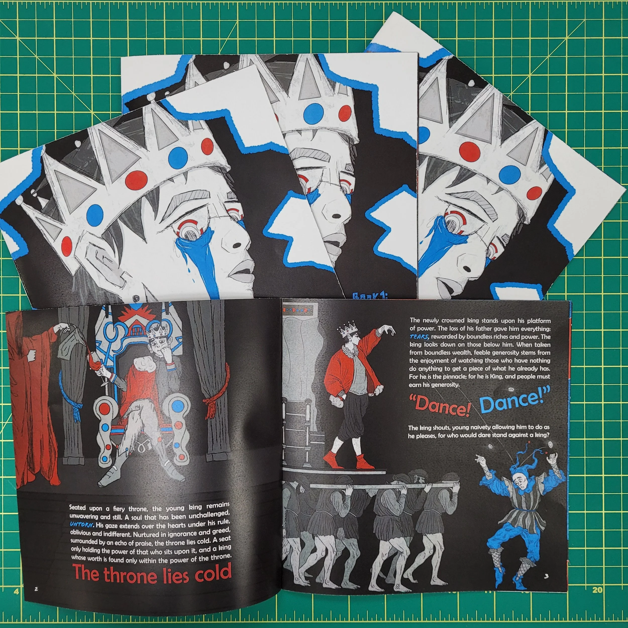
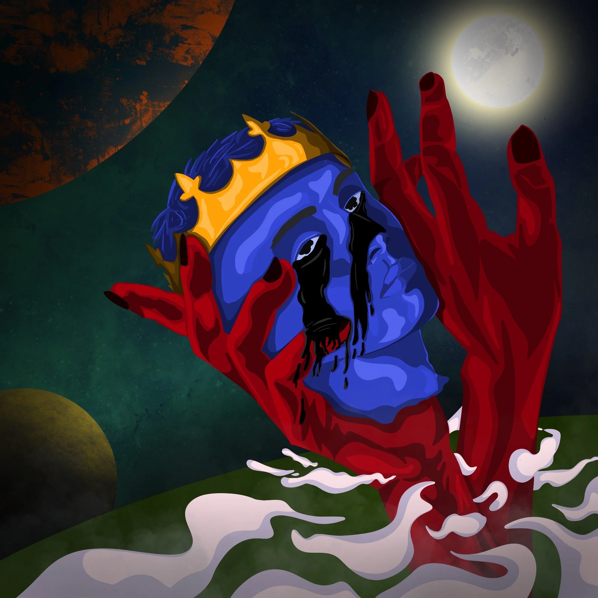
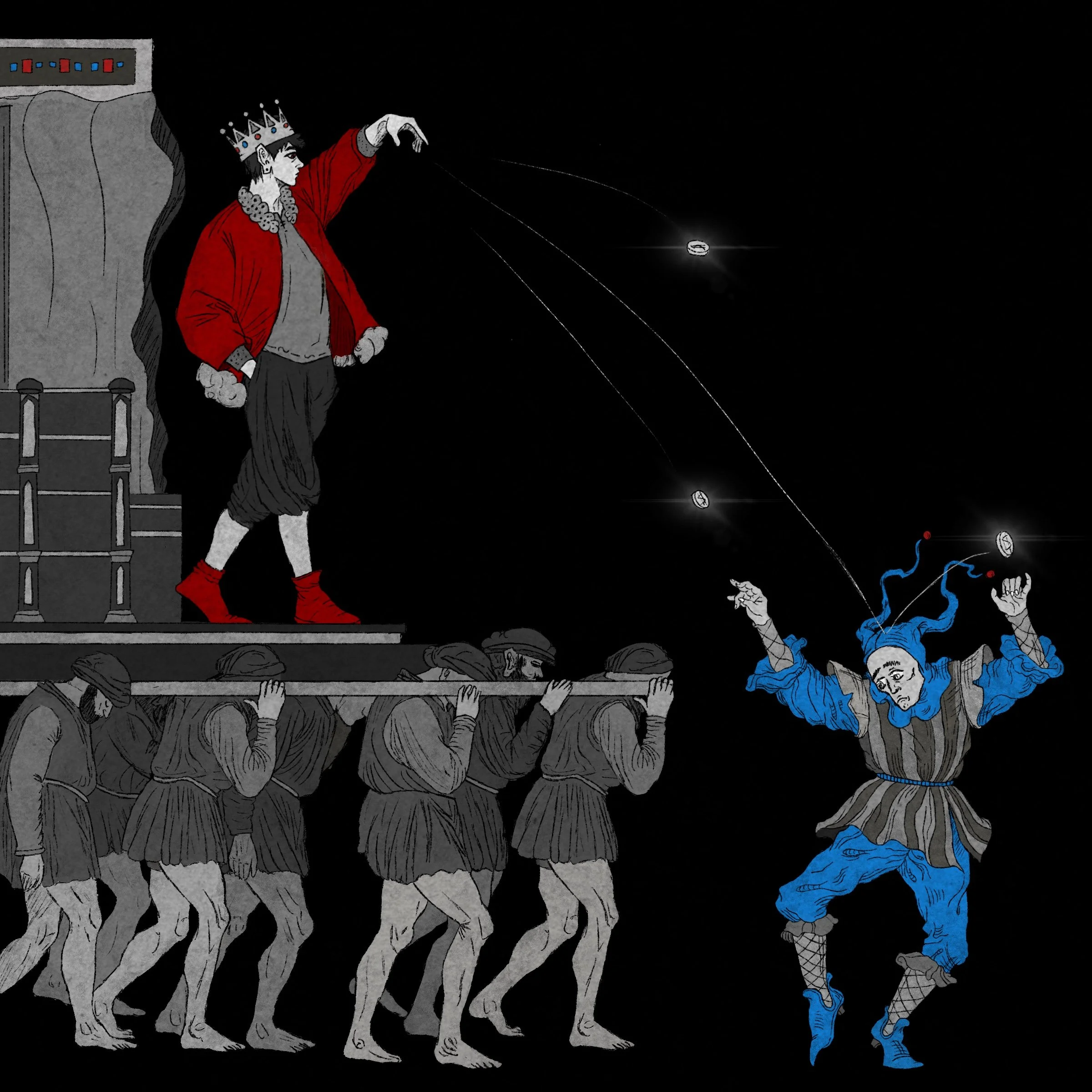
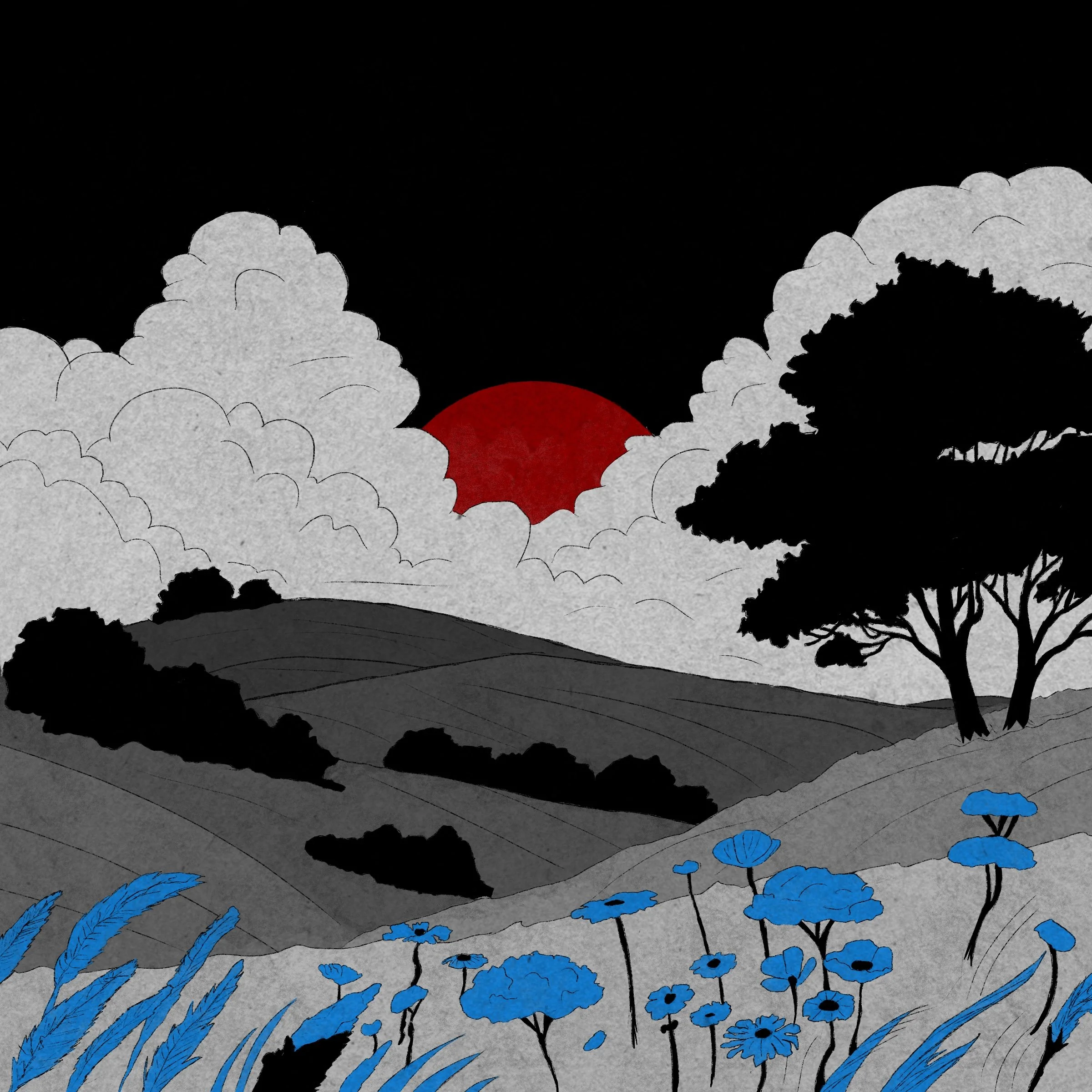
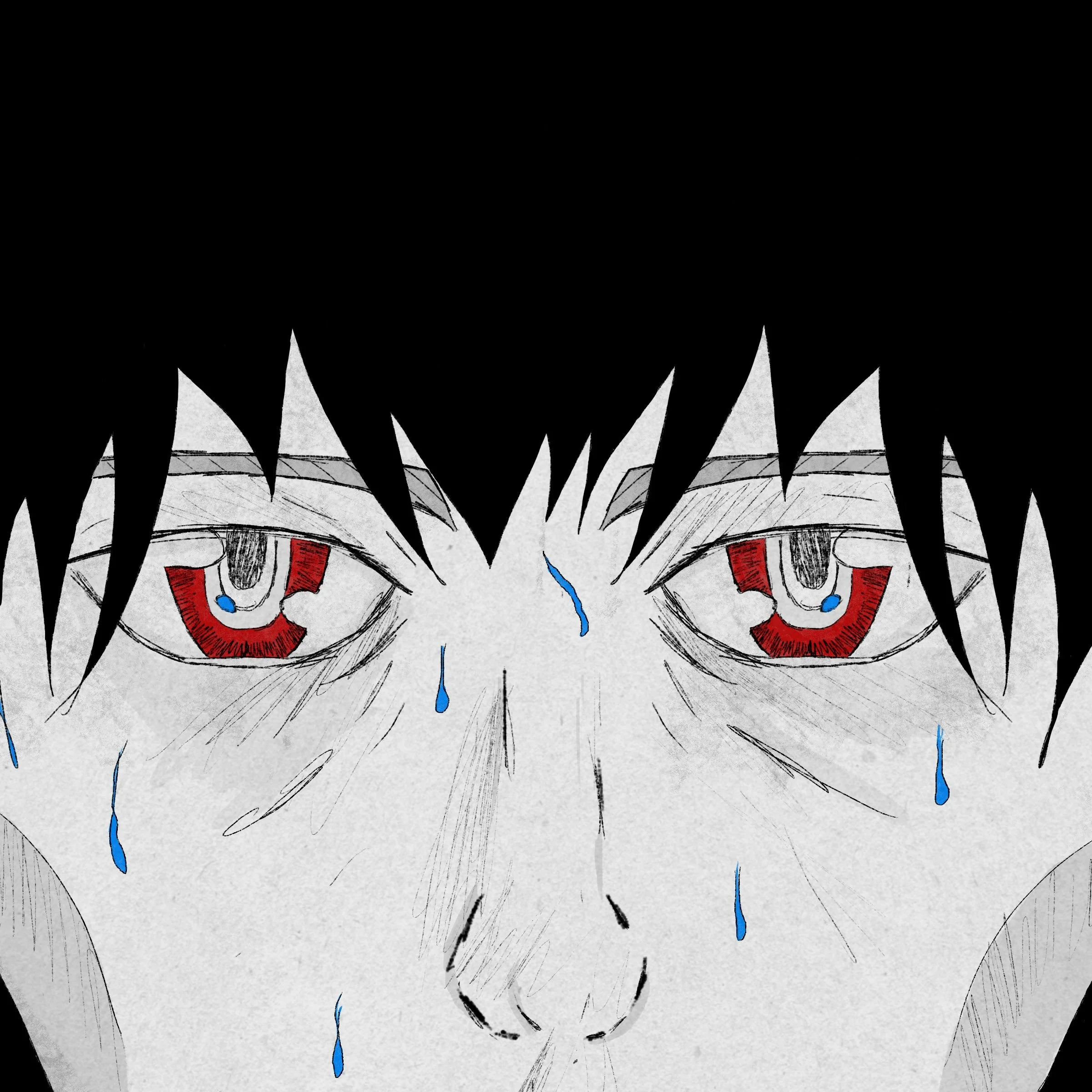
Patch Your Tears started as a Typography class assignment exploring homonyms, with the goal of designing around their multiple meanings. When I got the word “Tears,” I was immediately drawn to the idea of turning it into a full narrative. What began as a simple design exercise became a personal challenge to write and illustrate a 20-page short story. While my writing has improved significantly since then, this project remains one I’m proud to showcase as a completed piece.
The booklet’s design focuses on storytelling through layout, typography, and a carefully chosen color palette. A flexible grid structure keeps the pages visually engaging while maintaining readability. The red, blue, and greyscale palette adds contrast and symbolism—red for power and conflict, blue for wisdom and resilience. The balance between text and imagery was key to making the story flow naturally while keeping each spread visually compelling. This project pushed me to combine narrative and design in a way that enhances both, making it a valuable part of my portfolio.

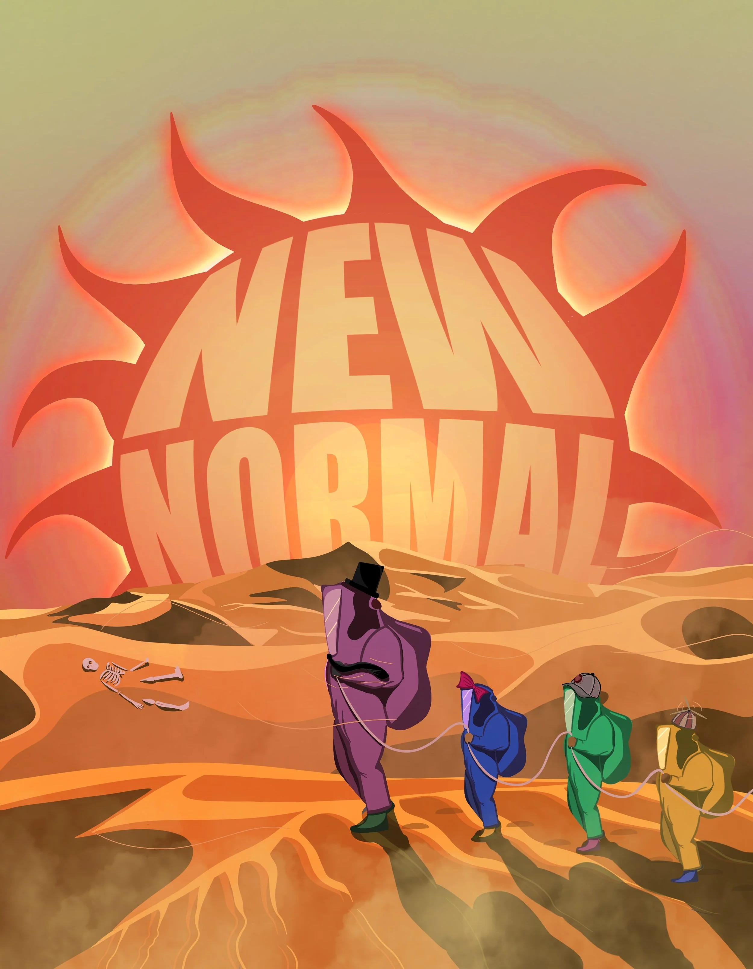
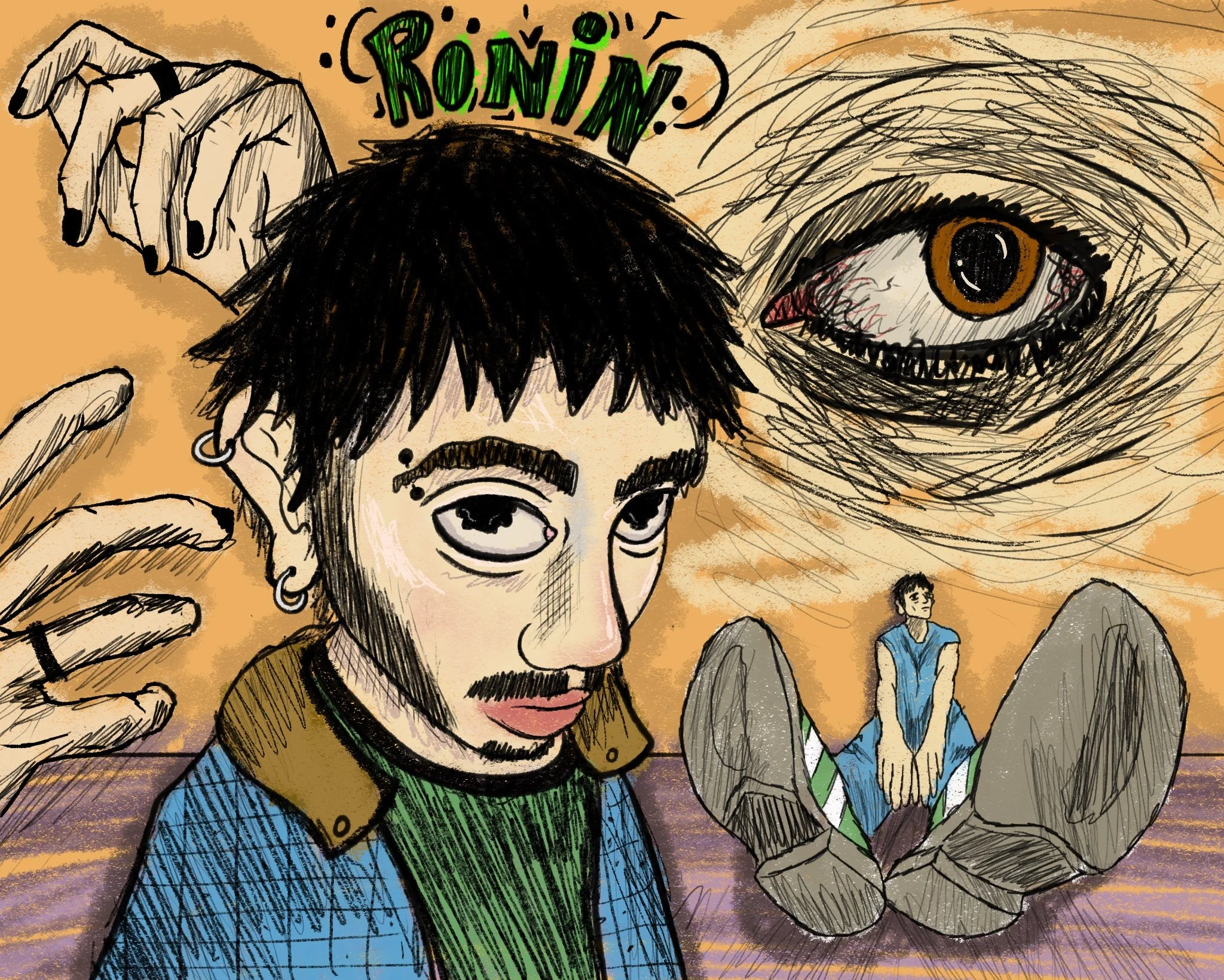
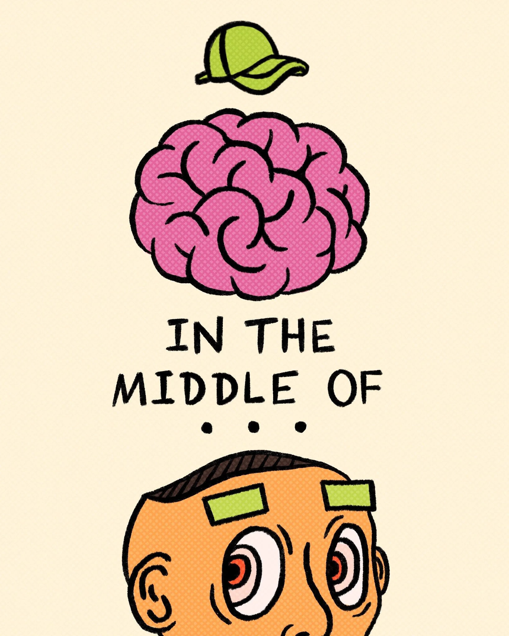
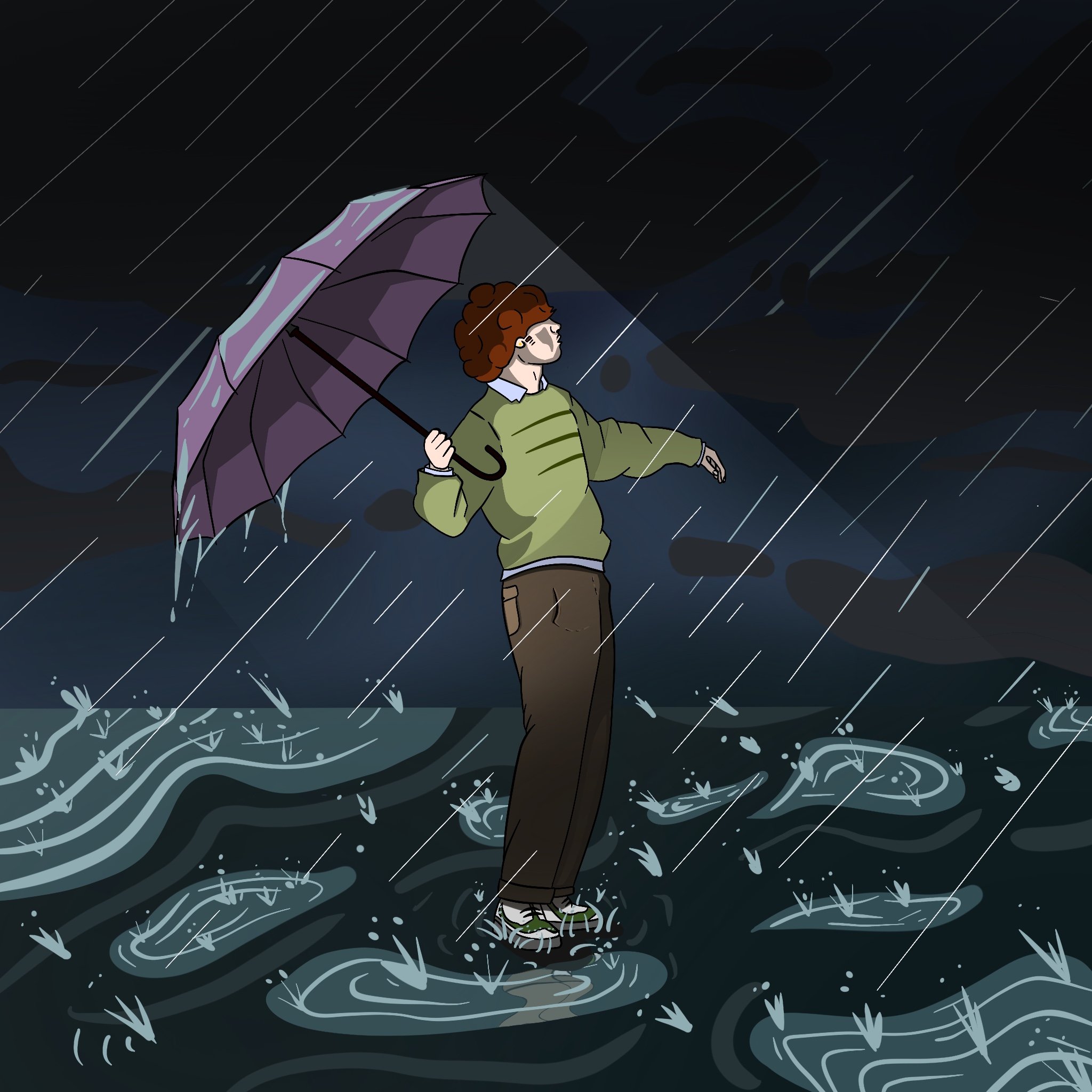
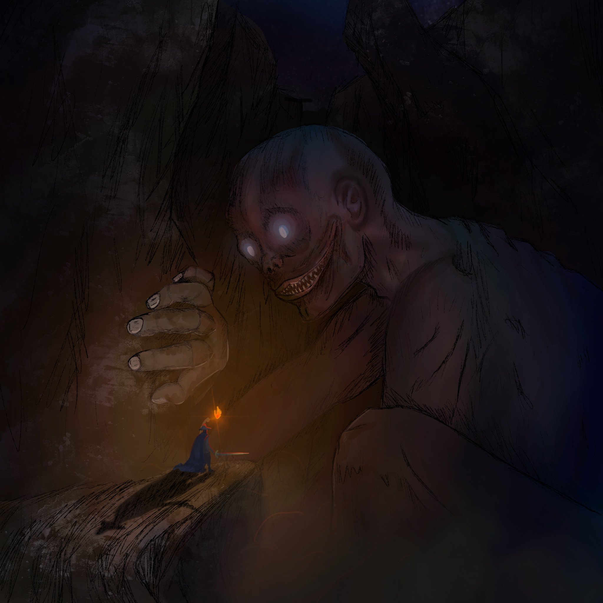
— Illustration —

— Design —


- FILM & MEDIA PRODUCTION -
BASELINE.
A Short Film I created about the idea of “Home” and the emotions that surround it.
This was all written, filmed, and edited in 3 days, and you can probably see my exhaustion in some of the shots.
That being said, I was able to convey the message I was looking to capture, in a deeply personal and intimate way.
Check it out!
- EXIT -
This award-winning experimental thriller is a short film I wrote, shot, and edited alongside a small crew of friends.
It features some of my favorite shots I’ve ever captured, but what I’m most proud of is the sound design.
As you watch, I encourage you to pay close attention to the audio. I crafted dozens of custom sound elements using a blend of foley and digital manipulation. This work earned the “Best Sound Design” award at the BC Student Film Festival.
HIT THE DECK.
A music video I directed, shot, and edited for the band Danger Box. It won “Best Music Video” at the BC Student Film Festival and never fails to get a smile when I show it to people.
I’m especially proud of the editing in this project, and the process of making it sparked my passion for music videos. It made me realize that working in this field would be a dream come true.
MEDIA EDITING
The first Adobe program I ever opened was Premiere Pro, driven by a simple goal—to create a fan trailer for my favorite show at the time.
That small spark of curiosity ended up shaping the course of my life. I quickly fell in love with video editing, and my passion soon expanded into other Adobe programs.
To this day, I continue creating edits of my favorite pieces of media. Learning to edit this way taught me to feel the rhythm and flow of a sequence, giving my work a cinematic quality—even when cutting the most mundane content.
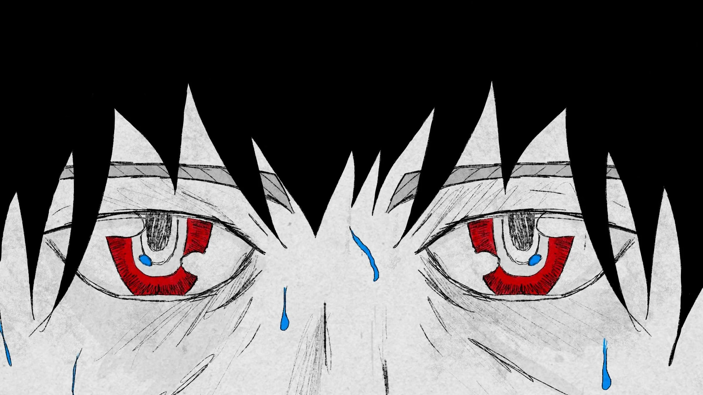
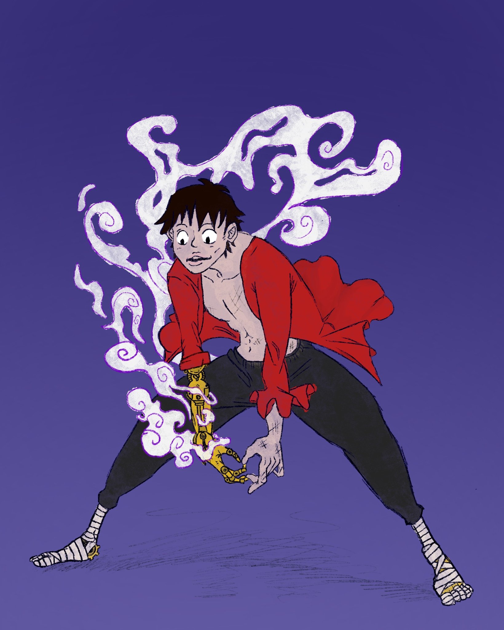
My edits have accumulated over 500,000 views across TikTok and YouTube, with the attached video, “King of the Pirates,” becoming my most popular. It’s often praised by fans as one of the best One Piece edits ever made.
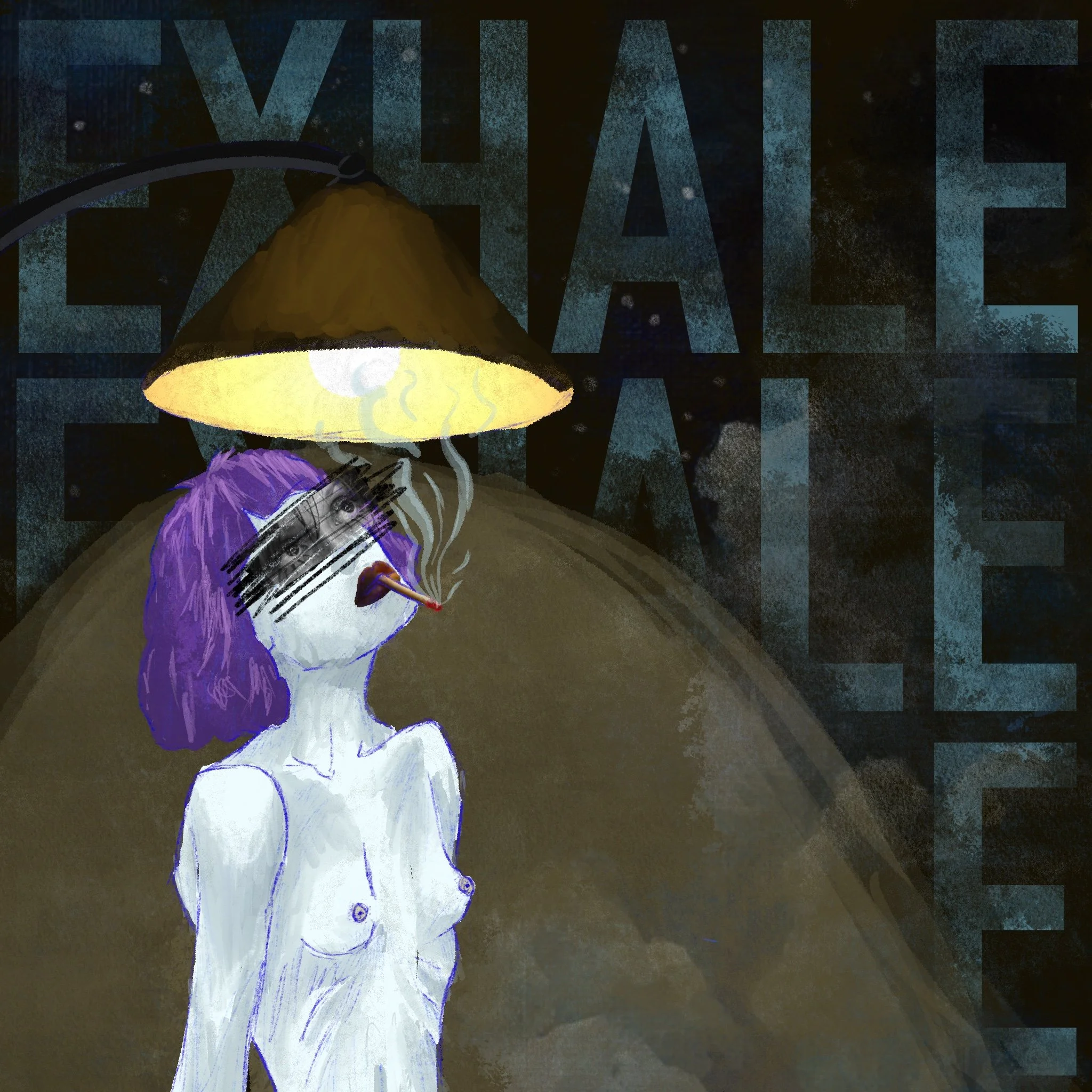
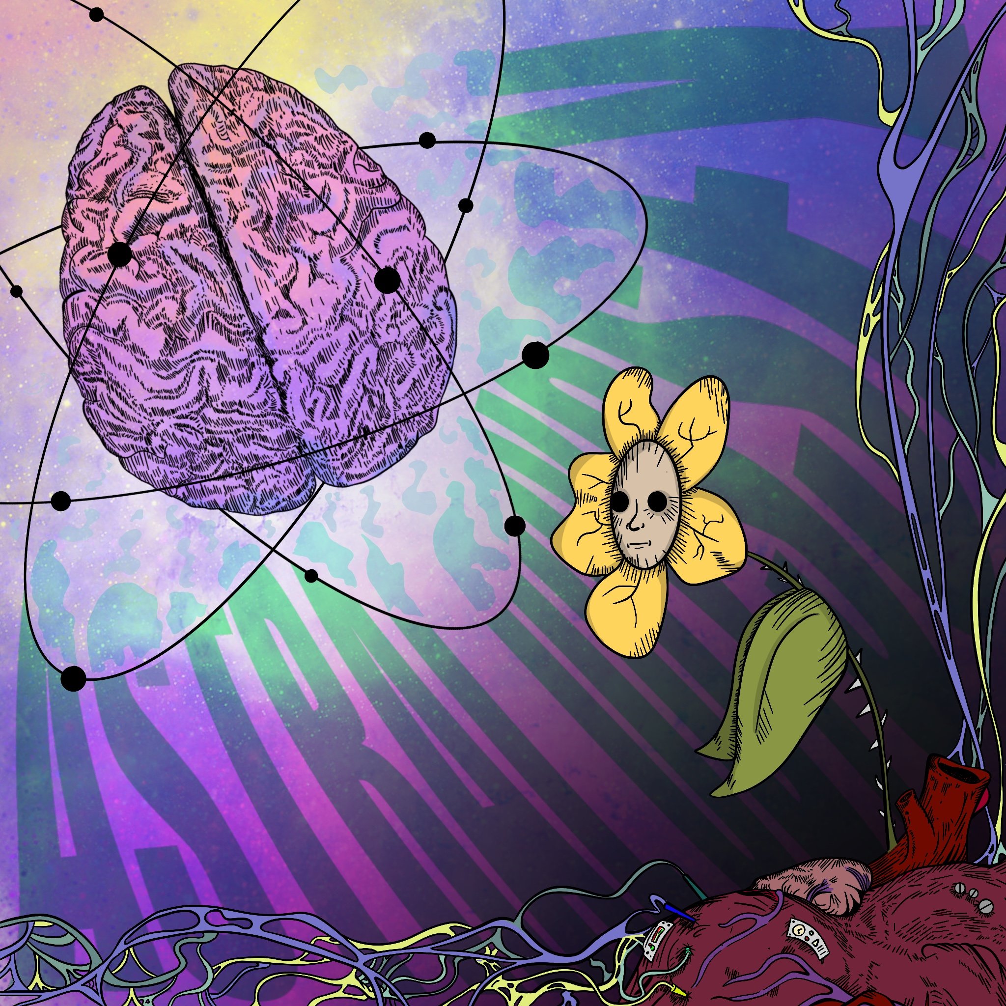
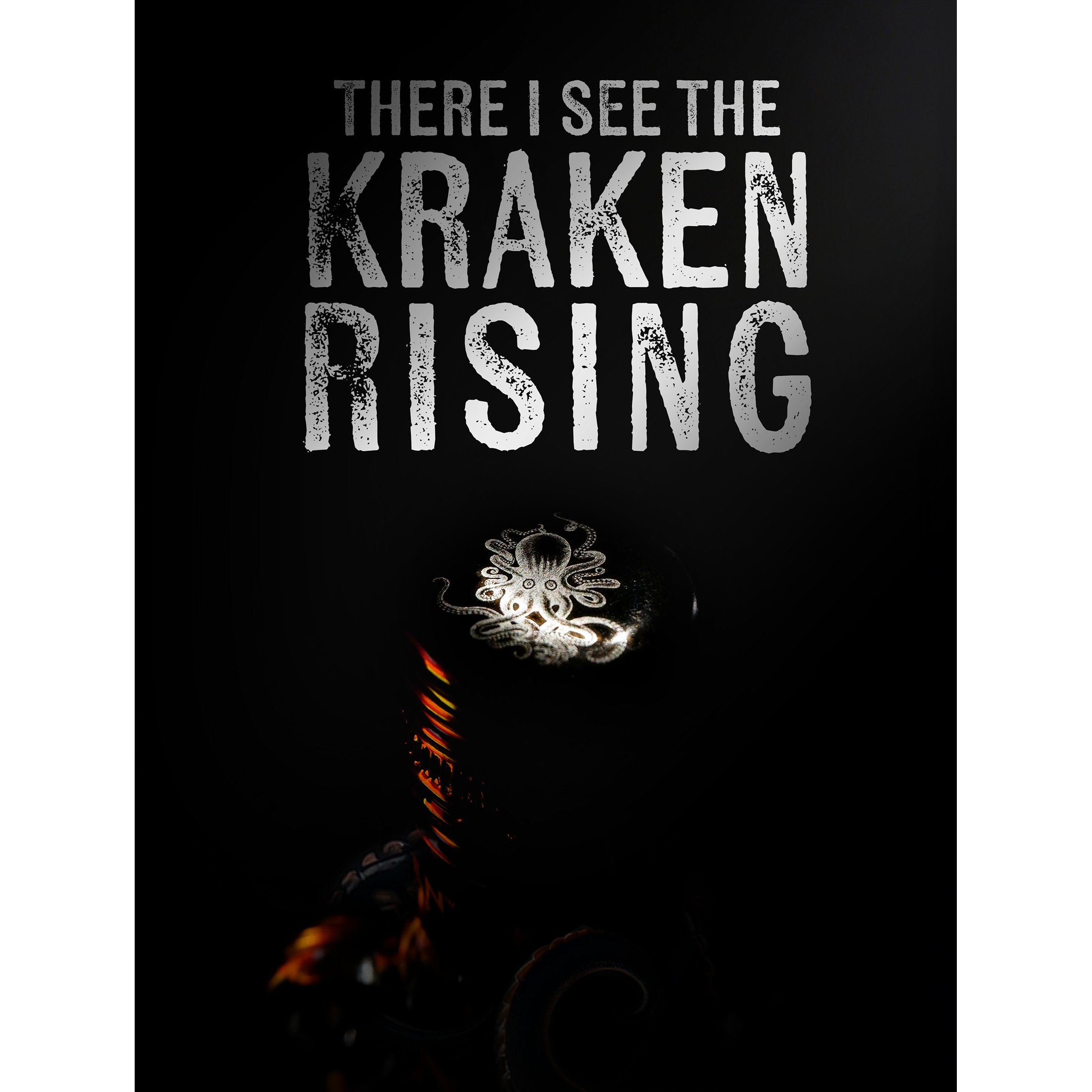
DEATH - LibYang
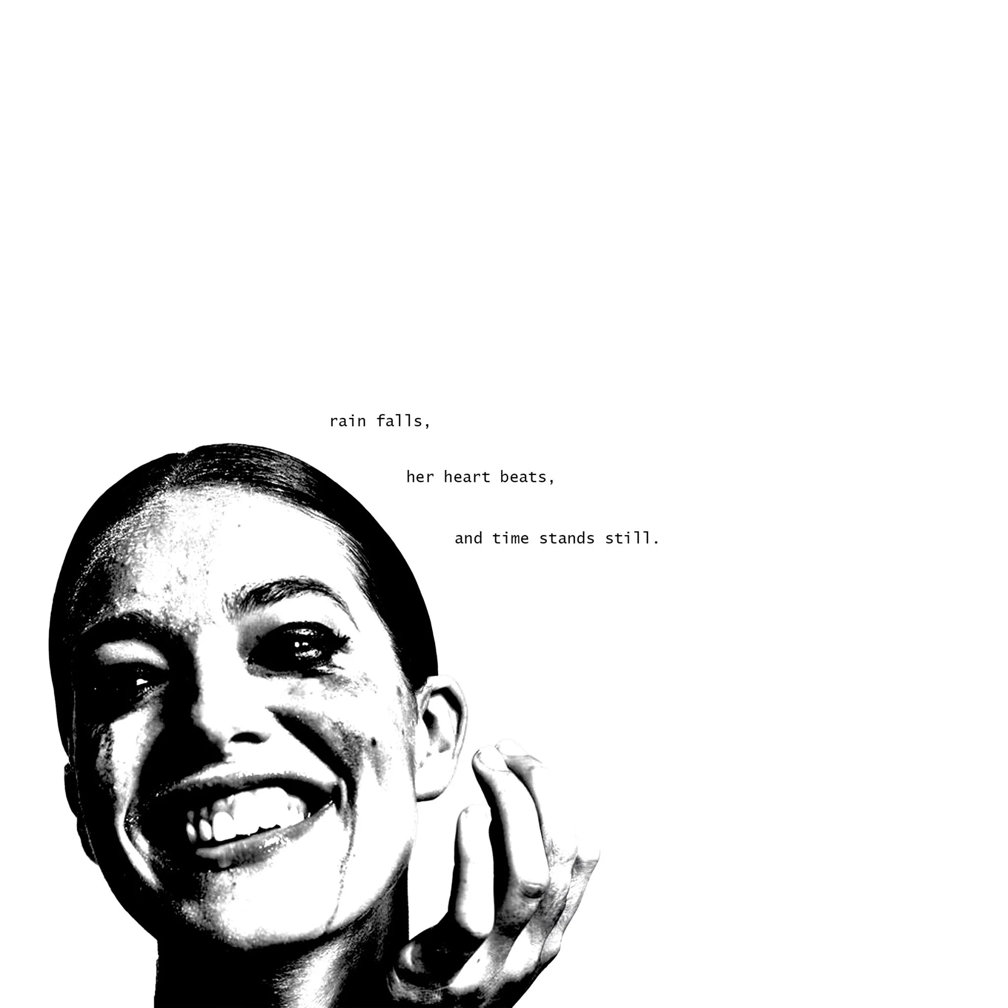
These visuals were edited for the musician LibYang, with the goal of capturing the feeling of death through imagery and pacing. I chose the motif of “life flashing before your eyes” to guide the edit.
I’m incredibly proud of this piece, as it showcases not only my technical editing skills but also my ability to evoke emotion and convey theme purely through rhythmic, visual storytelling.
Check it out!
“Ronin is a very personable young man. He is eager to succeed in all that he does. His warmth exuded through his smile and his demeanor, his proactive and accepting personality would warrant any team with a strong player. To any team looking to work with Mr. Harver, you will not regret it.”
- Linda McDonald (DB Cinematrix)